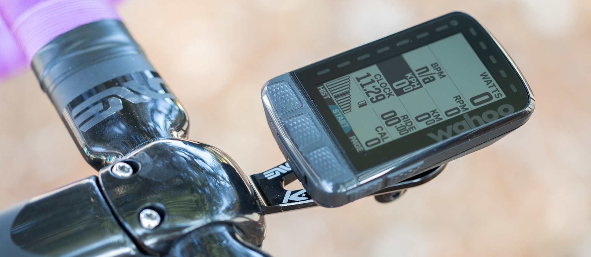
Cyclingnews Verdict
If you want a cycling computer that just works, the best choice continues to be Wahoo. The latest update means you are now back to having a choice of the Roam v2 with a larger screen and two extra hours of battery life or the smaller Bolt v2 for a bit less money but a similar user experience.
Pros
- +
17-hour battery life
- +
High contrast screen
- +
Excellent implementation of upcoming navigation and Varia display
- +
Convex buttons and USB-C charging fix the two glaring issues of the previous Roam
- +
Pan and zoom finally comes to the Roam
- +
Simple to use
- +
High-quality companion app
Cons
- -
Updates don't push the brand forward
- -
Lacking street names on the maps
You can trust Cyclingnews
One of the most important pieces of gear a cyclist has is their bike computer. For some people, it's the navigation that's important and the bike computer becomes a gateway to adventures. For others, the route is always the same and long since memorised but every ride is a new opportunity to train, from which the metrics and sensors tell a story that gets dissected and analysed later. There are also lots of people who look for a mix depending on their needs. Sometimes the metrics help with pacing, and sometimes they get ignored, while sometimes the navigation means riding places they've never been and sometimes it gets ignored. Whatever your need, we have options on our list of the best bike computers to cater to every price point and need.
If you spend time studying that list, one thing you will find is that there are three major bike computer companies. Wahoo is a brand that finds itself in that top tier as one of the most well-known and widely used bike computers. Each time they release an update it makes a big splash in the market and they've just released a big one: the Wahoo Elemnt Roam v2, which is their most feature-rich, and most expensive bike computer to date.
At one time the original Wahoo Elemnt was the most groundbreaking bike computer available for sale. Seven years later, the Wahoo Roam v2 is the latest successor and we have had a chance to see what it's like to use. If you are considering a first bike computer, or a new bike computer, keep reading to see if the Wahoo Roam v2 is a bike computer that makes sense for you.
Design and aesthetics
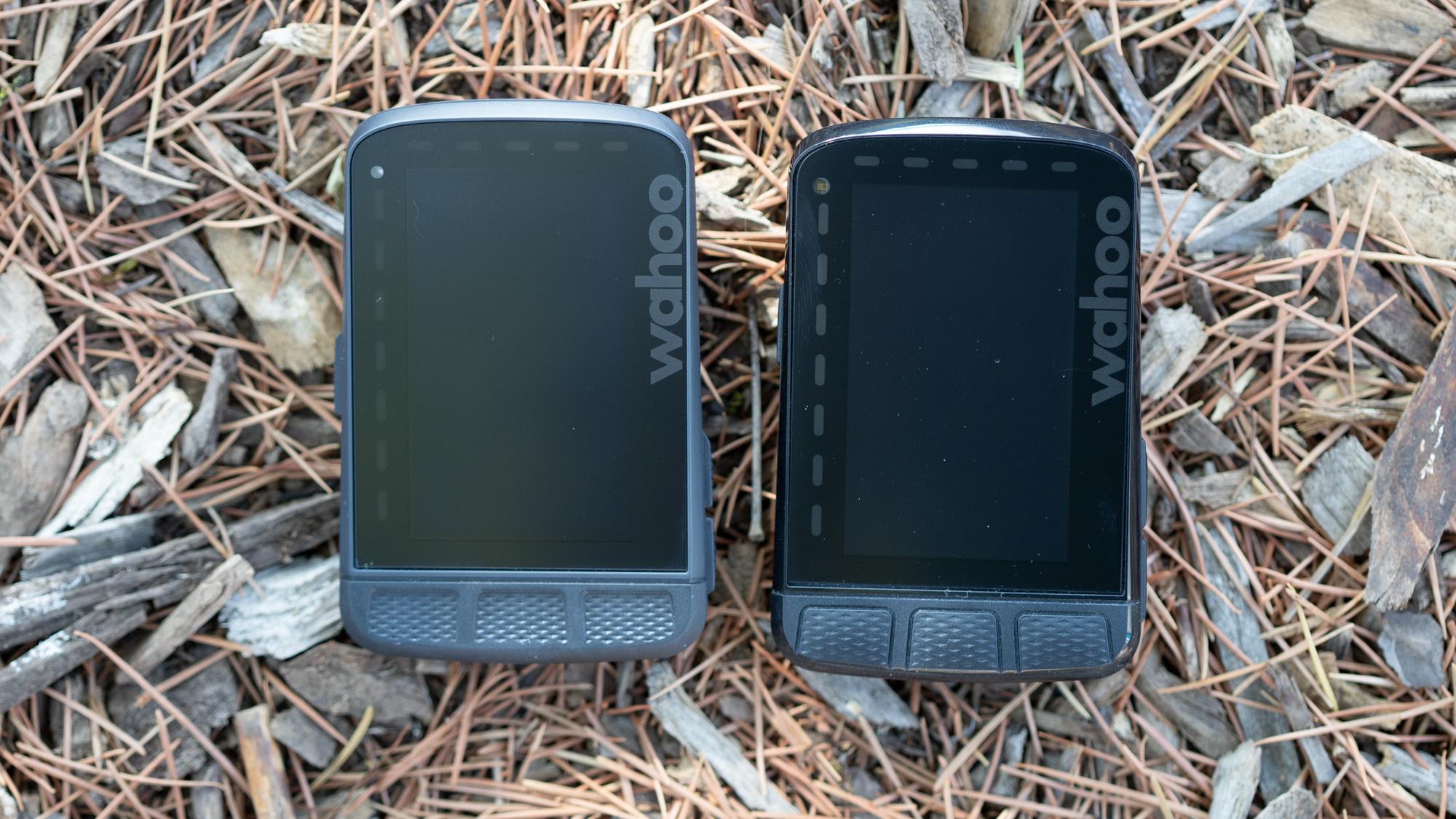
When the box for Wahoo Roam v2 arrived at my door step I took one look and thought I had the wrong device. “Oh, woops, there was some kind of mix up and I ended up with the old version.” I opened up the magnetic flap and as the actual unit came into view, I noticed the buttons were just a little different. Then I grabbed the box with my current Roam in it and compared the two. I'll spare you the exact details but if I handed you one box and let you examine it then handed you the next, I doubt most people would catch that it changed.
I don't normally spend a lot of time on the packaging in a product review, but in this case, it sets the tone. Long-time users of the Roam will quickly spot the updates that Wahoo is bringing with version 2 but everyone else will probably find it hard, even with access to both.
The official specs from Wahoo quote the new unit as being slightly bigger. According to Wahoo, the difference is small but I think they need to remeasure. The only difference I can find is that the new unit is maybe a millimetre thicker and everything else appears to be exactly the same. You can certainly swap the out-front mount back and forth between the two units and there's no noticeable difference.
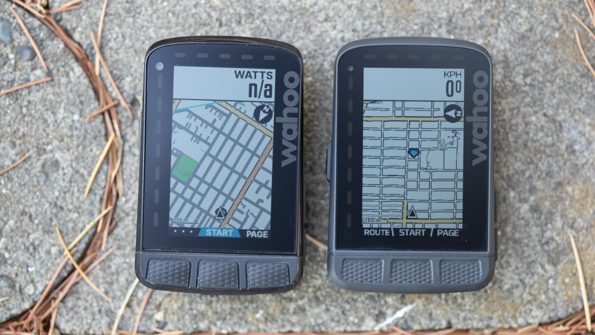
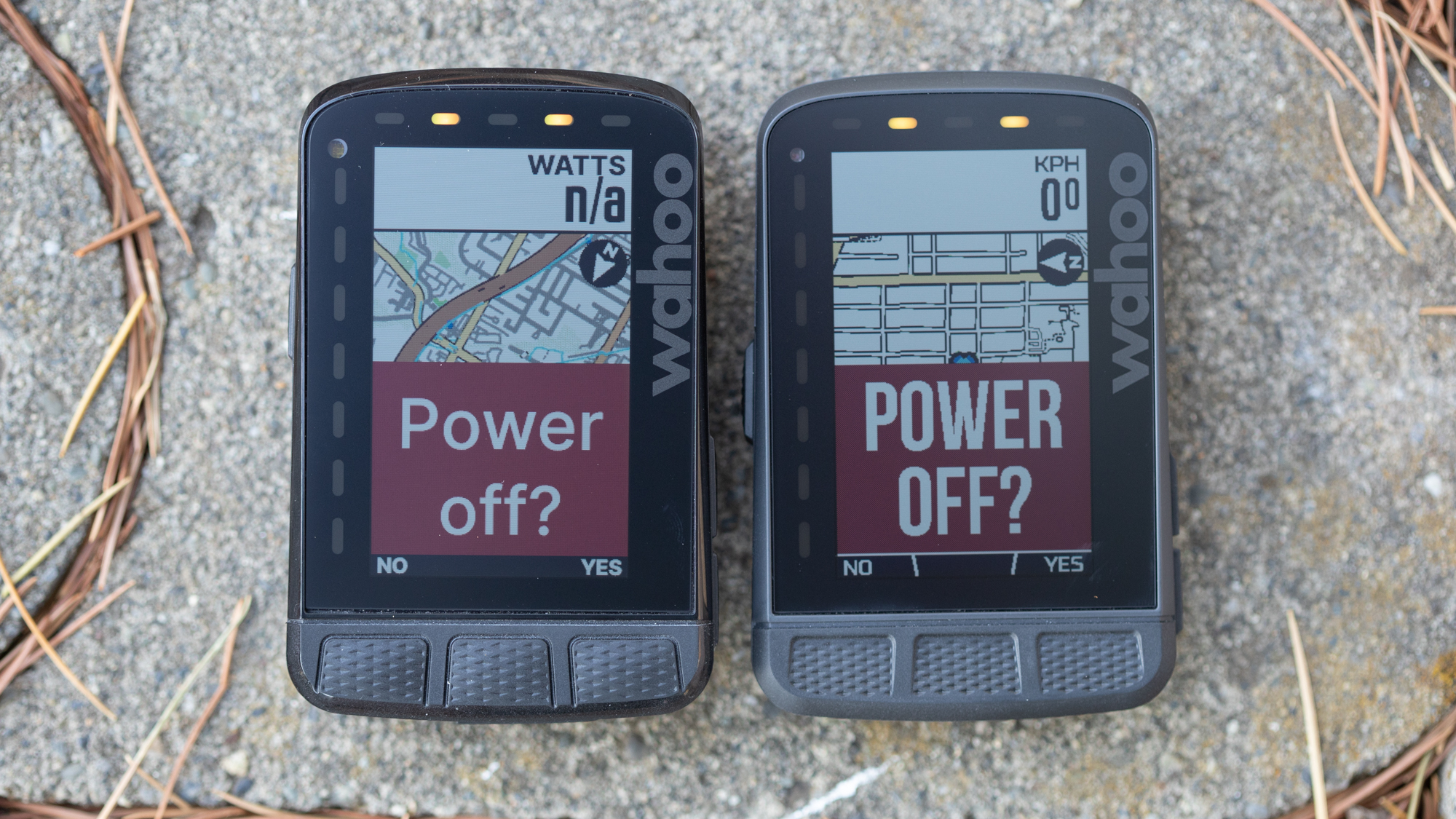
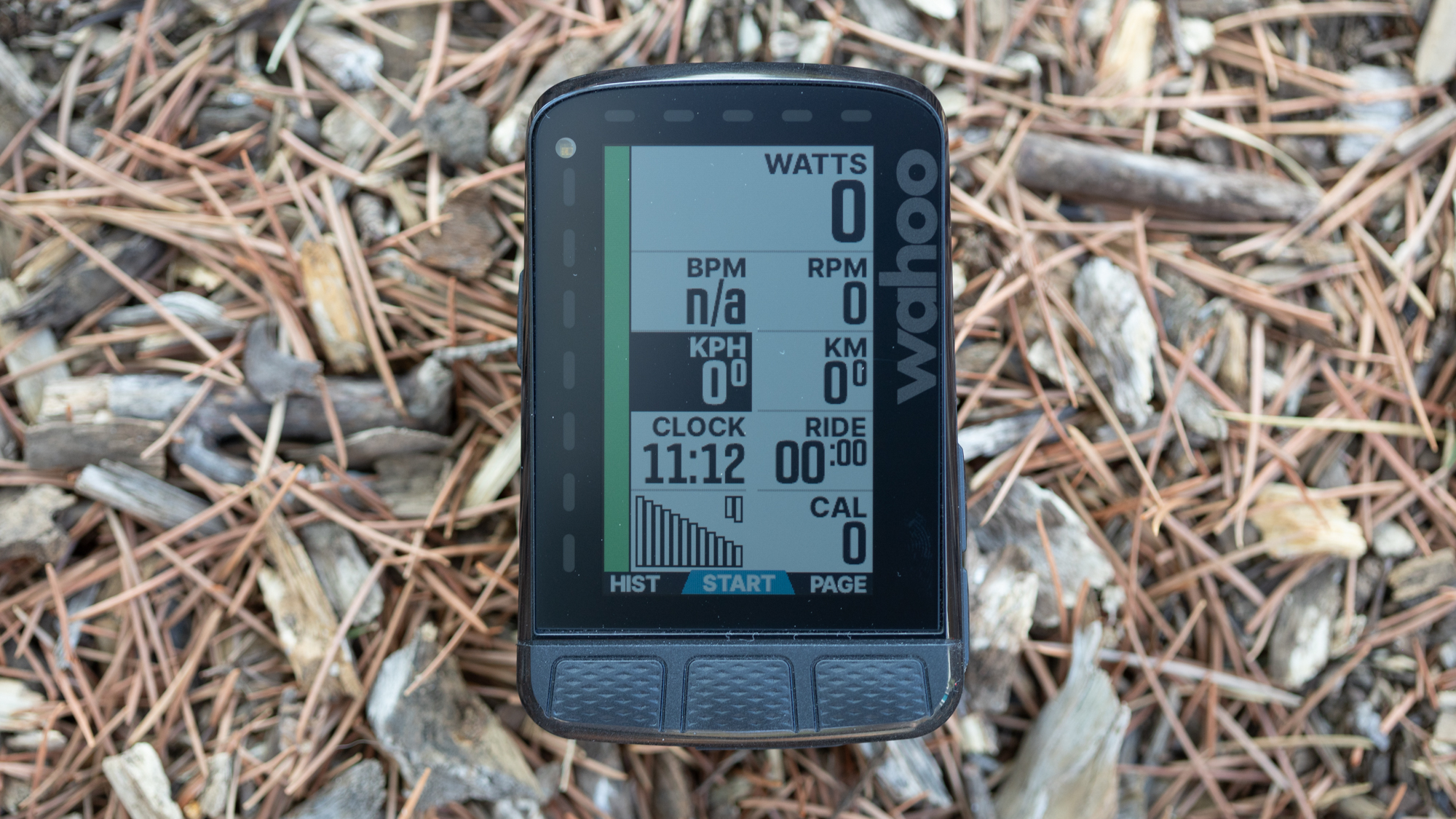
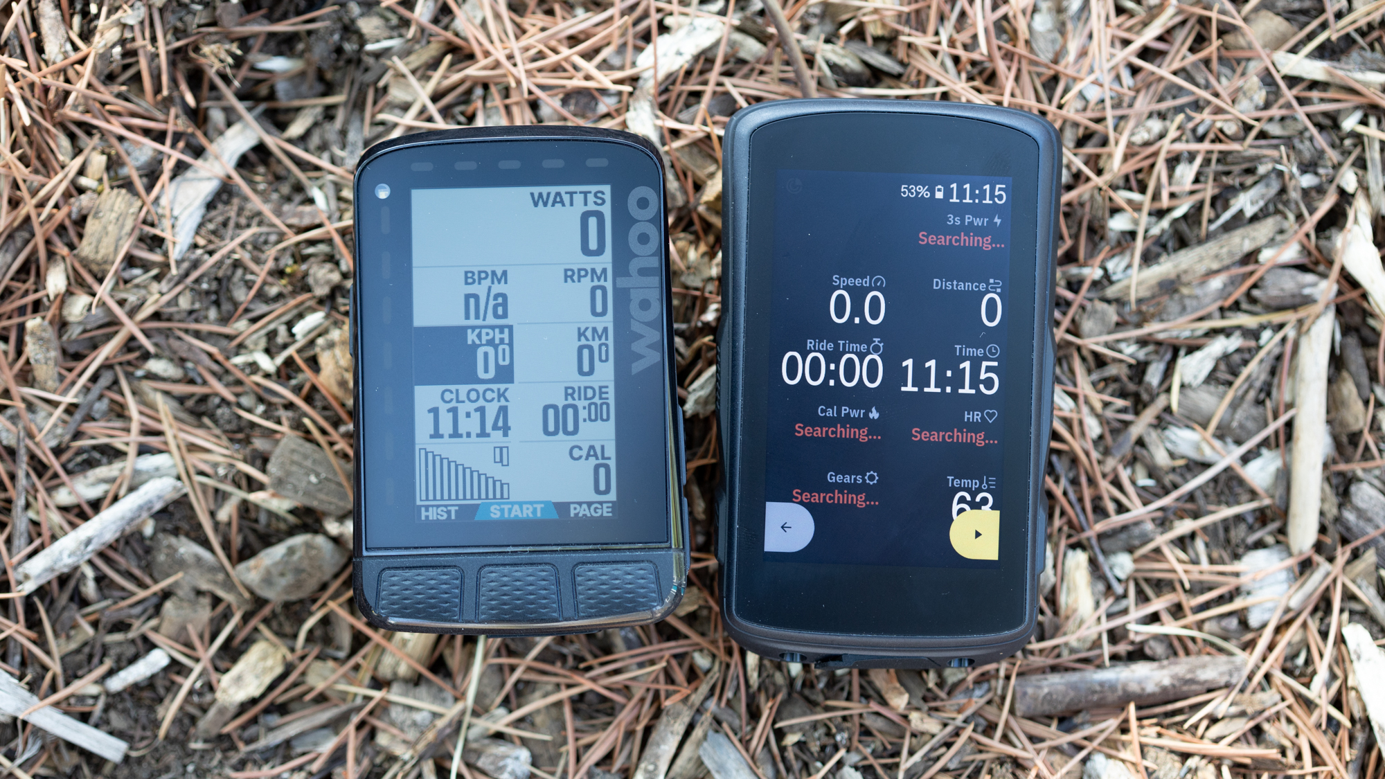
The rest of the physical design doesn't differ much either. The screen is the exact same 6.7 cm at 400x240 resolution and the massive bezels with their integrated strips of LED lights (which can be programmed to show info such as power, heart rate or directions) remain unchanged. The rear panel is a richer black as opposed to the grey of the previous generation but even that's tough to notice. The buttons have made this same colour switch as well, although the rubberized coating makes noticing that difference even more difficult. Wait, let's get back to those buttons.
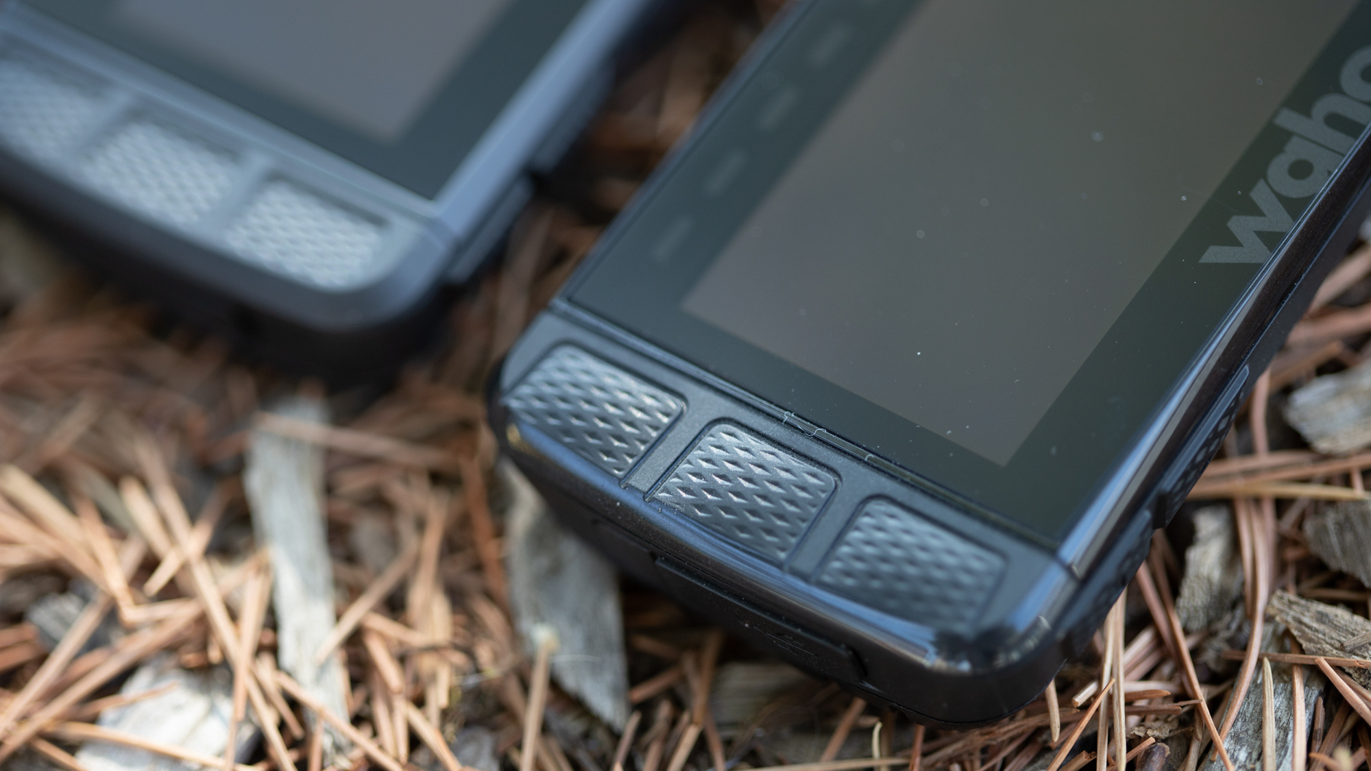
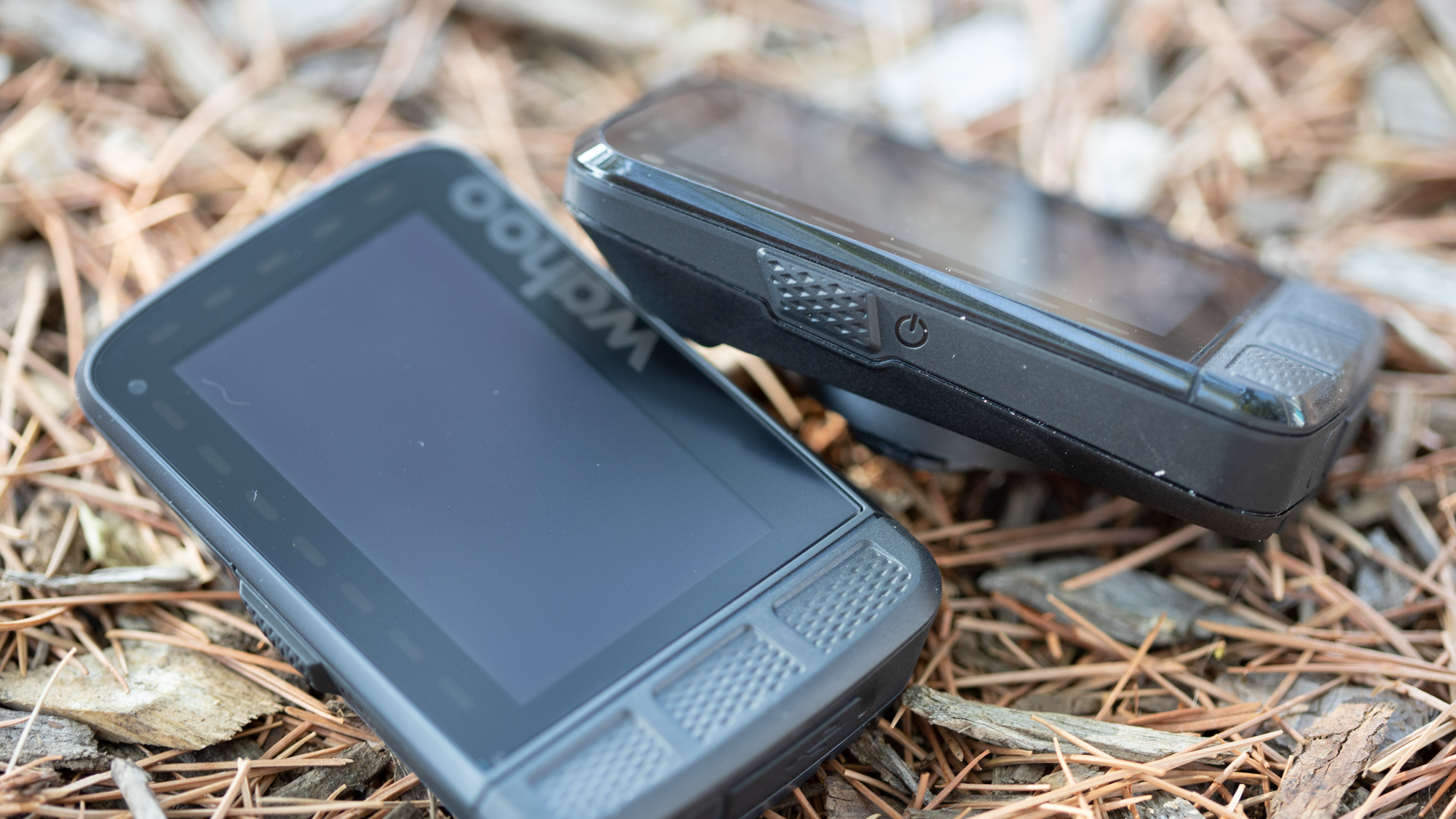
I said long-time users of Wahoo would recognize the differences and this is one of those details. If you are familiar with the Wahoo Bolt v2, the buttons have made the move to the Roam. Instead of a recessed design, the three bottom buttons now sit proud of the display and the side buttons have changed a bit as well. The power button is thicker and lower down the left-hand side while the right-hand function buttons are a bit bigger as well.
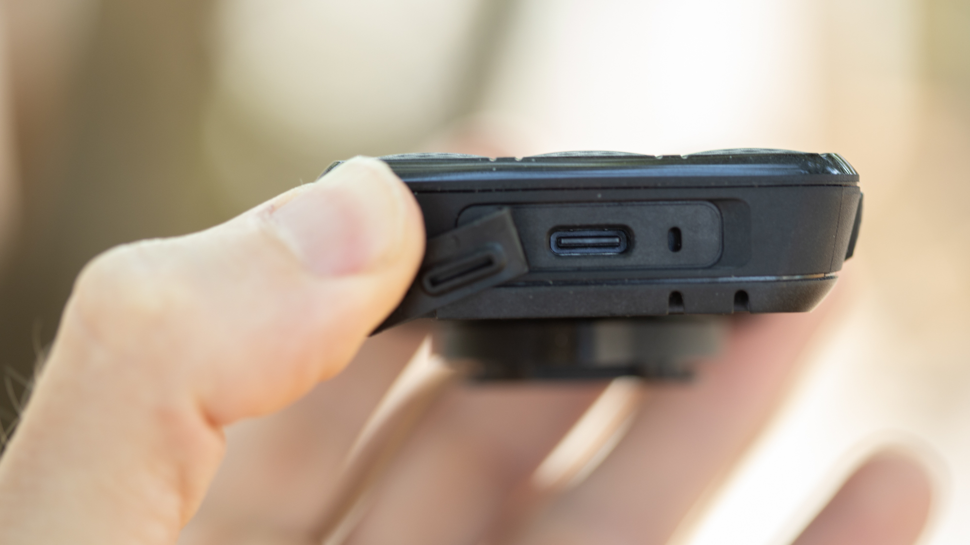
The last external change is another one that Wahoo Roam users will applaud. At the rear of the unit, placed in the perfect spot for mid-ride charging, is the power port. There is still a rubberized flap protecting it but now it's a USB-C port. The battery itself remains unchanged and carries the same 17 hours of quoted battery time. That's still 2 hours more than the Bolt v2.
Internally, there's another couple of small hardware changes. The GPS has switched from single-band to dual-band for better accuracy. The onboard storage has jumped from 4GB to 32GB for more maps on board without a download and the final change is the screen. The old Roam was the first Wahoo product with colour but the colour was very limited. The update brings the same 64 colour display that the Bolt v2 uses.
Software updates
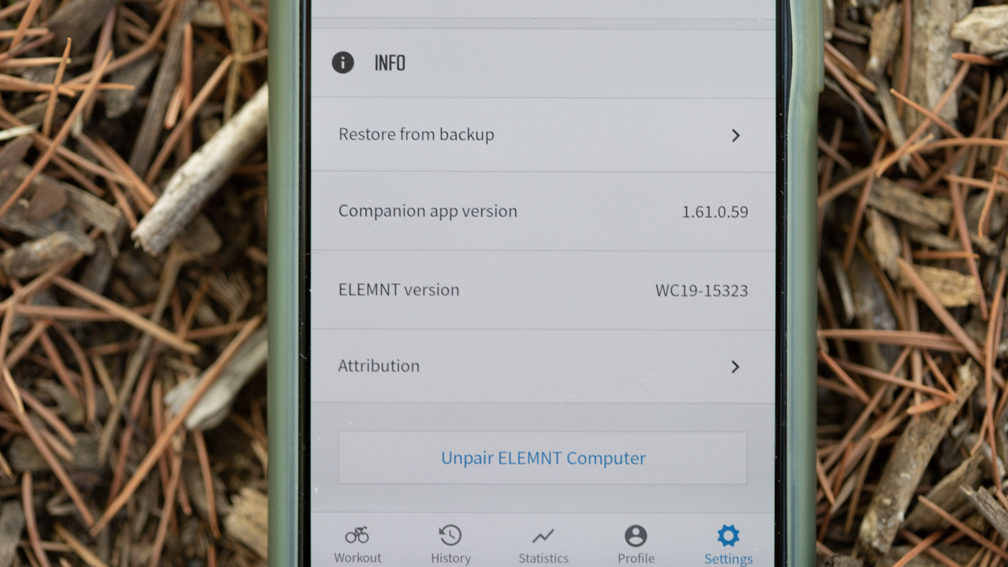
As always, Wahoo computers leverage the power of smartphones by putting most of the setup and settings features into the Elemt app. The first time you turn on the Roam v2 you will start by scanning a QR code which will add the new device to the Wahoo Elemnt app. Although the latest version of the Wahoo software (available to all Elemnt computers still in operation) adds a backup feature, it won't pull your setup from a previous Roam.
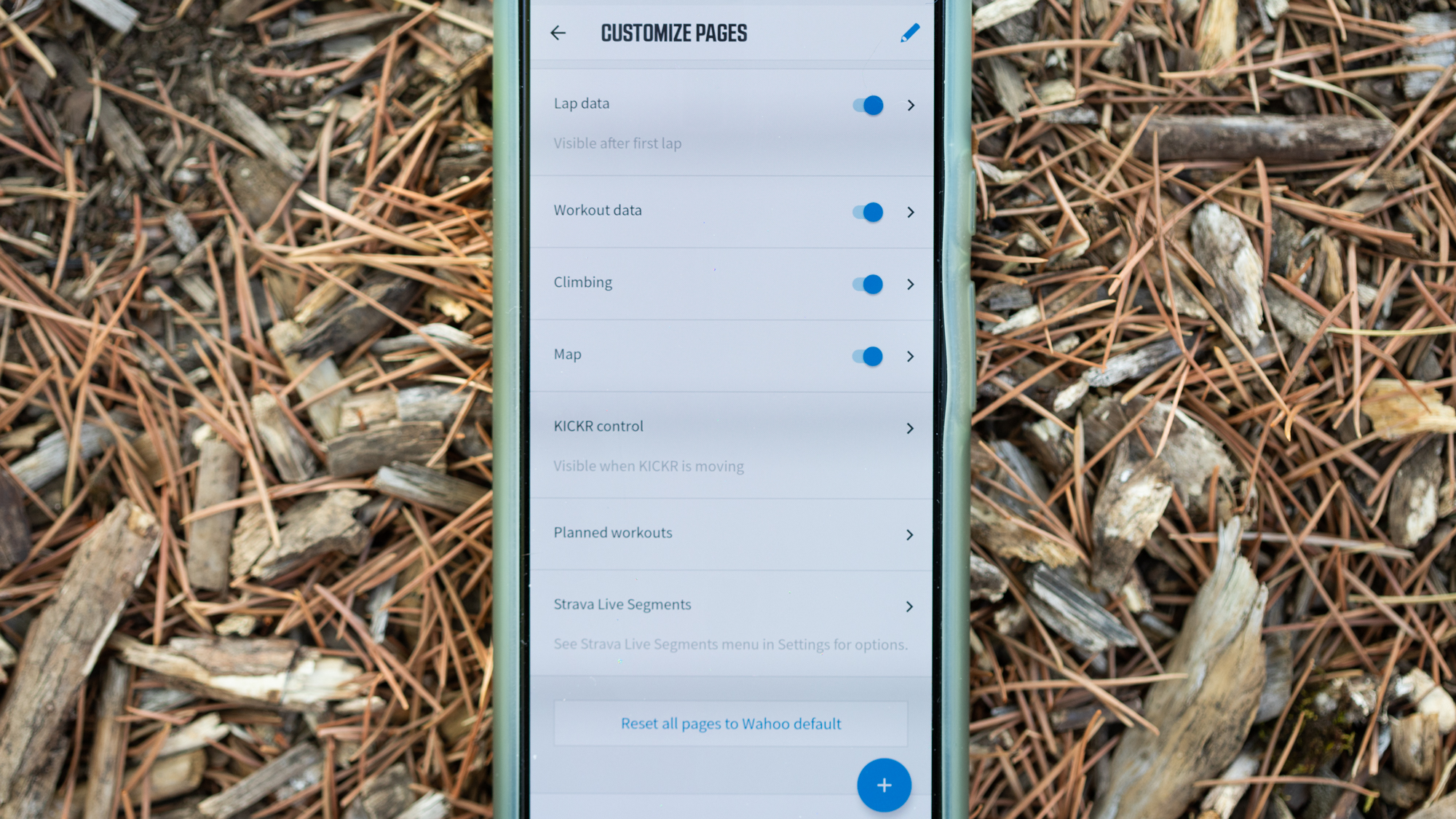
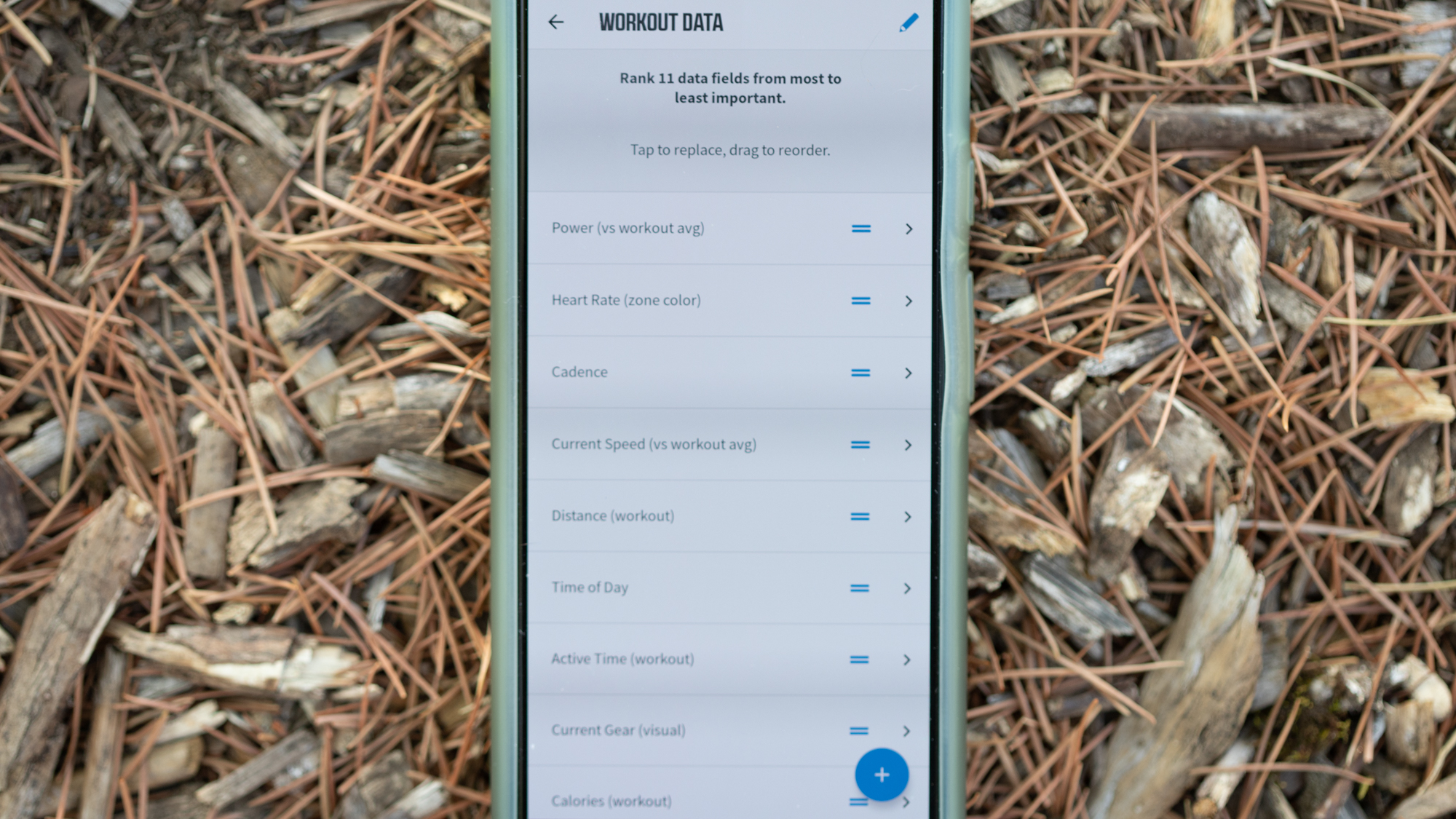
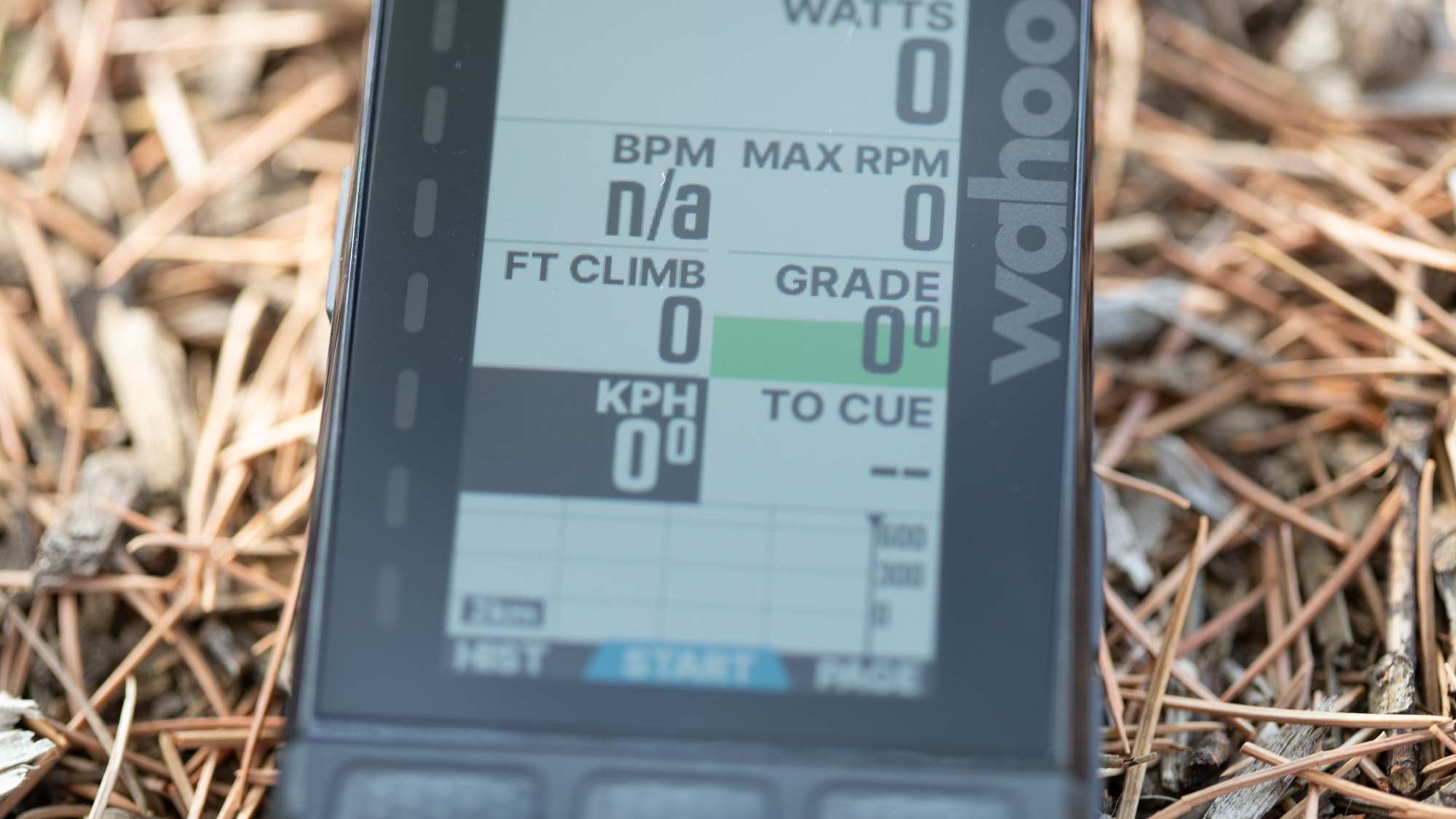
Instead, you will dive into the menus and add data fields in ranked order with different options available for each type of screen. While riding you'll use the buttons on the right to decide how many data fields are visible on each screen, while the third button belneath the screen will cycle through the screens sequentially. None of this is any different than before and it's, mostly, very good.
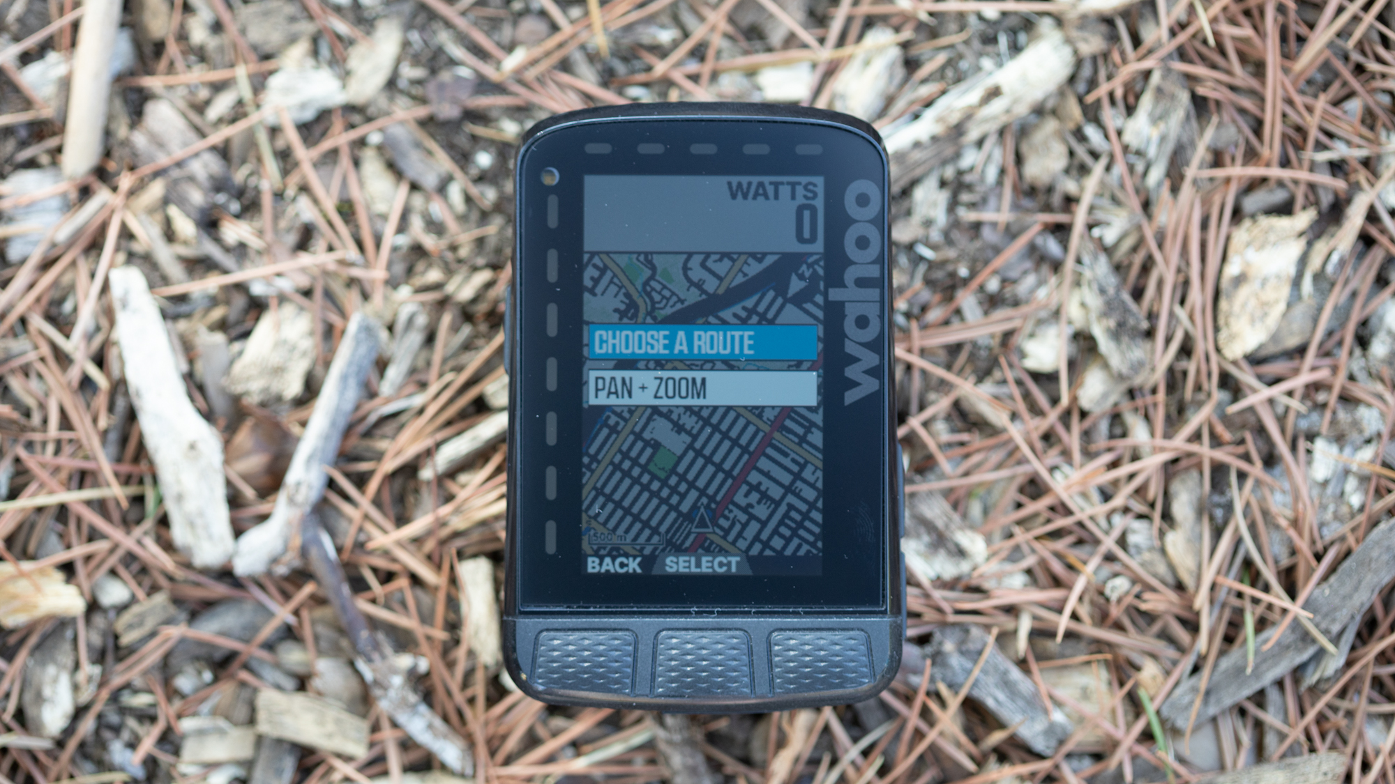
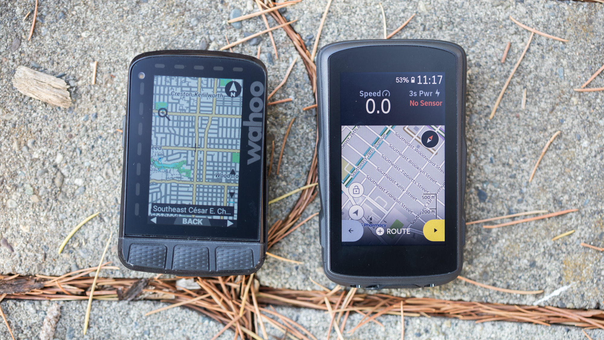
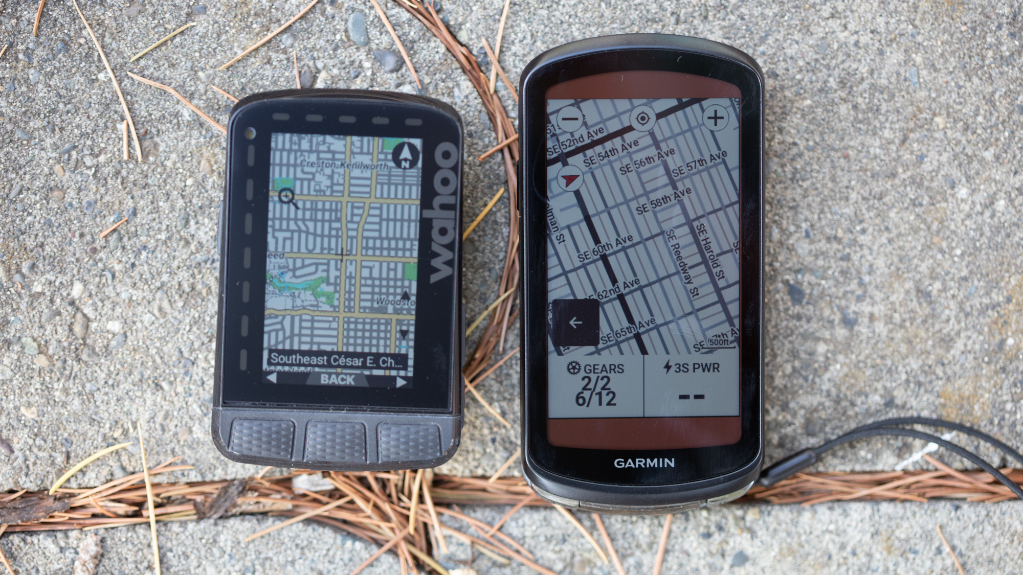
The app-first concept does have a way of colouring some of the other features that in the past have been annoying. Really that just means the map doesn't have any street names and if you needed context you'd need to stop and pull out your phone. It helped when the first version of the Roam added dynamic routing with real GPS to route you back if you made a wrong turn. That's still true but now the Roam v2 picks up the pan+zoom feature first introduced on the Bolt v2.
You could always zoom in or out of the map. The challenge was that with no street names, and no ability to see where a road went, it was little help if you needed to understand which road to take. Now you can move around the map with ease and even without mobile service, you can figure out which road is the one you are trying to take. Unfortunately, this feature isn't coming to the Roam v1 although that seems to be an arbitrary decision since it's a software feature and the button layouts haven't changed. This is the same story as the backup feature which also isn't coming to the older unit.
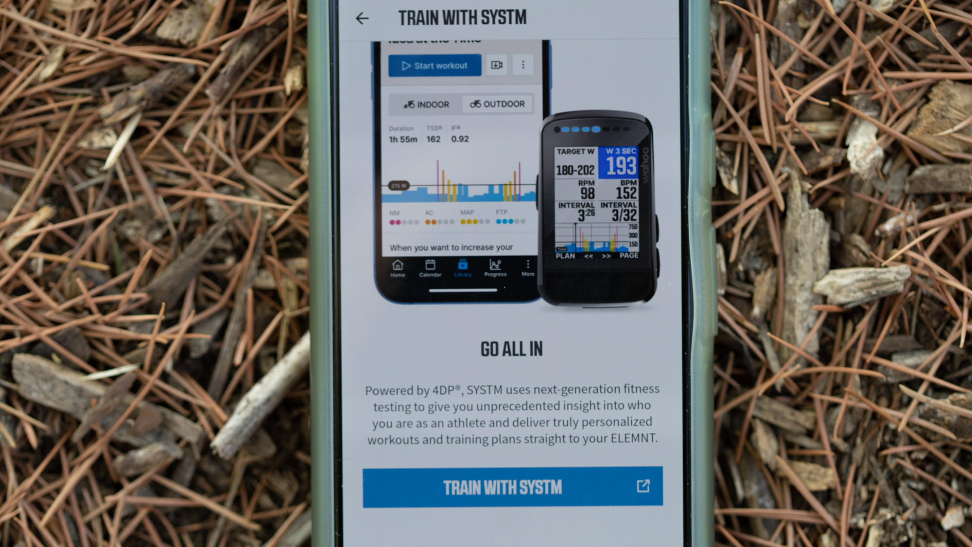
One change that is coming to the older Roam is the addition of synced Systm Outdoor workouts. Wahoo has been assembling one of the most robust training and indoor riding ecosystems over the last couple of years, and it's called Wahoo Systm (alongside Wahoo RGT). It should be no surprise that your workouts will now sync to the head units. Other companies already had this feature and without checking first, I would have told you Systm must have it. It didn't, but now it does.
Not yet implemented
There are some features rolling out alongside the latest Wahoo Roam that aren't yet implemented and I haven't yet tested. The Summit Segment feature is akin to what Garmin has with the ClimbPro and it gives additional details about climbs on preloaded routes. There's already colour coding based on gradients but what's coming soon is a better overview of how many climbs are on a route and what's still upcoming. Hammerhead's Karoo 2 also offers a similar feature, and on the face of it, Hammerhead's is better as it works on all roads, rather than being limited to preloaded routes.
Another soon-to-come software feature is public route sharing. There are already lots of ways to do this but right now it's a function of whatever software you created the route in. The update brings that feature directly into the Wahoo ecosystem and it sounds like it should work somewhat like the ride-tracking feature. According to Wahoo, you'll be able to "mark any route in the Elemnt app as ‘public’ for a specified period of time." Once marked as shareable, other Wahoo users within 2km will see it as available for loading onto their head unit.
The first two are software features that those with older hardware will get but the last detail still to come involves hardware changes. Onboard the Roam v2 two new sensors are a compass and a gyroscope. Right now, they aren't doing anything and Wahoo hasn't laid out what to expect in the future. Could be safety-related, could be navigation, we'll all have to wait and see.
Performance
When you leave your house for a ride the changes you can expect with the Roam v2 include an updated screen, updated buttons, and dual-band GPS. Of the three, the one that matters is the buttons. The Roam v1 buttons were so stiff that pressing one would flex the out-front mount and it would frequently require multiple presses. Also, since it takes time for the screen to change, you'd need to press then wait and see what happened. Get too impatient and you'd end up passing the screen you needed and spending even more time trying to press buttons.
The experience with the Roam v2 is a far cry from that. While testing, I was about halfway through an impromptu time trial attempting to grab the KOM on a segment. Up ahead I saw a potential turn and I needed to understand if I was turning and make adjustments so I needed to see the map screen and that meant pushing buttons. It was a revelation how easily the button pressed. It no longer broke my concentration and I was able to see what I needed and then get back to my main screen. Of course, you could argue that's how it always should have been but it doesn't matter, it's fixed.
The performance of the newly-added dual-band GPS is a little less amazing. I tend to ride far from high buildings and I rarely have issues with GPS accuracy but the earlier Roam was the worst about putting me slightly off the route. Often on double track through logging areas, there would be a constant stream of beeps as the computer bounced me back and forth between being on the route and a random spot off to the side in the trees. The first ride with the new unit and I experienced the same behaviour. It only happened once in my testing so I’d call that improvement but don’t expect miracles. GPS tracking on the Wahoo Roam is generally fine but dual-band or not, it's not perfect.
The last detail that you can really notice when riding is the screen. I never thought there was a need to add colour to the Roam but the previous version barely had any. The new version adds a bit more but it's still inherently a black-and-white display and that's not a bad thing. The screen that Wahoo uses on all its devices is brilliant. It's super high contrast and easy to see. The colour pales in comparison to the Hammerhead Karoo but the battery life on that unit suffers because of it. There's a little more colour here and there to highlight details. You also get colour to mark your training zones but if that's your goal, Stages computers do that piece better. The colour is just a contrast tool and that's fine as long as you don't expect more.
Verdict
There's no way around the fact that the Wahoo Roam v2 is a tiny upgrade that mostly fixes what was wrong with the previous version. It duplicates the current Bolt v2 but you get a larger screen and longer battery for more money. The problem for anyone that sees this as an issue is that a lot of people love the Wahoo experience.
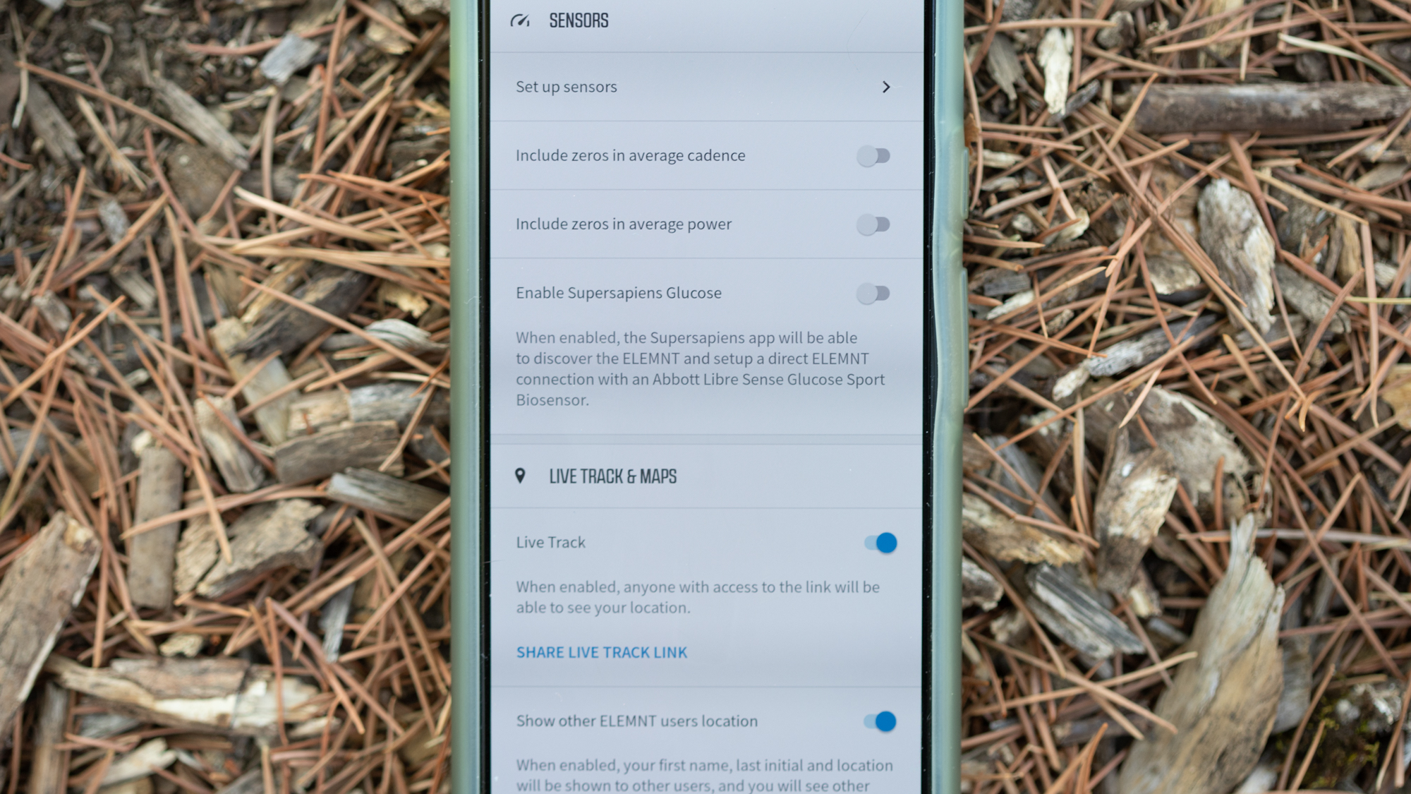
You spend a few minutes setting up a computer on your phone then almost everything is hands-off from there. Routes sync automatically from Strava, Komoots, and Ride with GPS and there's rarely any complication. If you forget to sync you can push it from your phone with ease. At the end of a ride the data uploads to wherever you need it to and, again, it just works. There's a tracking link you can send automatically or manually and the screen is super high contrast with plenty of battery life for whatever you want to do.
Both Garmin and Hammerhead offer more features but it's Wahoo that I tend to recommend the most. It's such a simple experience that it works for anyone who wants to ride their bike and not figure out how a bike computer works. If you want more battery life, choose Garmin. If you want a better screen, choose Hammerhead. If you want a great all-around computer that's easy to use, choose Wahoo and if you want a bigger screen and bigger battery, pick the Roam over the Bolt.
There is one challenge for Wahoo though. The brand risks falling behind either technically or maybe just in terms of public opinion. For the first time since I can remember, people are beginning to ask me about alternatives. They want to know about Hammerhead in particular and that could be a long-term risk for Wahoo. As it is, the latest version of the Roam catches it up and continues to deliver an excellent experience. But if you're always playing catchup, you're never winning the race. There’s very little to fault and the mix of features continues to be something that resonates with consumers, let’s just hope it stays that way.
| Screen Quality | Excellent in bright sun and easy to read quickly but the competition has better options. | 7/10 |
| Navigation Quality | Wahoo has always been amazing at following a dot on a map. Adding panning makes it more useful when you don’t have mobile service. The fact that upcoming navigation doesn’t block other data is a joy. The only downside is there are no street names on the map. | 9/10 |
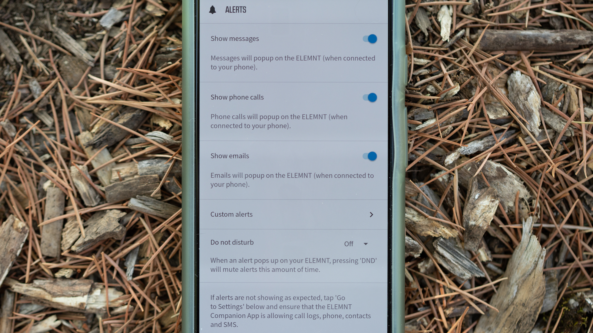
| Smart phone connection | It displays every notification I need it to, has a top-notch app, and makes it easy to share tracking. | 10/10 |
| Battery Life | Garmin offers better battery life but 17 hours is enough to get through just about any ride. | 9/10 |
| Value | It perfectly matches the price of the relevant competition and Wahoo units tend to last a very long time. | 10/10 |
| Overall | Row 5 - Cell 1 | 90% |
Tech Specs: Wahoo Roam v2
- Price: £349.99 / $399.99 / €399.99 / $599.95 AUD
- Dimensions: 9.05cm x 5.95cm x 2.05cm
- Display size: 6.9cm diagonal
- Display Resolution: 240 x 400 pixels
- Weight: 3.3 oz
- Battery Life: 17 hours
- Water resistance rating: IPX7
- Internal memory: 32 GB
Josh hails from the Pacific Northwest of the United States but would prefer riding through the desert than the rain. He will happily talk for hours about the minutiae of cycling tech but also has an understanding that most people just want things to work. He is a road cyclist at heart and doesn't care much if those roads are paved, dirt, or digital. Although he rarely races, if you ask him to ride from sunrise to sunset the answer will be yes. Height: 5'9" Weight: 140 lb. Rides: Salsa Warbird, Cannondale CAAD9, Enve Melee, Look 795 Blade RS, Priority Continuum Onyx
