You can trust Cyclingnews





This article originally appeared on BikeRadar
So you bought a power meter; now what do you do with it? Stages Cycling hopes its new Dash computer and corresponding Link software will answer this question on a daily basis for riders who want to improve.
While many cycling computers are increasingly focused on GPS-related elements, such as navigation or Strava Live, the new Stages Dash has a myopic focus on training with power.
Although it has GPS, Stages Dash is not a direct competitor to the top-end Garmin Edge computers; its closest comparison would be SRM's PC8, the training tool found on many pros' handlebars.
When tied in with the Stages Link software, the Dash delivers specific workout instructions, with a spartan but customizable presentation.
The Dash is the first head unit computer from Stages Cycling, which launched its left-crank power meter in 2012.

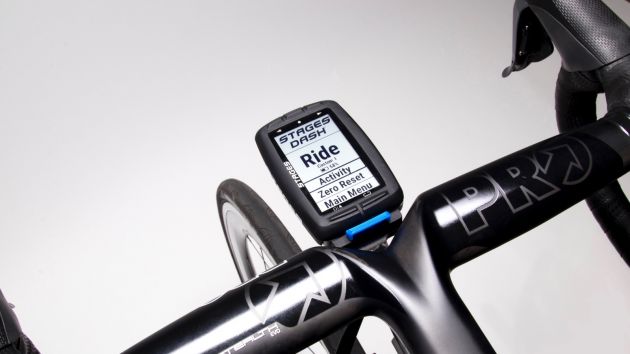
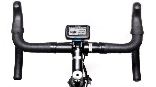
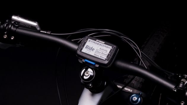
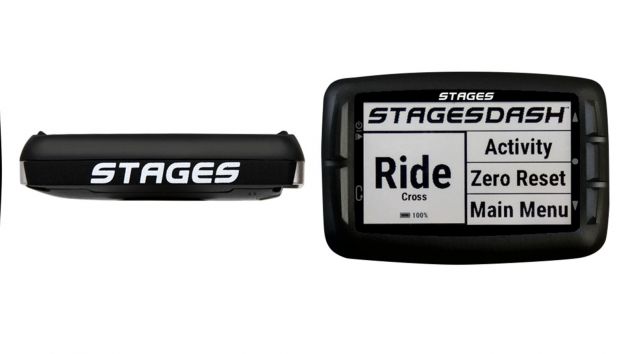
The Stages Dash can be used in portrait (shown) or landscape mode
Stages Cycling Dash highlights
- Integration with Stages Link software (by Today's Plan) for workout planning, execution and analysis
- Customizable guidance through interval workouts
- 2.7in black and white display with 240x400p resolution and anti-glare coating
- ANT+ and Bluetooth
- Aluminum body, five buttons
- Works in portrait and landscape configurations
- 1–16 data fields per screen, with custom layouts
- 25–40hr claimed battery life
Metrics galore with custom layouts, but it's all about the workouts
The black-and-white Dash can have between one and 16 fields on any screen, filled with any of the standard metrics that you would expect from a high-end computer: power, heart rate, distance, VAM, elevation, speed, time, etc.
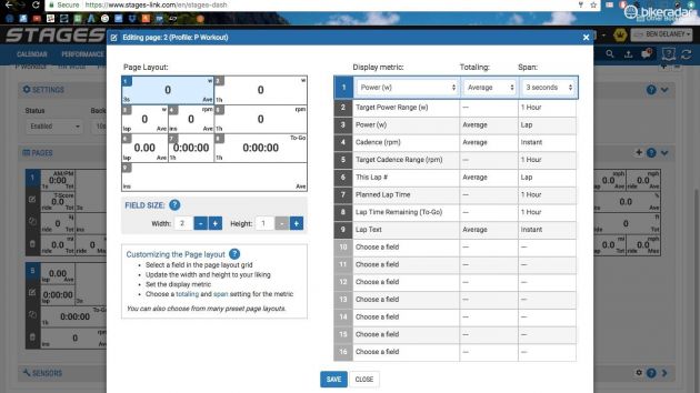
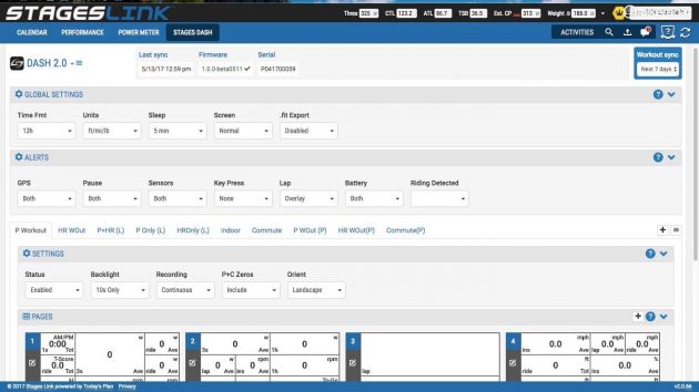
You can build screens via Link, where a series of categorized drop-down menus make selection fairly easy, and you can set up multiple screens for different activities.
For instance, you might have a Workout activity with detailed instructions on intervals and target zones on one page, and cumulative stats on the next. And then you could have a Race activity where the main page is just time, 3sec power, heart rate and speed.
Each of up to 16 fields can be configured by size, shape and position, as well as which information goes where
The screen layout is spartan and boxy, with no icons for GPS, battery life or other things.
One novel thing is the ability to set the size and location of each box. In other computers, you can usually select the order of data fields, but the overall configuration is fixed. With the Dash, you can build any data box between a quarter and full height, and between a quarter and full width.
The second novel thing — and the primary selling point of the Dash — is the workout functionality.
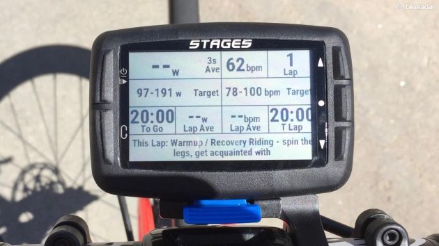
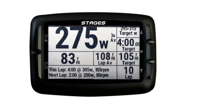
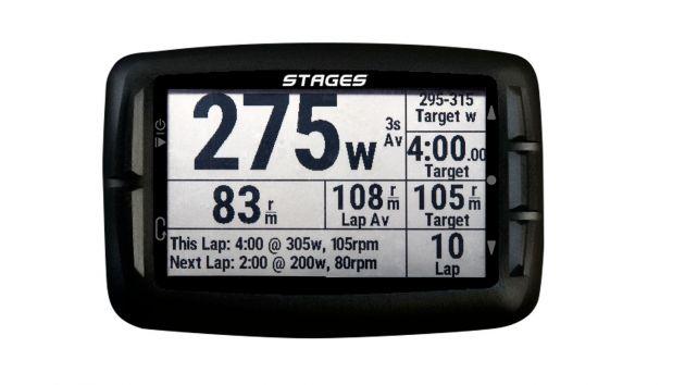
When following a workout, you can have the screen set up to show you a bevy of information: such as target zones for power, heart rate and cadence; actual power, heart rate and cadence; lap time; brief instructions; and a description of the next interval.
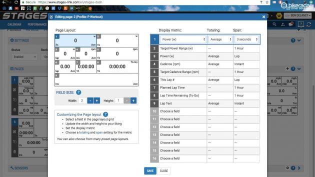
You choose which data goes where, and how big you want each data box to be
On the top-end Edge units, Garmin has a Workout feature, with a color-coded power zone graphic. For each interval, it is visually clear where you are in the prescribed range, as the power number and an arrow shifts around in the prescribed zone.
However, the actual power is 1sec power, not the standard 3sec average, so it jumps around quite a bit, which can be frustrating. Also, you can't change the layout.
On the Dash, there are no graphics, just numbers and text. But perhaps the best workout feature is simply the lap-start functionality, which lets you start each interval when you're ready — whether that is after the stoplight has turned green or you've arrived at the bottom of the hill, or whatever. On a Garmin, the laps just automatically advance; an Edge doesn't know what traffic is doing around you.
After you complete each interval, you get a lap summary pop-up for 10 seconds. (This summary can be disabled if you are doing short intervals like Tabatas.)
In some ways, the workout functionality is similar to TrainerRoad: there is no fluff, just straight-up and highly specified training. You don't get any graphics like TrainerRoad's helpful bar charts, but the target power/HR/cadence fields, plus the text ,make it clear what you're supposed to be doing.
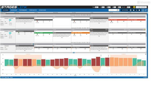
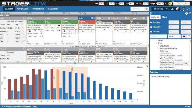
Stages Link prescribes and tracks the micro and macro fluctuations in fitness
One issue with the text is that the size of the box dictates how much you can see. If your interval instructions are long and the text box is set small, you can't read it all, and you can't scroll to see more.
Another issue with the text is that it can be hard to take in all the information when doing short, intense intervals. A graphic presentation would go a long way.
An issue with the lap-advance logic can arise if you are doing super-short intervals: constantly hitting the button is annoying when in a short cycle of all-out effort and recovery.
But for anything over a minute, the lap button just makes sense. If you are the type of person who wants to obsessively execute intervals, then it's best to be in control of when you start, instead of hammering away through sketchy traffic just because your computer is beeping at you to go.
What the workouts are based on: FTP
The workouts are all based on your functional threshold power, or FTP. If you have no idea what your FTP is — or even what FTP is — no problem. The Dash will walk you through a 20-minute test to find this number, measured in watts.
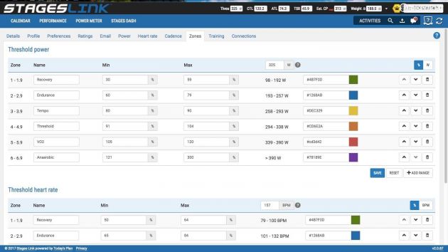
Once this is established, all your workouts are based on six training zones, which are set as a percentage of your FTP.
For example, your Recovery zone is 30–59 percent of your FTP. Your Endurance zone is 60–79 percent. And so on up through Tempo, Threshold, VO2 and Anaerobic.
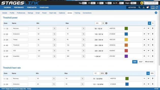
All of the workouts center around your training zones, which are based on your FTP
As with any power-based workout, the Stages workouts prescribe intervals of a certain intensity and duration. A Threshold workout could be 2 x 20min, with a warm-up, in-between recovery and cool-down built it. A VO2 workout could be 8 x 3min. The idea is to stress different systems and rebound stronger.
And, as with any power-based program, the nice thing is that you can measure your improvements as well as metering out your workouts.
Where the workouts come from: Link integration
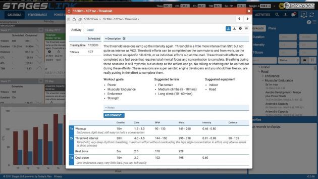
You can pull in a la carte workouts from Link's huge menu, which is searchable by type (endurance, speed, strength, etc.), duration, intensity and more. But the full benefit comes from following a training plan, where each day's workout is mapped out for you, based on your target event or goal, and your available training time.
Stages Link was built by Today's Plan, and those familiar with the Australian site will recognize some similarities. It is also similar to the American TrainingPeaks.
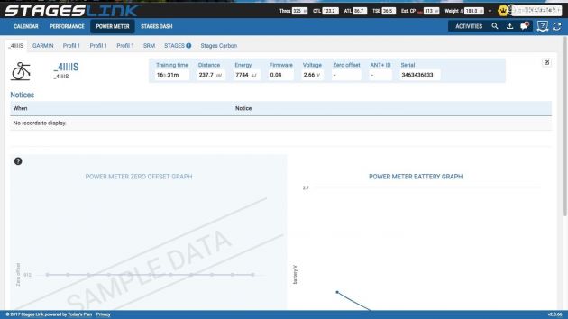
In addition to Stages-blue graphics, though, Stages Link also has unique features, such as an integrated Dash configurator and a power meter manager (which tracks all meters, not just Stages product.)
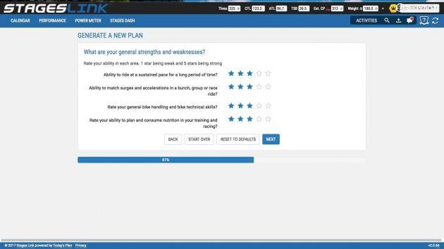
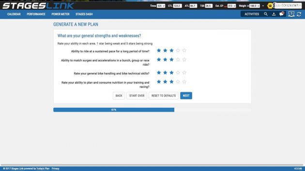
In setting up a training plan, Link walks you through a number of questions, including how much time you have to train each day of the week. This is the same as Today's Plan
As with Today's Plan, Stages Link will create a training plan for you, walking you through questions like how much time you have to train each day of the week. You can do this for a specific goal, such as improving threshold power, or for a specific race on your calendar.
There are also three stock eight week plans, from beginner to proficient, written by Benjamin Sharp, a former Olympic cycling coach and current power education specialist at Stages.
In addition to detailed forward planning, Stages Link can also track your fitness over time, whether looking at the 'forest view' of training stress balance or the 'tree view' of things like best power output over a variety of durations (best 10s, best 10min, best 30min, etc.). In this, it is similar to Today's Plan and TrainingPeaks.
What is unique, though, is the ability to connect the training plan with the specific workouts on the Dash. For now, whenever you plug your Dash into your computer, the Stages Sync app running in the background will upload all rides and download upcoming workouts. An Android app, tethered via Bluetooth, does the same thing. I have an iPhone, and the iOS app isn't yet ready, so I can't comment on this functionality.

Each prescribed workout is delivered an explanation about the reasoning for the specific work
With both Today's Plan and TrainingPeaks, you can create workouts or follow plans, and then manually export each workout. Then to get them onto a Garmin, you have to connect the Garmin to your computer and manually drag and drop them into a folder. The one exception is the new TrainingPeaks app, which gets that day's workout onto newer Edge units via Bluetooth.
One thing I love about Stages Link and Today's is how it shows your local weather forecast on the next four days in calendar mode. It's a simple but handy integration, especially considering that you can easily drag workouts around on the calendar.
After you do the workout...
I'm eager to test out the Link app functionality because I have become used to Garmin's easy post-ride routine: I press 'end ride', and either Bluetooth (on the Edge 520) or WiFi (on the Edge 820) automatically puts my ride on Strava, TrainingPeaks and Today's Plan. Connecting the Dash to a computer with a USB cable feels like a step backward. The Link app will let you upload rides and download workouts wirelessly via Bluetooth.
That said, you don't have to do anything besides plug the Dash in; the Sync app runs in the background to upload the ride to Link and push it to Strava or other sites.
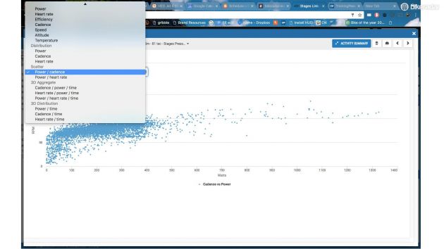
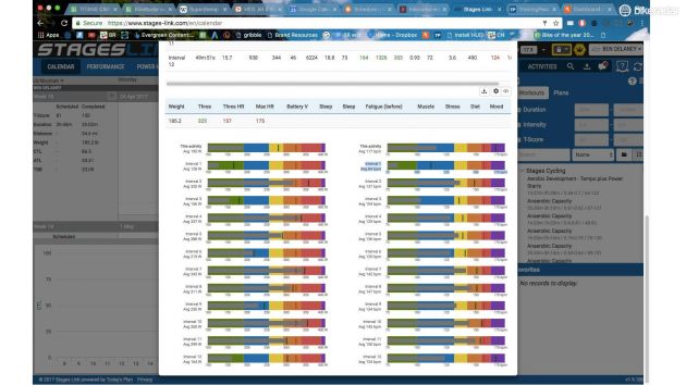
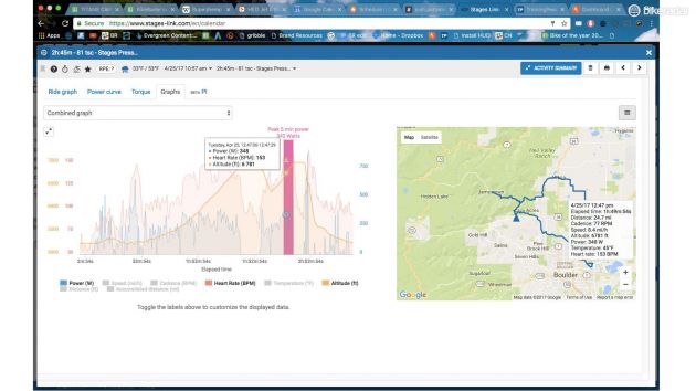
For post-ride analysis, it is pretty easy to get into the weeds with Link, as it offers so many ways to splice the data. Some coaches love this; some riders might find many of the options overwhelming and difficult to decipher.
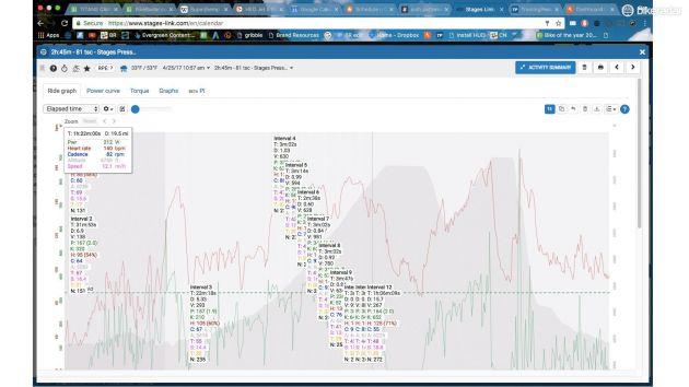
Some coaches appreciate the level of granularity available in Stages Link/Today's Plan, but many riders might glaze over with some of the options
But it is fairly easy to look at the basics, such as whether you executed the workout correctly (the day will turn green on the calendar view), and what your average power was for each of the intervals.
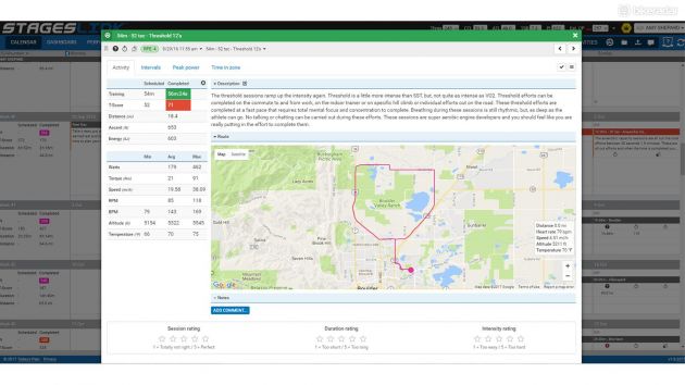
Some of the views I appreciate are time spent in zones, the peak power chart (how this ride compares to recent bests, in various durations) and 'load', which shows the forest view of your long-term training in terms of training stress.
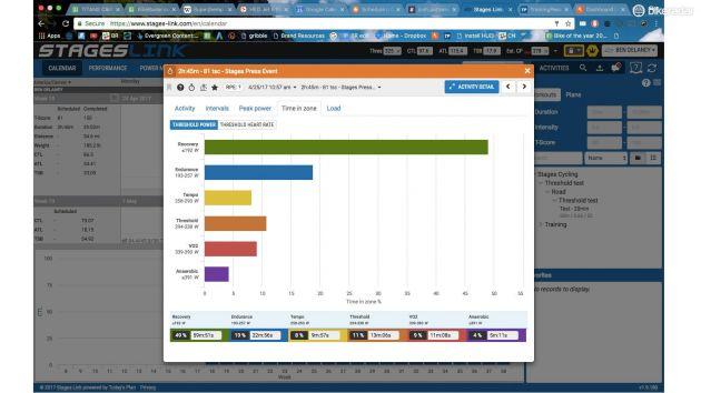
This is a screen I can easily digest and appreciate: time spent in each zone
Speaking of the long-term view, you really don't have to dive into the minutiae of the analysis if you're not interested. One of the great things about following a well-crafted training plan is that someone else has already done the planning part; you just have to go out and do your intervals. (And take rest days when you're supposed to!)
Comparisons to SRM PC8, Garmin Edge 820 and Wahoo Elemnt Bolt
New GPS computers are coming thick and fast. I have been really impressed with the $249 / £199 Wahoo Elemnt Bolt, which is the most smartphone-friendly computer out there. Although black and white, the auto-syncing of routes and Strava Live segments is handy and modern, and the battery life is great.
Lots of people like to bash Garmin (myself included), but the fact is, the Kansas City company remains the dominant player. The £369 / $399 Edge 820's color touchscreen can be finicky when on the bike, but the feature list is deep.
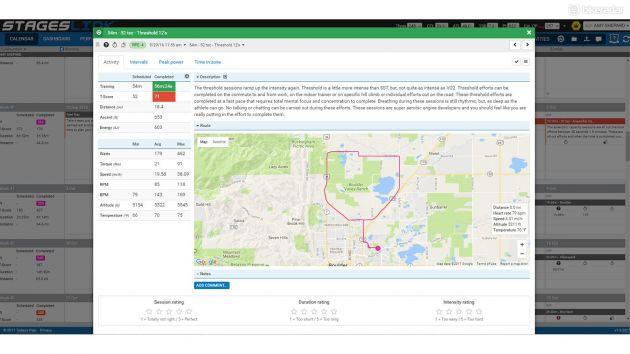
Since the Dash has GPS, you can see your route in Link afterwards (plus use GPS for speed and distance while riding
Compared to the Stages Dash, both of the above units offer clear navigation and maps, Strava Live, plus automatic WiFi uploading of rides. The Dash offers none of these.
The Garmin has a Workout feature as described above, and you can manually build workouts in the computer itself. But you can't customize the Workout layout, or automatically get a training plan's worth of workouts loaded into it. The Bolt does not have a workout feature.
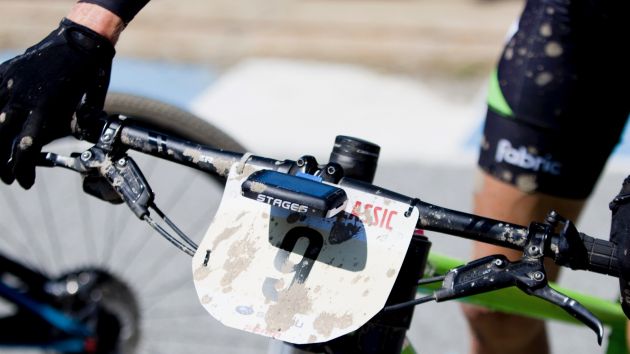
SRM's £610 / $749 PC8 is similar to the Dash in form; its metal rectangular body clips on right up against the handlebar. The PC8 now has WiFi uploading. Like the Dash, it has GPS but doesn't offer mapping or navigation. It has three somewhat inscrutable buttons (pro, mode, set) to the Dash's five. But the layout is a bit more refined in terms of design, with little icons along the right side and a live bar chart at left for training zones. The PC8 does not have a workout feature. And the price is, um, notable.
Bottom line: a good option for those serious about training, but pricey and still evolving
This is more in-depth than our typical first ride review, but since the product is still evolving, I want to wait until I can test the iPhone app with Bluetooth notifications, ride/workout sync, and phone-driven turn-by-turn navigation before giving a scored review.
As it stands, the Stages Dash is like a boxing gym: plain in appearance, but if used consistently, very effective. Having targets alongside live data for power, cadence and heart rate for your intervals is a proven formula, but one that has primarily been executed with indoor training, whether that is TrainerRoad or Zwift, or with coached indoor classes.
Stages brings detailed, prescribed training outside with the Dash, with some real-life-friendly features like a button to start each interval when you're ready and the road is safe.
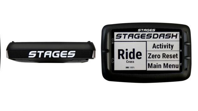
The Stages Dash is continuing to evolve, with an iPhone app in the works, among other things
The Stages Link website lives up to its name of linking together your power meter(s), your Dash, your training plan, your workouts and the macro and micro analysis thereof. It can be pretty dense, but the user can also navigate through the basics of setting up a training plan based on a goal or event, and available training time each day. That, plus the drag-and-drop functionality to move workouts around as weather and real life dictate are pretty cool.
The price strikes me as high. The workout features are robust and generally superior to the competition, but £349 / $399 for a black-and-white computer that doesn't offer maps, WiFi uploads or pretty graphics is pretty steep. Including a full year of Premium Link instead of the included two months would sweeten the pot.
With its laser-focus on power-based interval training, the Stages Dash is an interesting solution for riders who want specific training. It's like a stern little coach, sitting there on your handlebars.
Click through the gallery above for more snapshots of inside Stages Link.
Specification
Name: Dash
Built by: Stages Cycling
Price: £349.00 / US$399.00 / AU$589.00
Weight (g): 100
Batteries Included: Yes
Type of Battery Required: Built-in Rechargable
LCD Backlight: Yes
Wireless: Yes
Waterproof: Yes
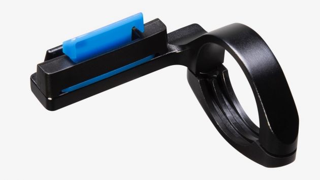
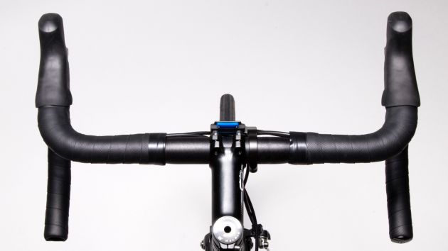
Mount Type: Clip-on
Activity Type: Cycling