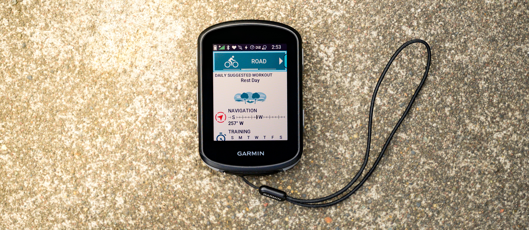
Cyclingnews Verdict
The Garmin Edge 540 brings with it a fix for every common complaint for the previous Edge 530 and effectively locks any competition out of the conversation. Right now if you want a small, premium, computer there is nothing else that makes sense to consider.
Pros
- +
PowerGuide and Real-Time Stamina trickle down
- +
Mount “wings” are now replaceable
- +
USB-C charging
- +
Class leading 26 hour battery life
- +
Multi-band GNSS means more accurate tracking
- +
No course required Climbing screen
Cons
- -
Lacks full phone interface integration
You can trust Cyclingnews
There are a lot of products that will help you go farther, ride faster, and expand your on bike adventures. One you might have overlooked though is a quality bike computer. Modern options from our list of the best bike computers are so capable that depending on your choice, you are buying far more than just a bike computer. Yes, you can see your ride metrics but you can also design complex routes then have your computer telling you where to go and rerouting on the fly. Some of the options even have built-in coaching features and any of the choices will integrate with all the sensors you need.
Price: £349.99 / $349.99 / €399.99
Display: 2.6" (66 mm) diagonal with a resolution of 246x322 pixels
Weight: 82g as measured with lanyard
Storage capacity: 200 waypoints/locations, 100 routes & up to 200 hours of history
Water resistant: IPX7
Connectivity: Wi-Fi, Bluetooth, ANT+
Sensors: GPS/Glonass/Galileo, Multi-Band GNSS, Barometer, Magnetometer, Gyroscope, Accelerometer, Ambient light sensor
Battery: Rechargeable with up to 26 hours of battery life in intense mode and up to 42 hours using battery saver mode
Dimensions: 2.3" x 3.4" x .8" (57.8x85.1x19.6mm)
If you've ever given any of these features much thought, you've certainly also considered a Garmin. The brand has been, and remains, one of the leaders in the field with a robust offering across a wide range of prices and features. Out of those offerings, the Edge 500 series sits at the low end of the premium options and now there's a new model to consider.
The Edge 540 replaces the outgoing Edge 530 and we've put the new model to the test. With the latest features trickling down the lineup from the Edge 1040, there is a lot to like. Is there anything missing though? If you are thinking about a new bike computer this summer, keep reading to see if the Edge 540 is the best option for your riding.
Design and aesthetics - hardware
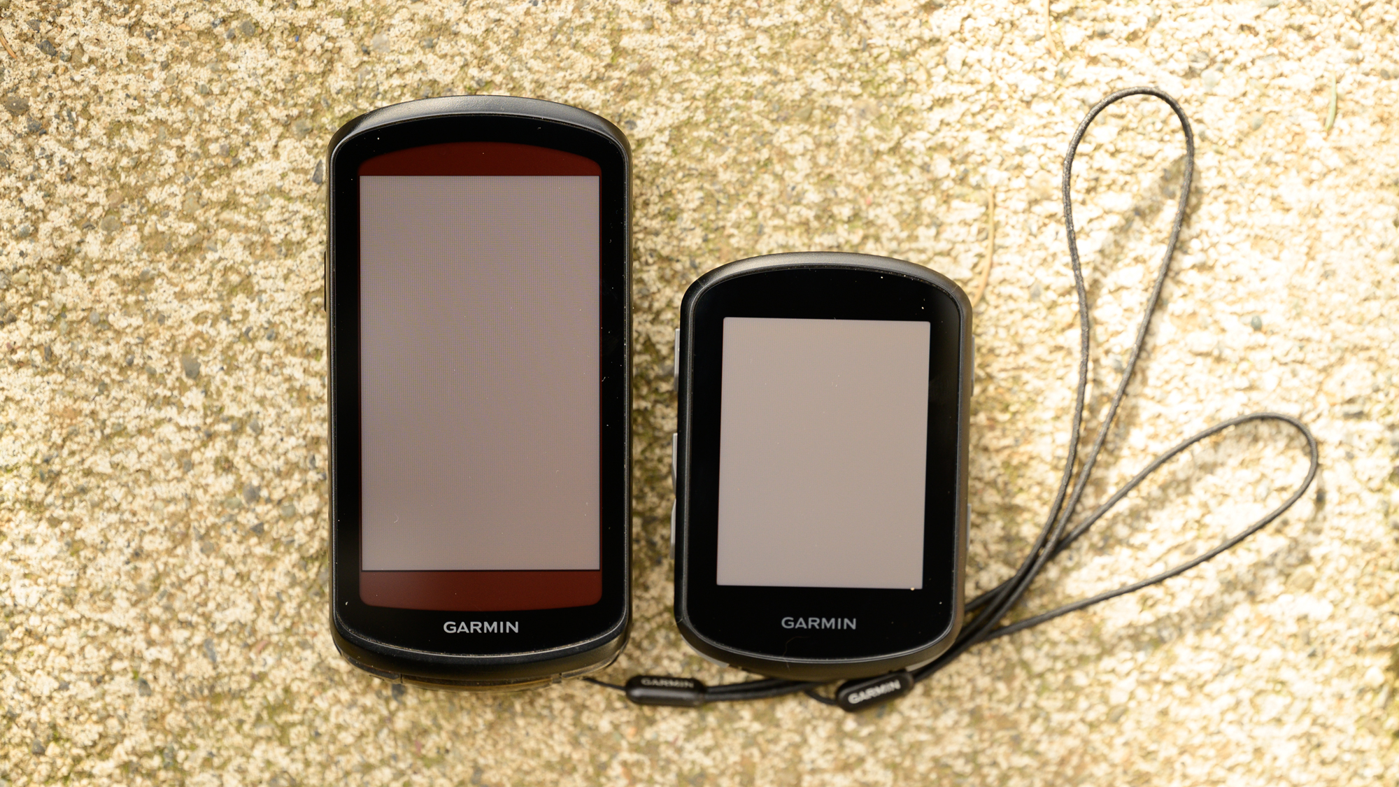
The most recent Garmin computer I reviewed is the Edge 1040 Solar. I bring that up because there's no possibility of this review not ending up as a comparison. The Edge 540 is so close to the 1040 that you can't help comparing the two options. Even visually, the two are near copies of each other.
Obviously, the 2.3 x 3.4 x 0.8″ (57.8 x 85.1 x 19.6mm) dimension of the 540 is smaller than the 1040 but the design language is nearly identical. If you look down on the Edge 540, it looks as if a 1040 lost some height. In reality, the 540 is a bit narrower but you can't tell visually. I even had to get out a tape measure to verify that the 2.6" and 246 x 322 pixels screen is slightly narrower as well.
For the eagle eyed out there, that size and resolution is the same as the outgoing 530. There are differences though. Everything is following the lead of the larger 1000 series update but compared to the older 500 series, the hardware is new. There’s an improved contrast ratio, enhanced colour filters and more backlight LEDs to improve colour representation.
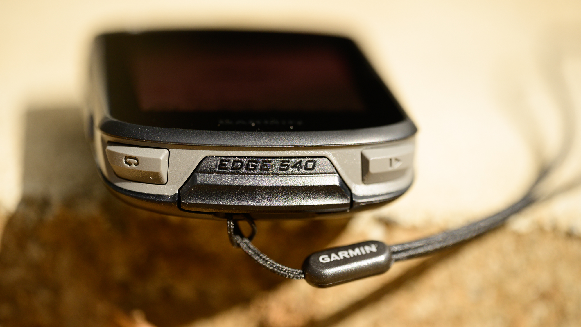
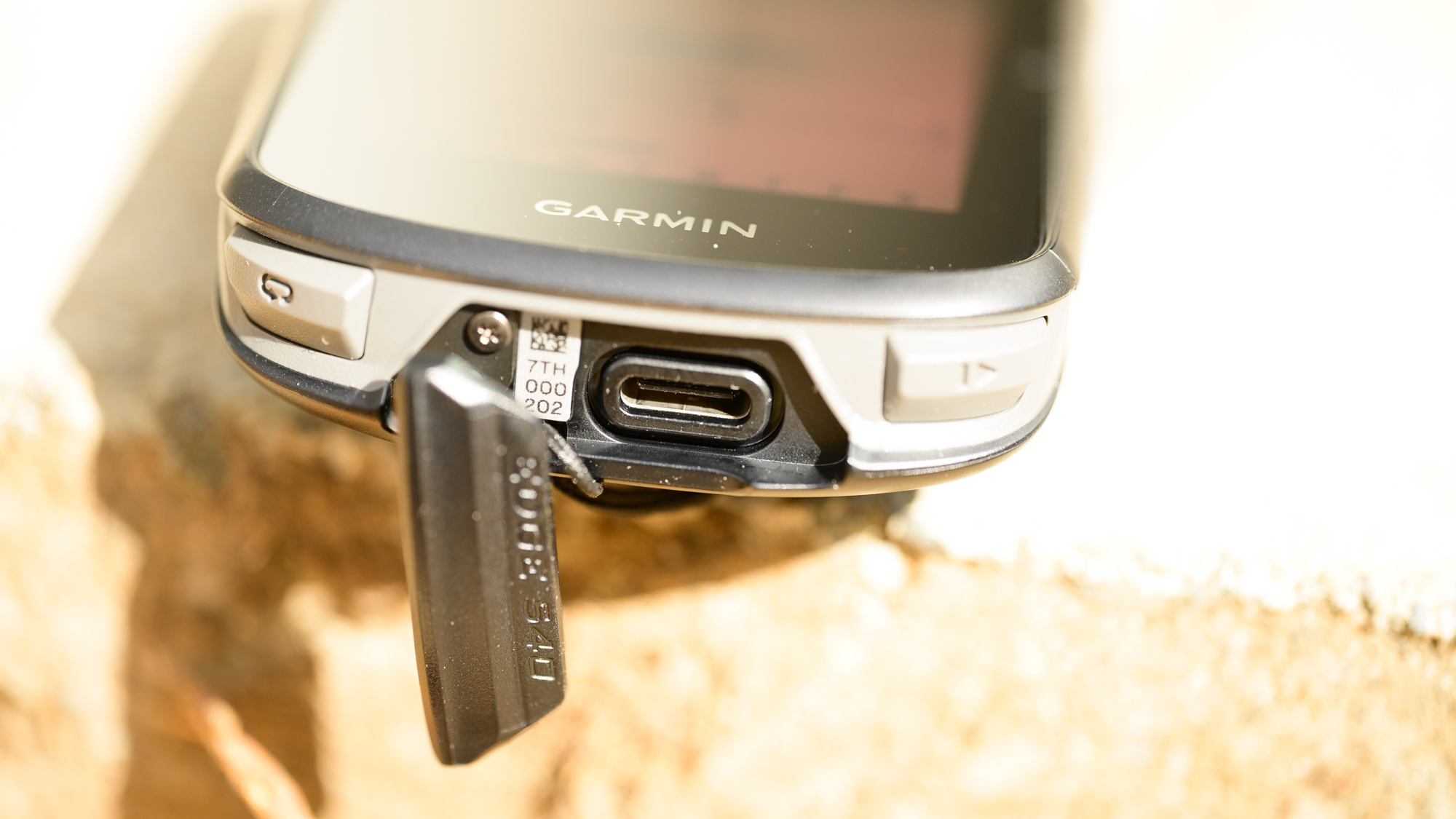
Where things start to actually change a bit compared to the bigger model, is when you examine the sides of the Edge 540. The top is an exact duplicate but the bottom uses the same design language with a less premium look. The start and lap buttons sit on the outer edges standing slightly more proud and switching to a grey plastic instead of the metallic detailing on the bigger computer. In between the two buttons, you get an attached cover for the USB-C charging port with a lanyard attachment sitting below in the main body.
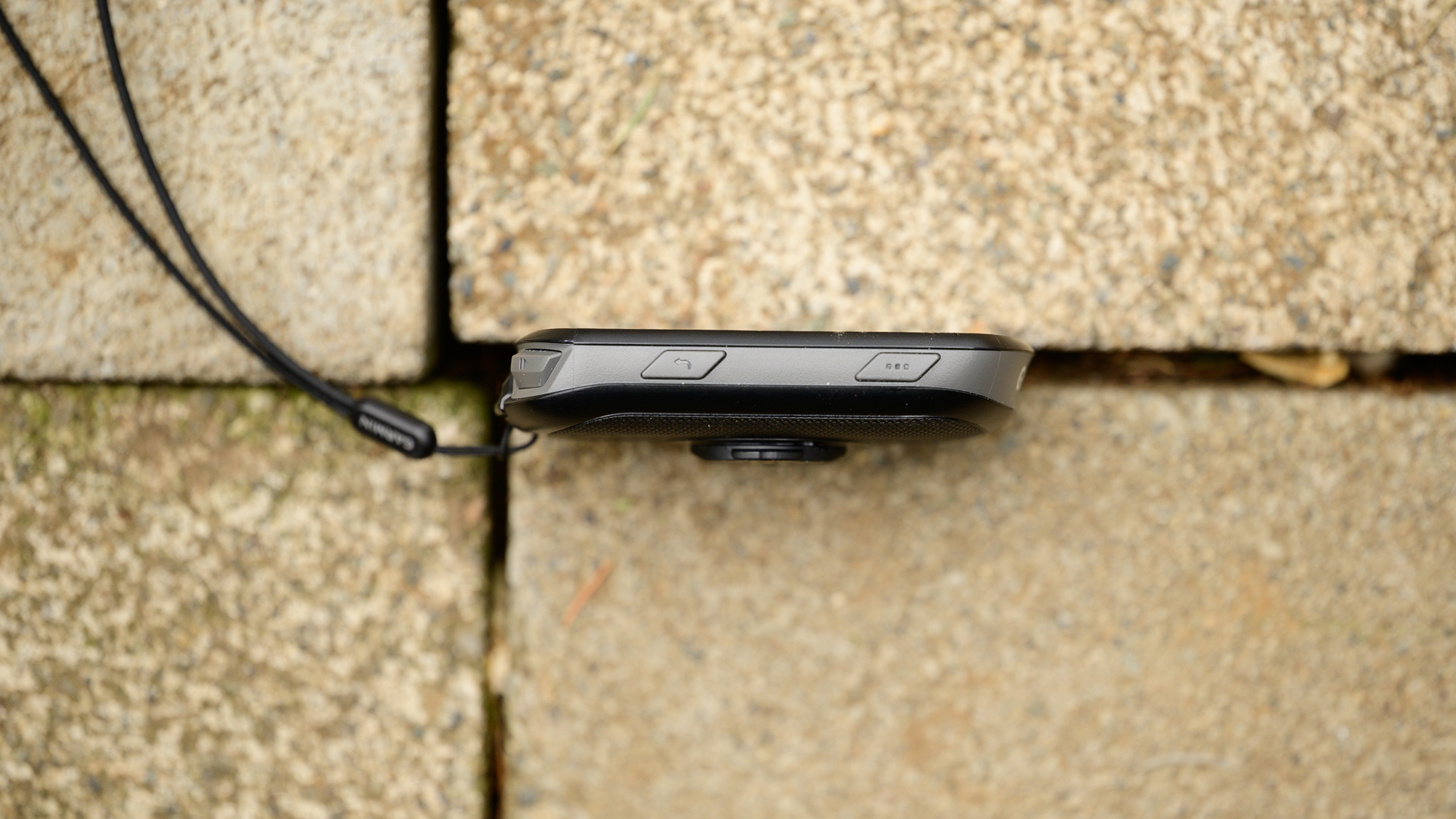
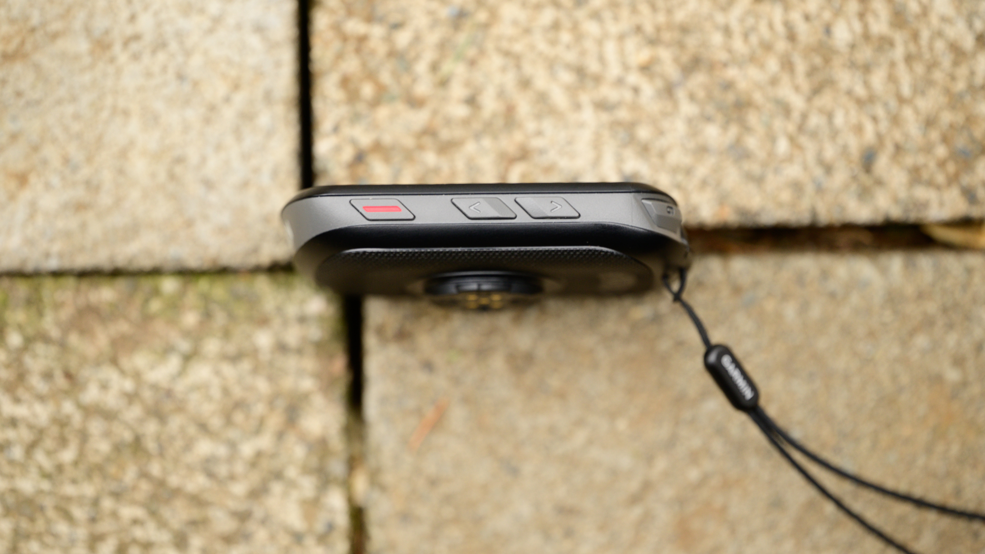
Keep moving around to the left and right and you'll spot more changes. In many ways, the buttons you will find are the biggest change when compared to the 1040. Both the Edge 540 and the, also brand-new, Edge 840 offer a non-touchscreen interface. There is a more button at the top right and a back button lower down. On the opposite side, there is the power button up top with a pair of up and down navigation buttons lower down. While the 800 series does have a touchscreen, the 500 series relies solely on the buttons to navigate the interface.
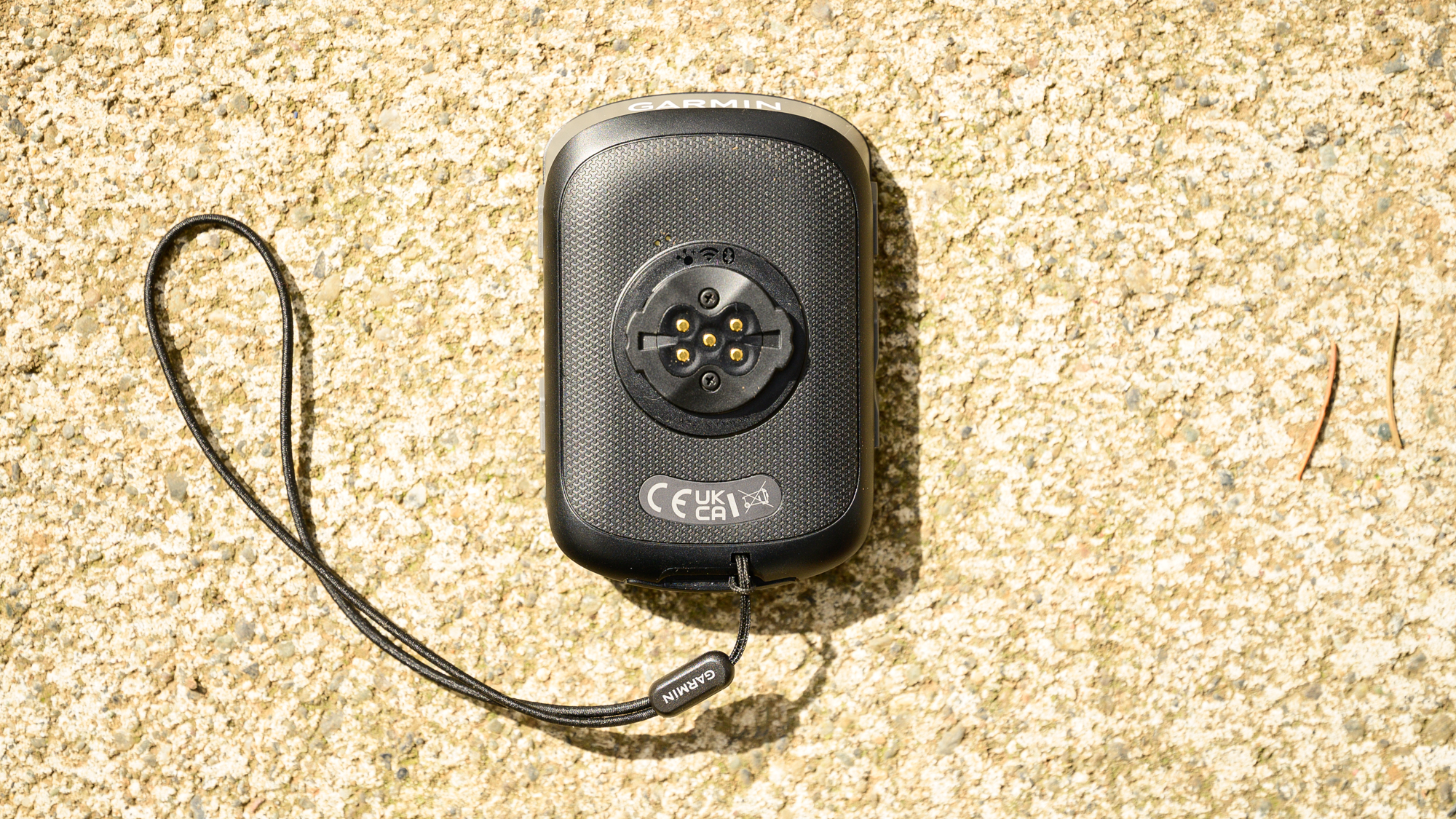
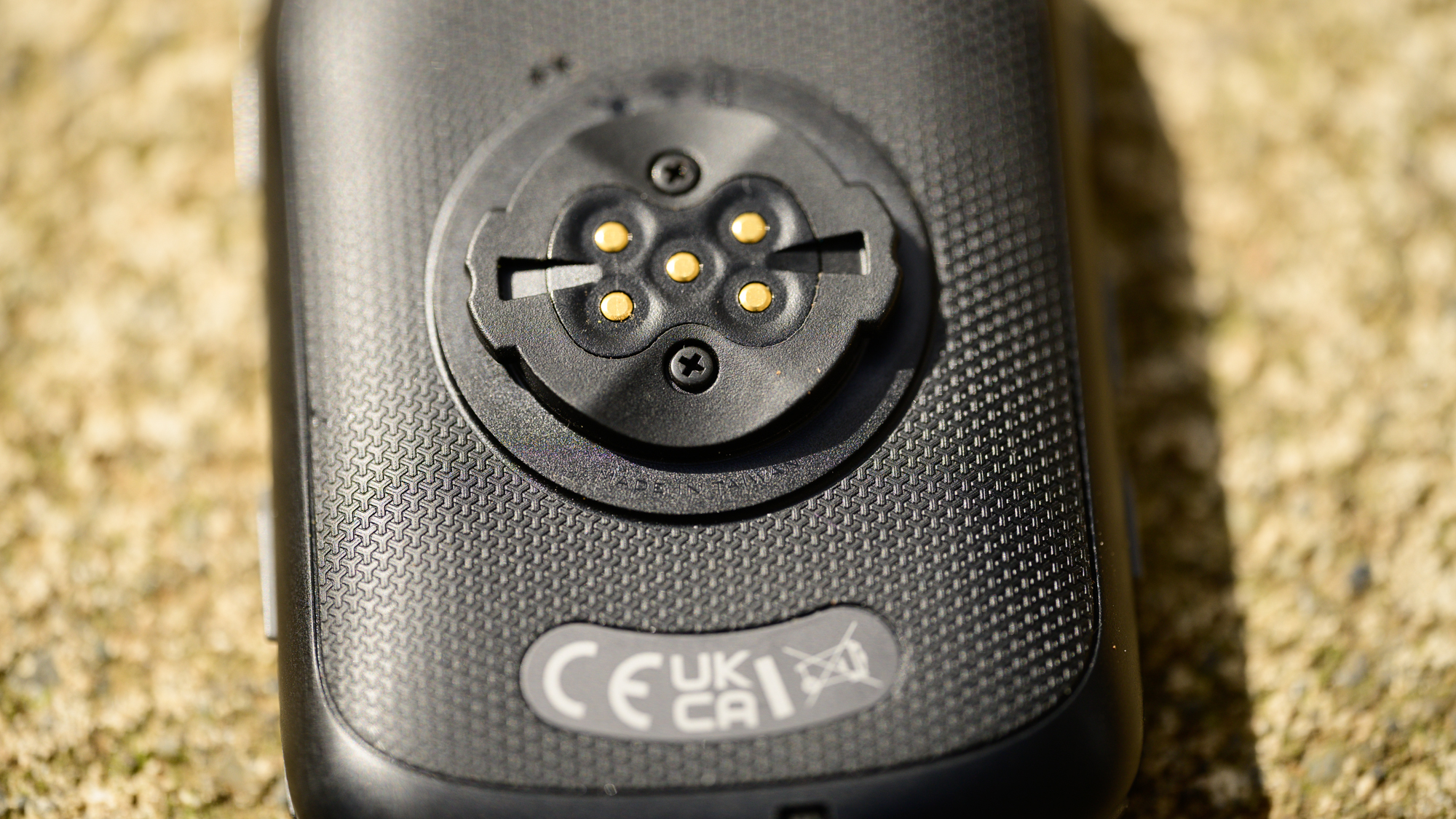
Jump to the back and you will probably be disappointed at first. A common complaint about all Garmin computers is the weakness of the tabs on the quarter-turn mount. The 1040 solves that by switching to a metal mount but the 540 sticks to plastic. It's not exactly the same as the old version though. As you study the mount you will notice a pair of screws just beyond the contacts for an optional Garmin Charge pack. Instead of needing to rely on a third-party solution, you can now swap the outer part of the mount should it ever fail.
Along with that change to the quarter turn design, there are bigger changes inside the 540. Those changes start with the battery. While previously the spec was "up to 20 hours" you can now enjoy 26 hours of battery life for the non-solar version under normal use. No tricks for low power modes are needed, just connect everything up and ride as people do and you've got over 24 hours to conquer goals. If you need to keep going there is also a battery saver mode with up to 42 hours or, as mentioned, the Charge battery pack continues to be an option.
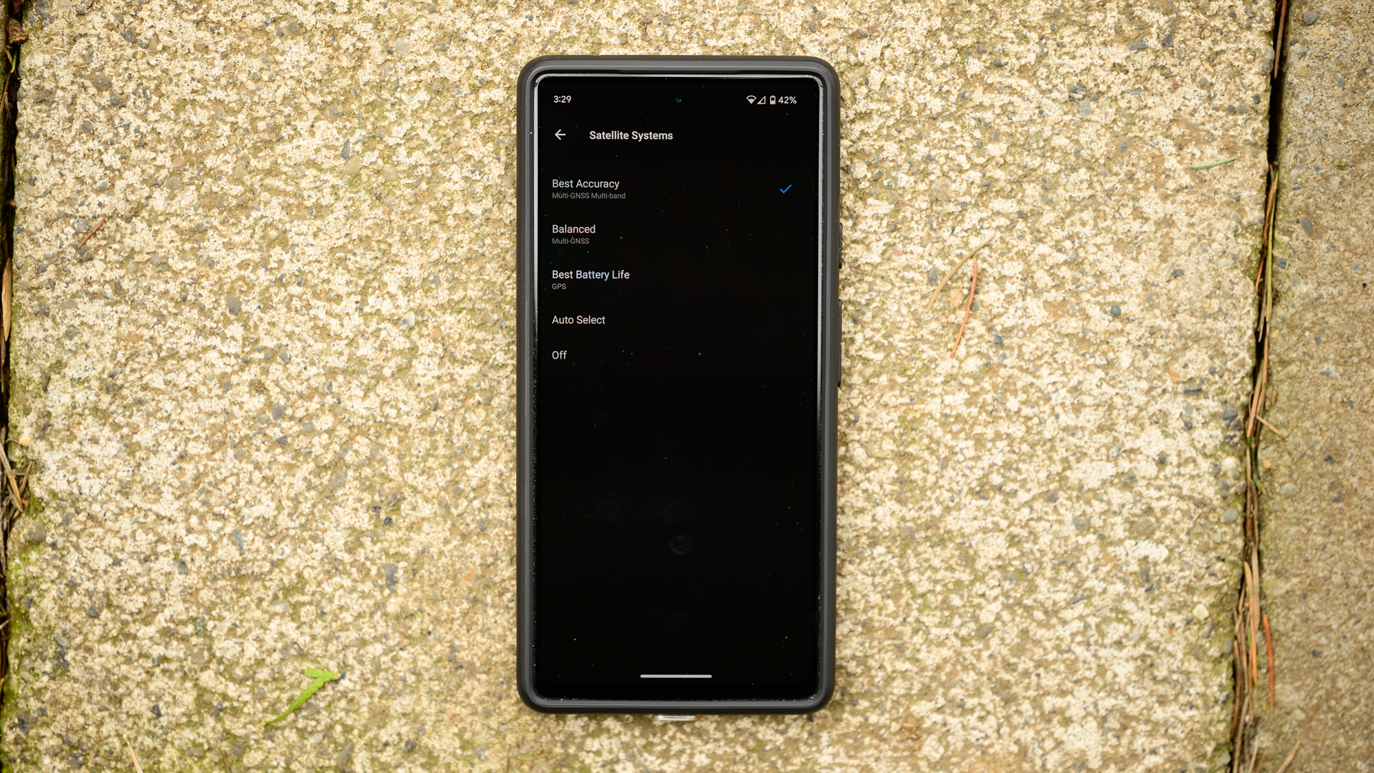
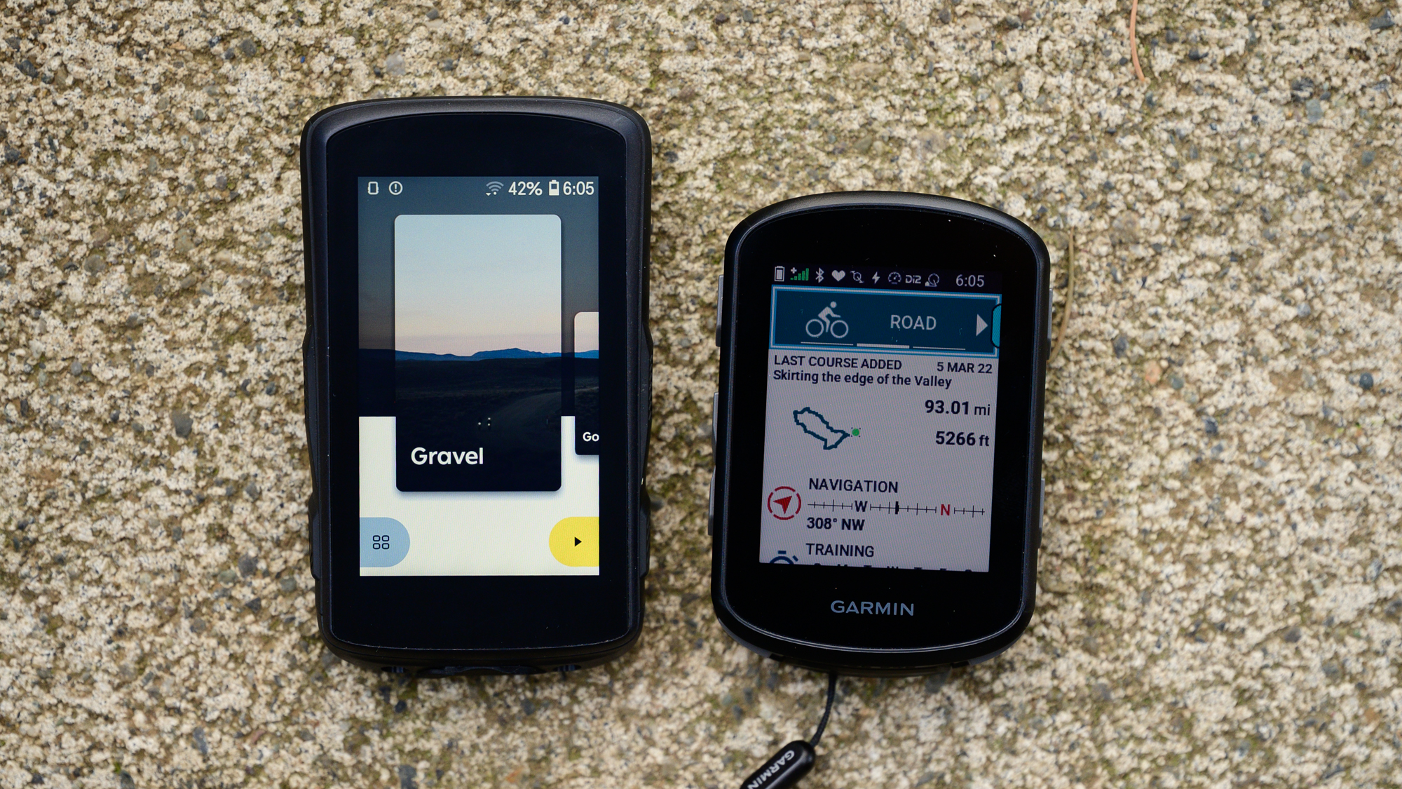
Outside of the battery, there is also the same GPS update we saw in the 1040 previously. Gone is the single-band satellite connection that last-generation bike computers of all kinds had and in its place is Multi-band GNSS. Expect improved accuracy under tree cover over and around tall buildings in the city.
Otherwise, things inside remain pretty similar to the older computer. The new unit should feel faster but that's because of software optimisation rather than a new processor and internal memory also remains the same at 16GB. The barometric altimeter, magnetometer, accelerometer, and ambient light sensor are all still there with no changes and you’ll find Bluetooth, WiFi, and ANT+ connectivity. The one detail that changed in terms of sensors is the addition of a gyroscope for MTB incident detection.
Design and aesthetics - software
Once you turn Edge 540 on, the design similarities with the 1040 continue. The only feature that you won't find shared between the two is the ability to create courses directly on the 540. Otherwise, all of the once groundbreaking new interface advancements from the previous 1040 release make their way to the new computer as well.
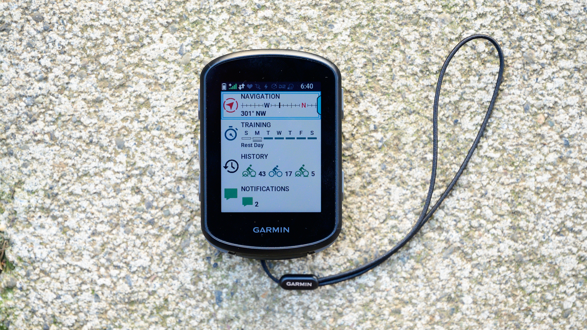
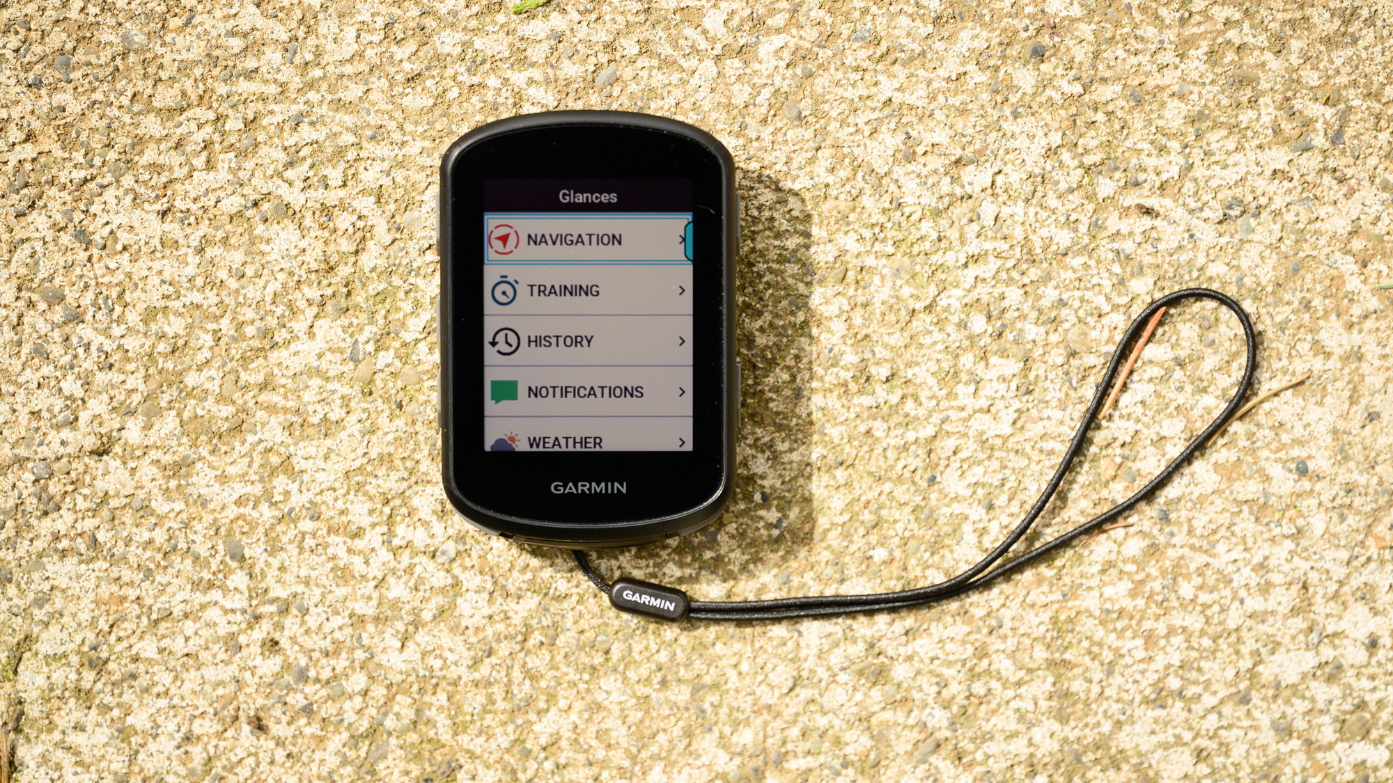
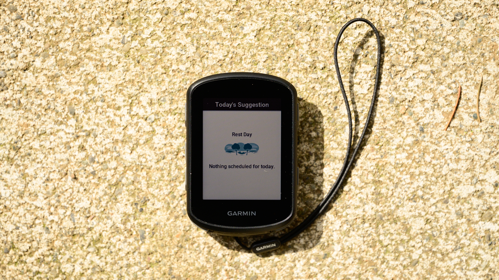
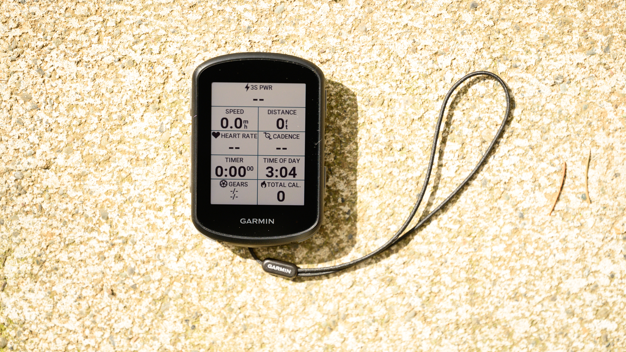
That starts with a widget-based home screen. Choose a collection of sensors and screen setups through a profile then, depending on your preferences, you'll see a list of information. You can examine past rides and Garmin will provide training advice just like the 1040. Also, like the 1040, you can pull up a course and create a Power Guide to help with pacing.
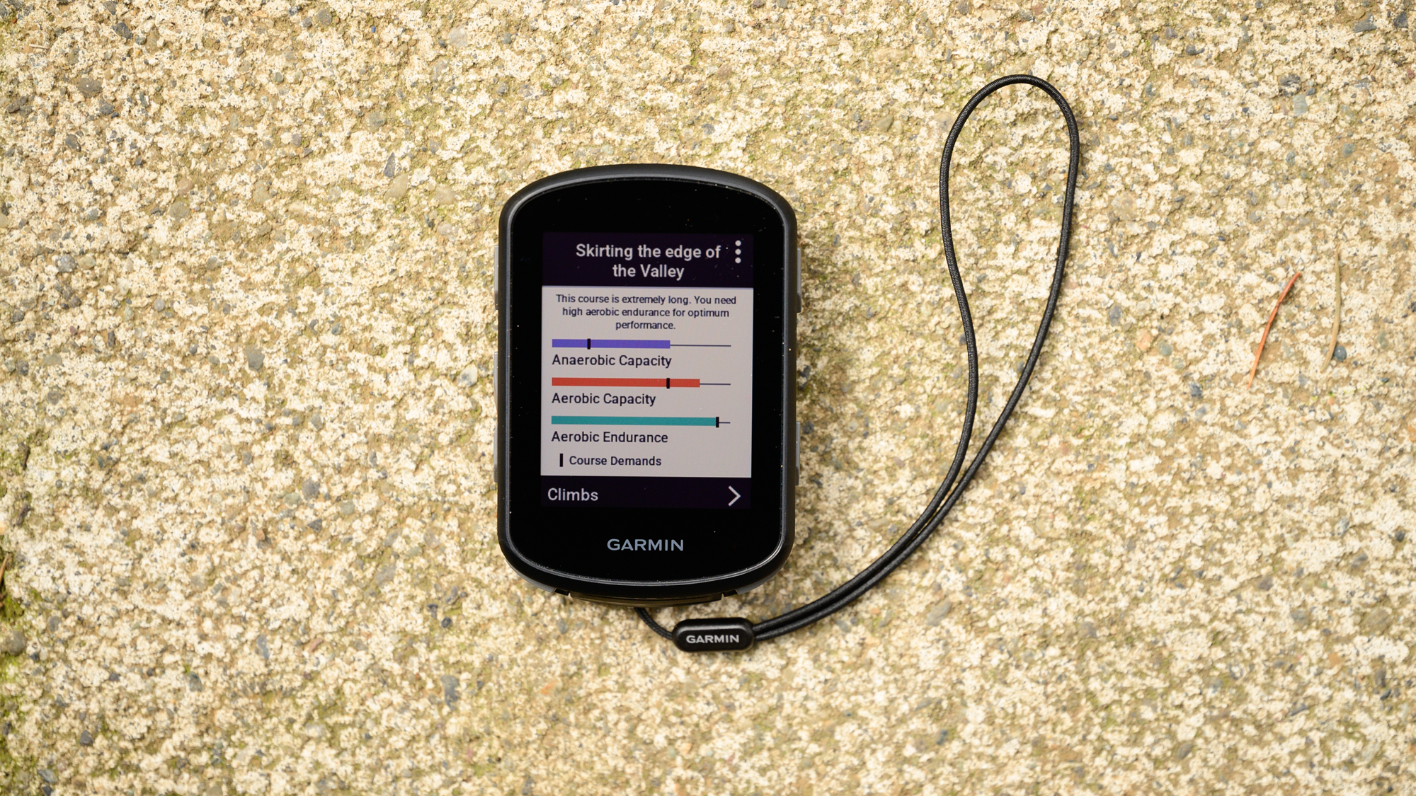
You can also select a course, say a race course you've pulled in from Ride With GPS, and examine the requirements. Jump back and forth between the requirements, your training status, and your current ability info and you can see if it's doable. If you'd like to give it a try, you can have the Edge 540 control a smart trainer to simulate the ride exactly and see how you do. If you are a bit more seat of your pants, the Real-time features will tell you during a ride what toll your effort is taking on your body.
The only differences here are some small changes based on screen size and the interface system. A good example of this is the menu button that floats in the interface of the 1040. On the 540, you'll need to scroll down using the left arrow keys then select the menu button with the "more" button on the right-hand side.
If you are looking for anything new from the Edge 540, you won't find much. The headline new feature is sure to be the added functionality of the climbing screen. While before you would only see a climbing page if you were also navigating, now it's there any time you approach a hill. If you are a 1040 owner who is reading this, don’t worry the update is coming to that computer as well. Given that this functionality matches with what Hammerhead has had for a while, that leaves only Wahoo requiring navigation to see information about the climb you are currently on.
Performance
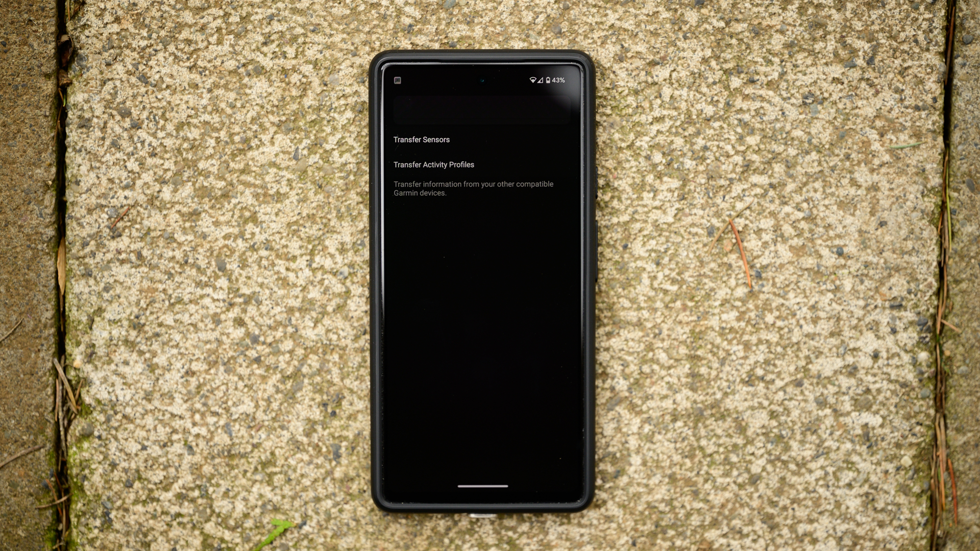
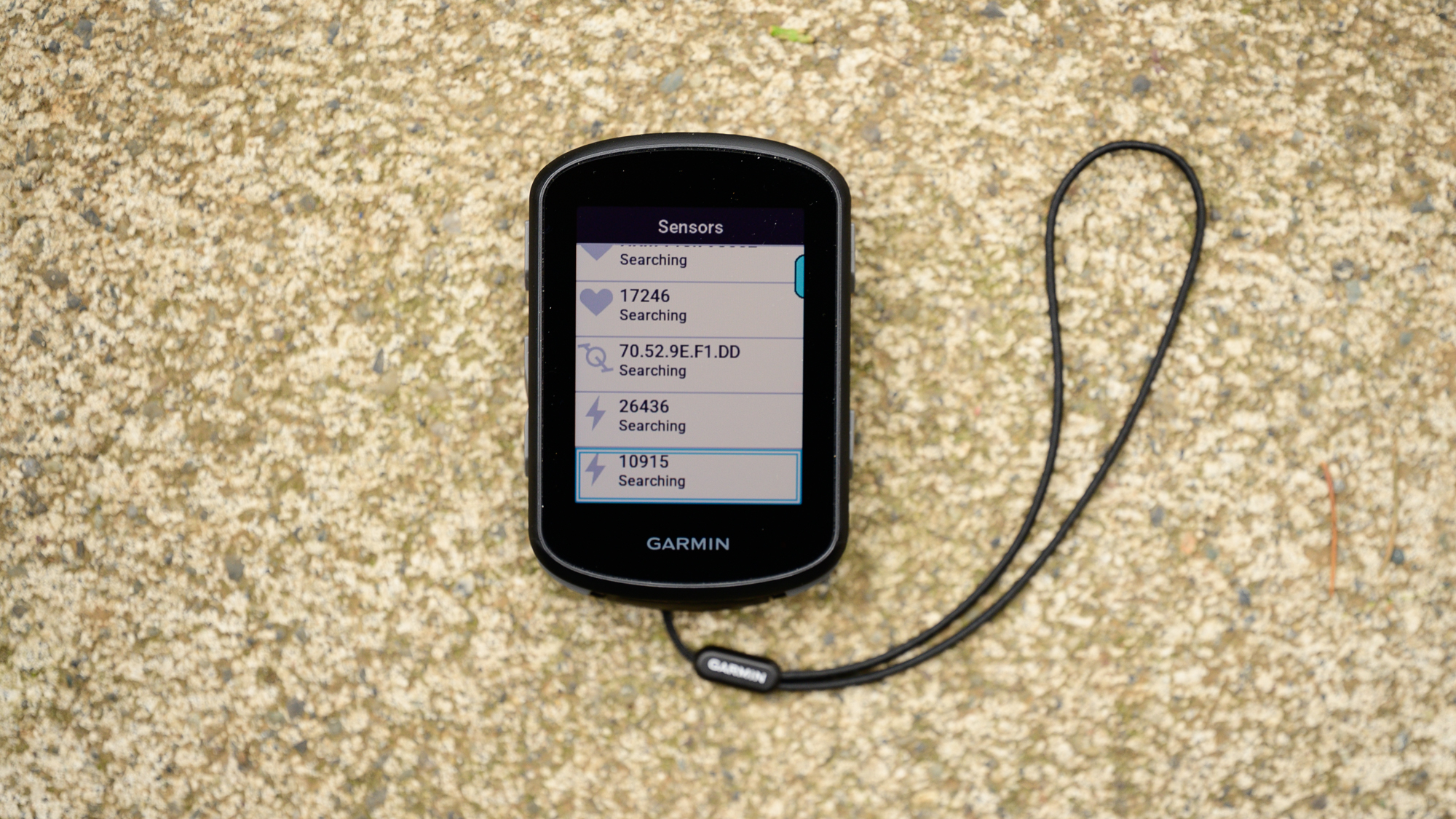
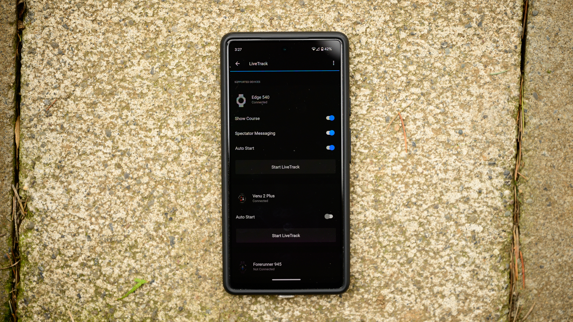
The very first thing I noticed when I turned on the new Edge 540 was how quickly I was ready to go. The pairing was fast and seamless on a Google Pixel 6a. Then, as soon as the new computer connected to Garmin Connect I got a request asking if I wanted my sensors transferred. When that process finished, I got another request asking if I wanted to transfer my activity profiles from my 1040 Solar or 1030 Plus. For me, those are the same but there's a last updated date in case you need help remembering what to transfer.
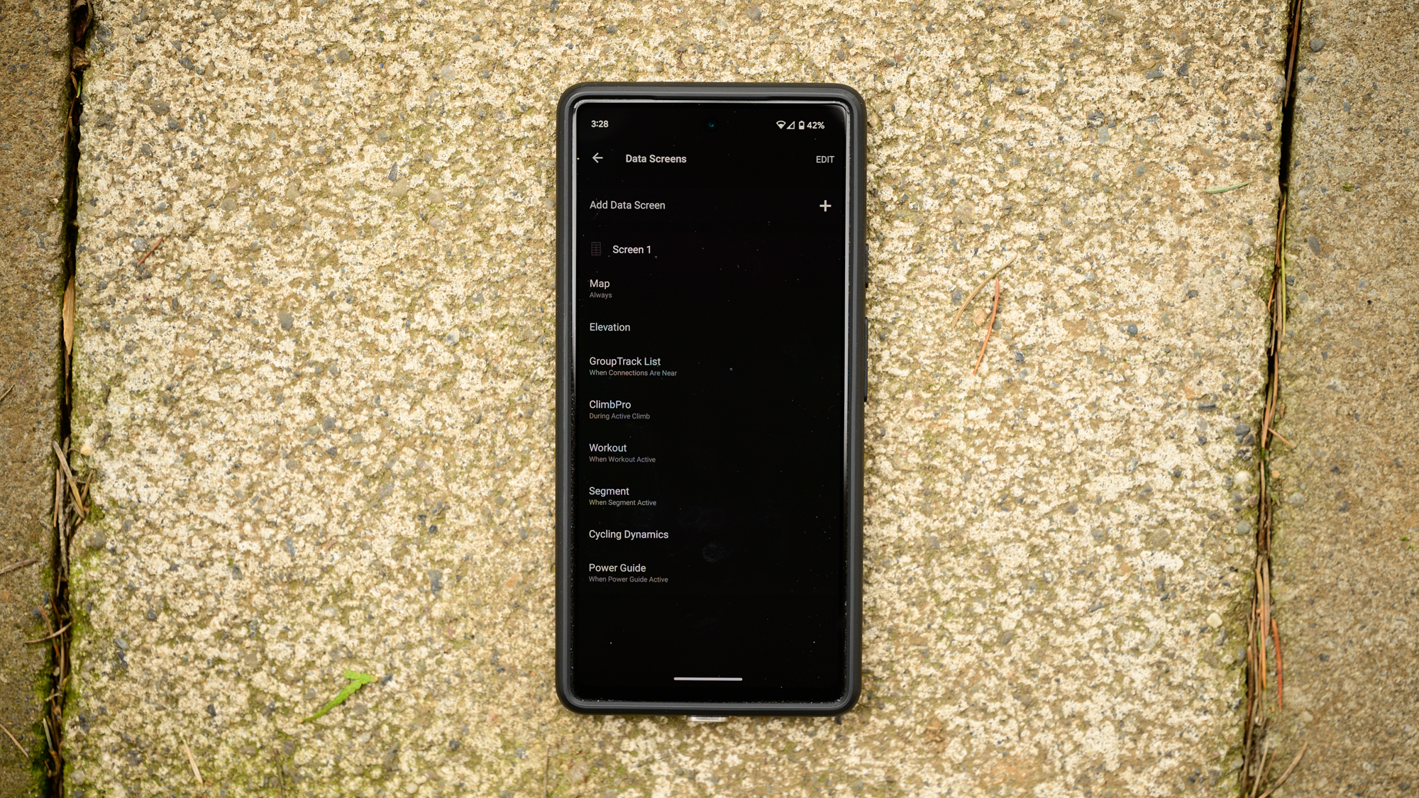
With those questions asked and answered, I now had the new Edge 540 ready to ride with. This feature came as a promise when the 1040 hit the market but it didn't pull my setup from the outgoing 1030 Plus. Part of that may have been the pre-release nature of my first setup but either way, I've now seen it and it's glorious. Every sensor I have is on my list and will connect automatically right away. Every screen is exactly how I like it with the metrics I care about.
After that, I had very little to test. Up above in the review, I leaned on how similar the 1040 and the 540 are because the experience of using the two is almost exactly the same in every way. The 1040 costs as much as a budget bike while the 540 matches the price point for the entry-level premium bike computer market. Right now that means only the Wahoo Elemnt Bolt but what's more important is the relationship with the Edge 1040 and its status as the most expensive bike computer on the market.
Just to be clear about that, it means that everything is the same. I touched briefly on a use for some of the features up above but it's worth expanding. Last year I got an invite to the Maratona delle Dolomiti in Northern Italy. As usual, I was nervous as well as bored of indoor riding so I loaded up the route ahead of time. One rainy Sunday I covered most of the route on a Tacx Neo 2T. When the real event arrived, I already had a kind of muscle memory for the hills and knew what to expect.
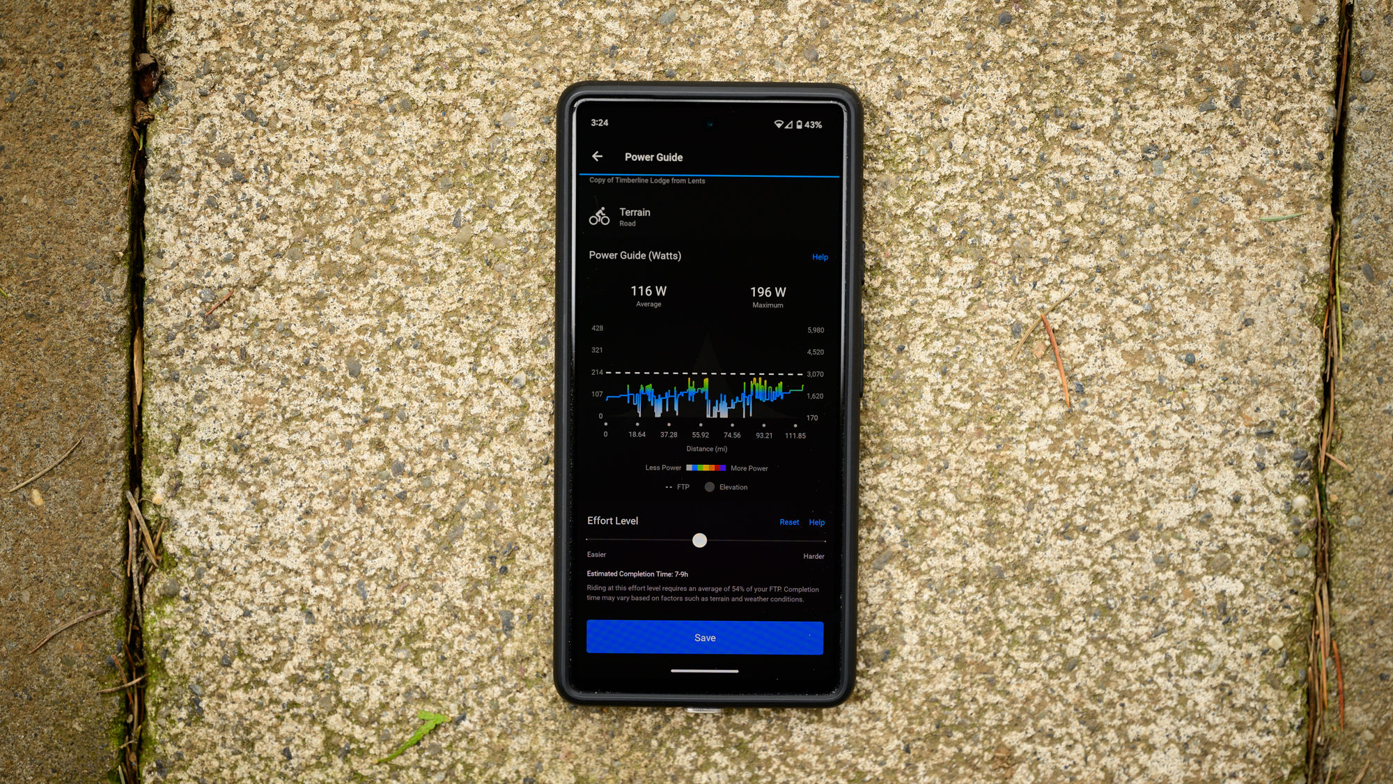
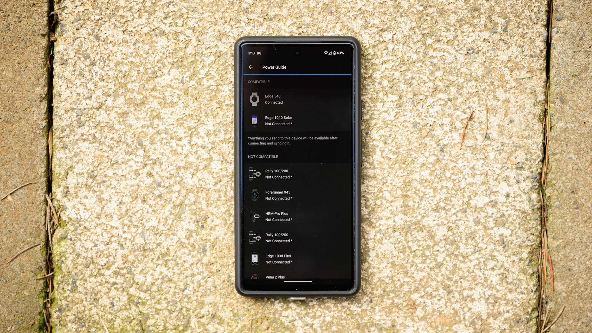
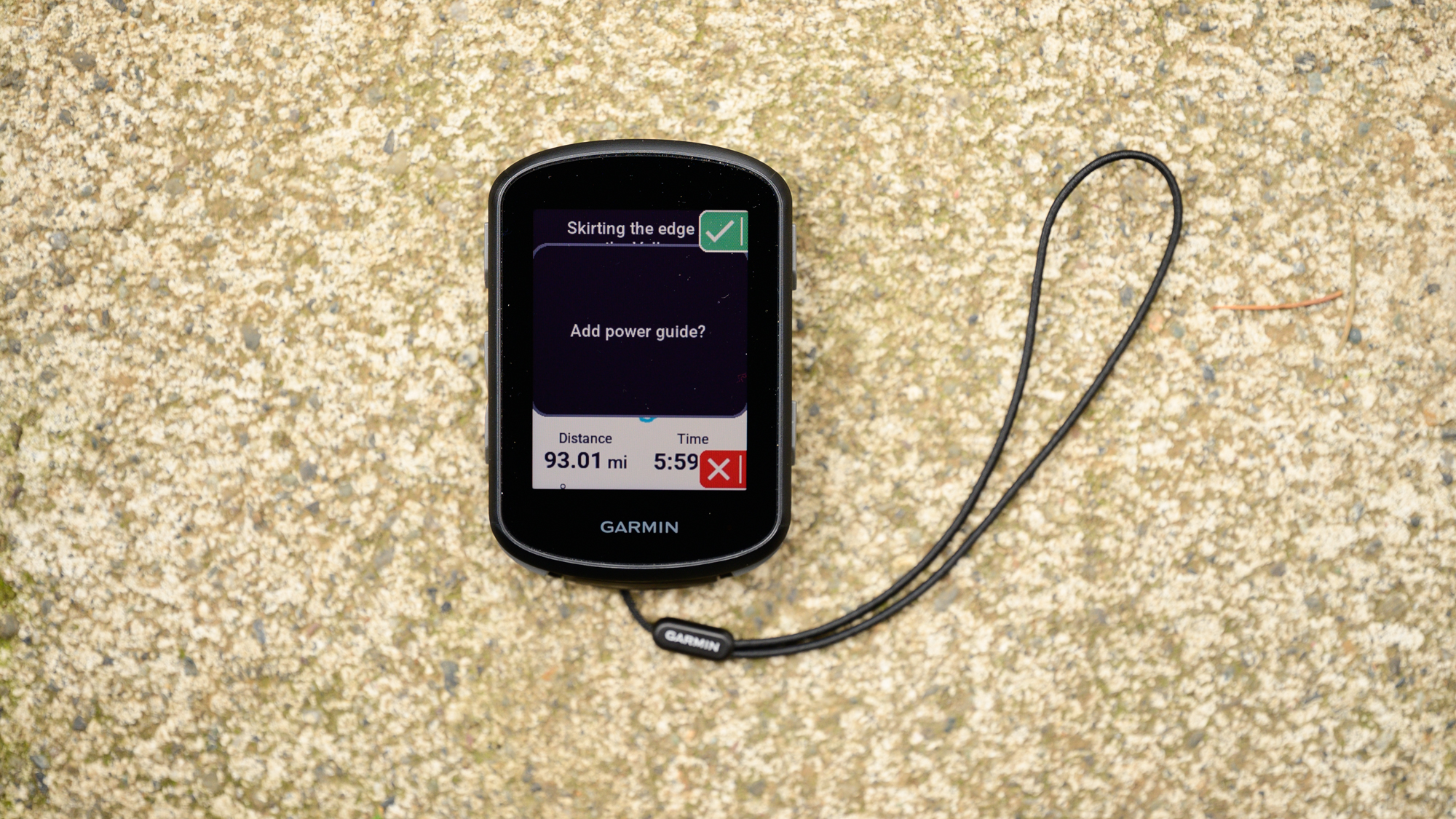
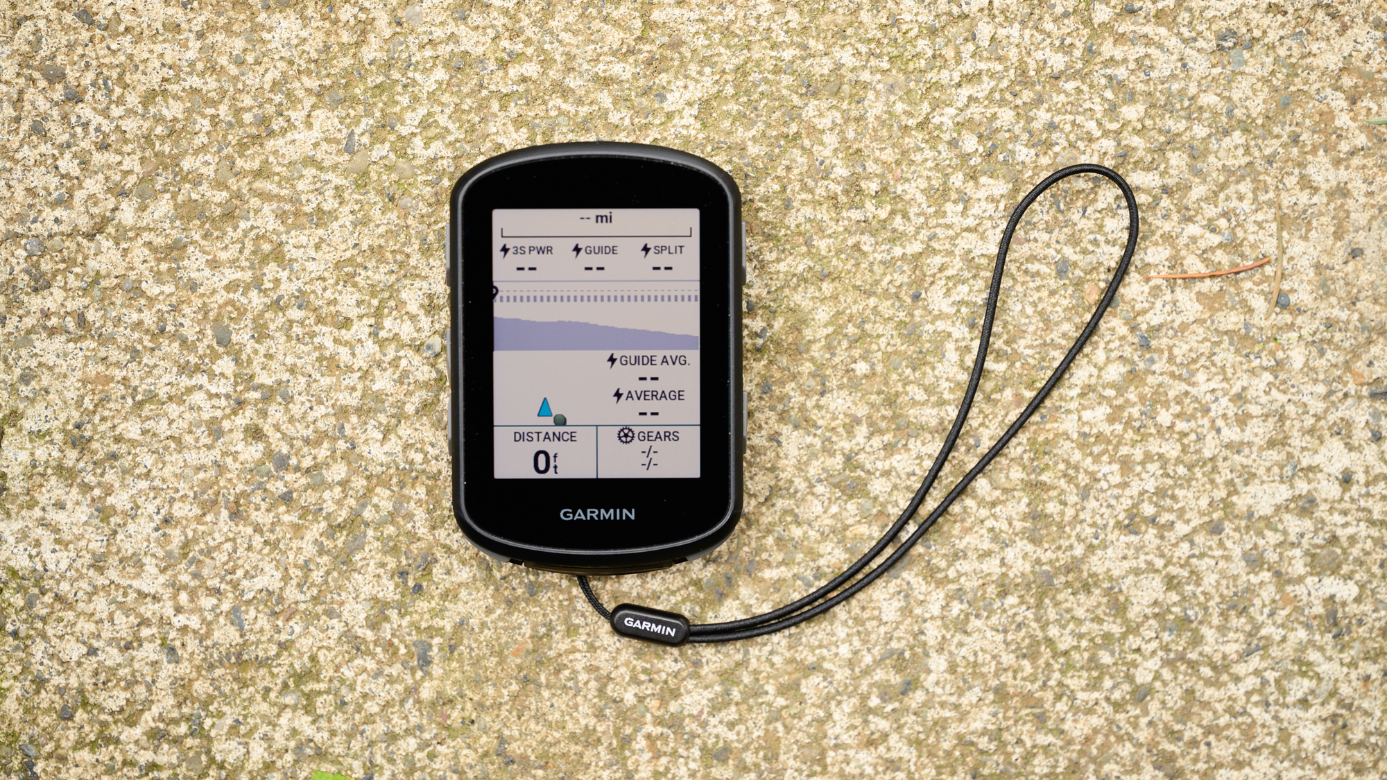
I've also found myself using the Power Guide a fair bit. It's good late in the summer when I get bored even riding outside. It's also good for races where I'm riding for a time I care about rather than a potential podium. The feature allows you to set an intensity based on your FTP and match that to a course. As you ride you'll get a screen telling you exactly what power you should be pushing and it does a great job of intelligently modulating intensity. It's far more advanced than just holding a wattage over a distance and instead adjusts based on the geography of the route as well as giving you time to rest inbetween efforts.
Real-time Stamina is the flip side of both features. If you do less solo efforts and instead need to judge your level of effort as it happens, that's when it comes into play. In particular, it's great for knowing when to give up your attack and settle in for a bit of recovery.
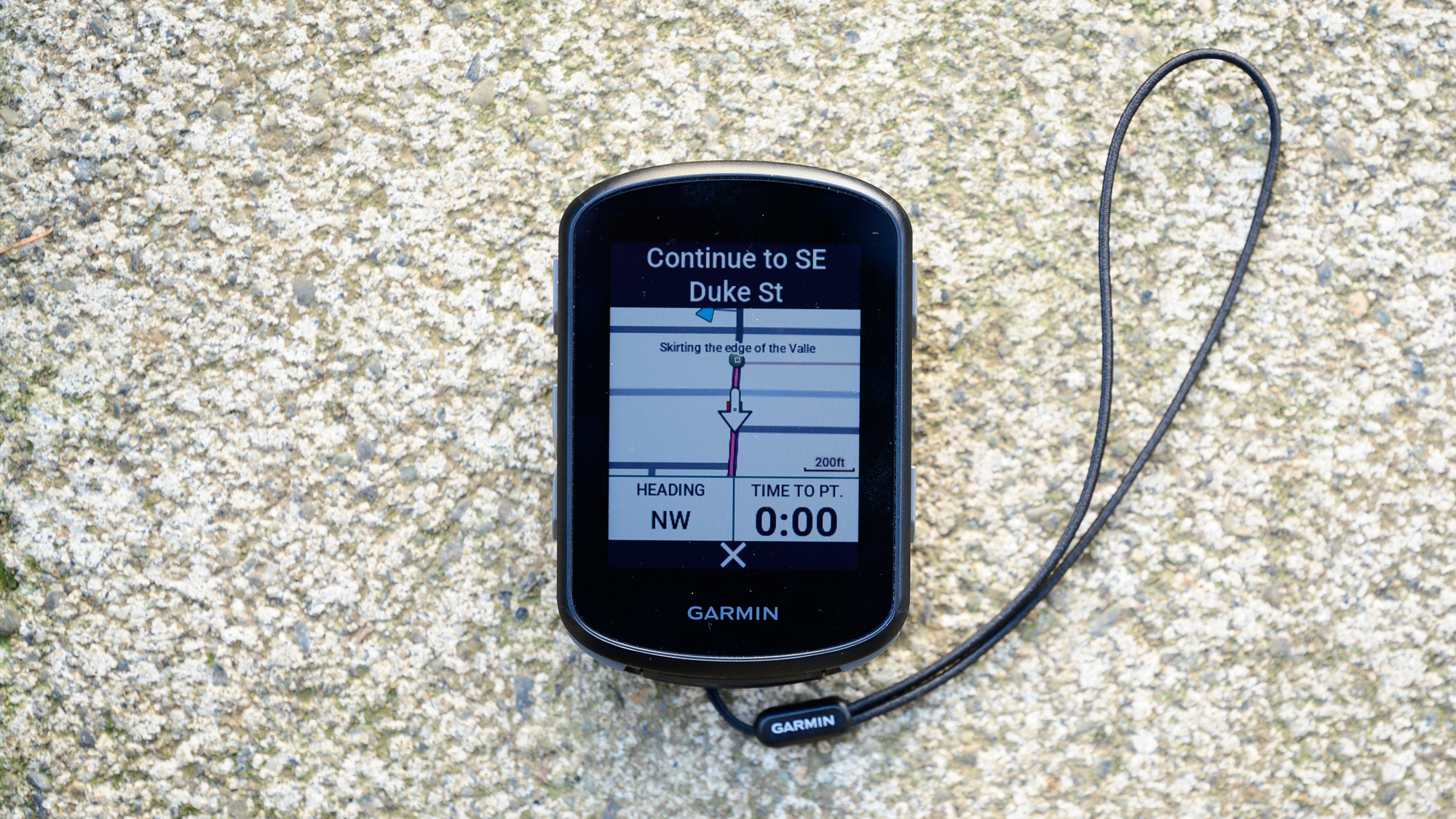
In terms of unique features of the Edge 540, there are two things I found. The first is the obvious detail that the climbing screen no longer requires concurrent navigation to show up. Heading out the door to catch an hour of riding before the sun sets, I can now see how long a hill is and what gradient I'm at while climbing. Personally, I don't find a ton of value in this only because it lacks context.
What's great about the Garmin climbing screen is not so much the details of one climb. In fact, any climb of much length will stretch between multiple screens leaving you unsure where you are anyway. Current gradient is marginally interesting but altimeters are never that accurate in the moment anyway. What's great is when the days are long you can watch the number of climbs tick away. Early in the day you might see 1/11 but as each new one appears, those numbers tick away. When you hit 11/11 you know you've made it through the worst.
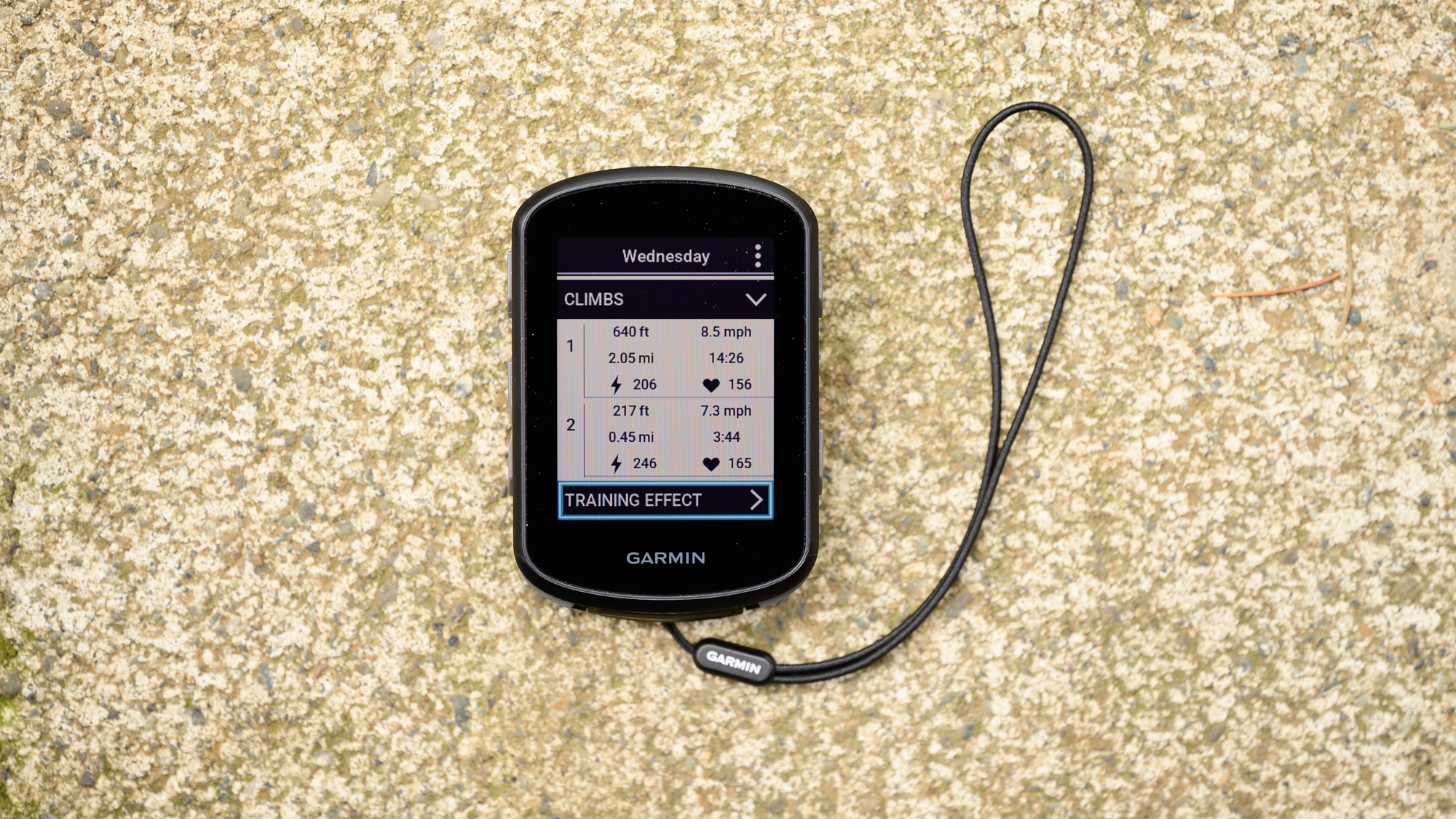
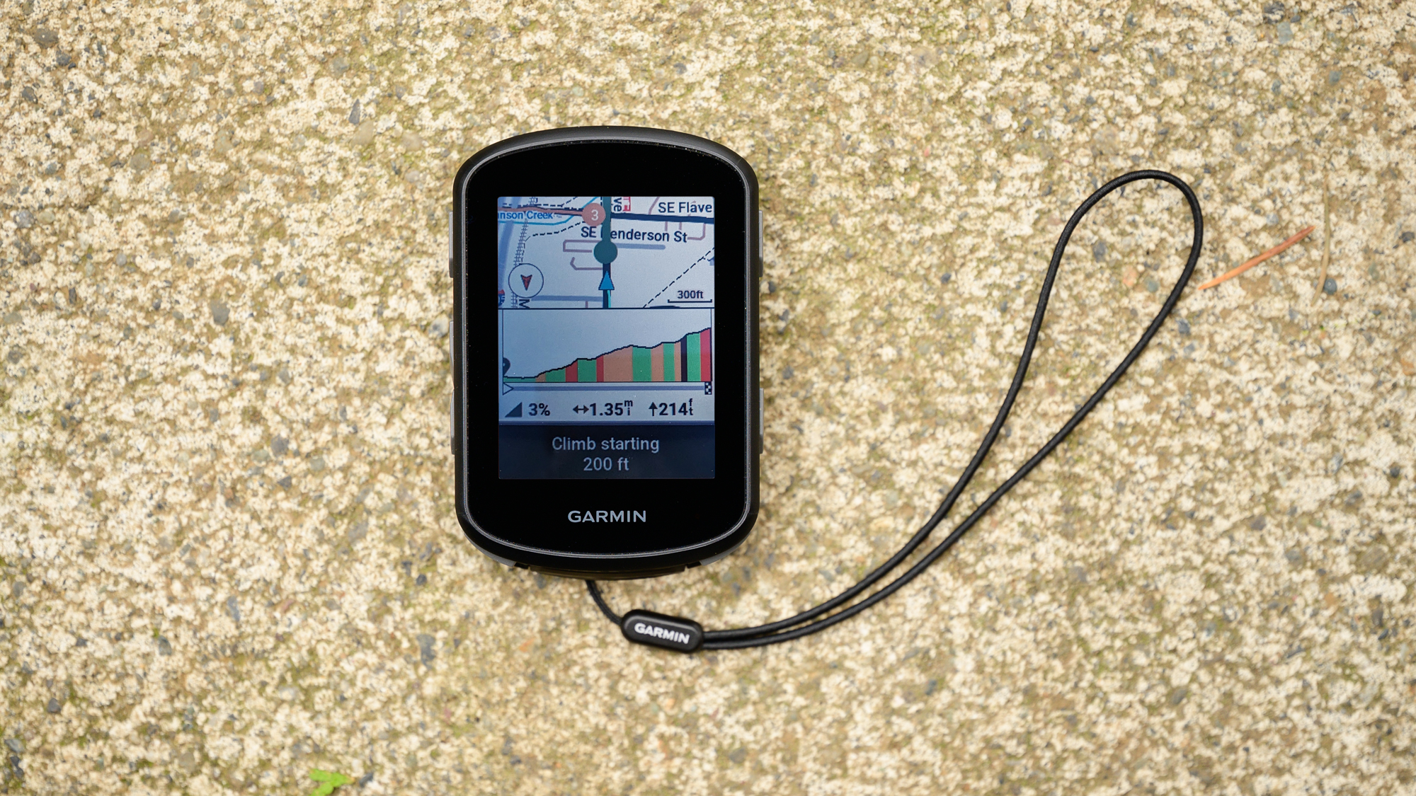
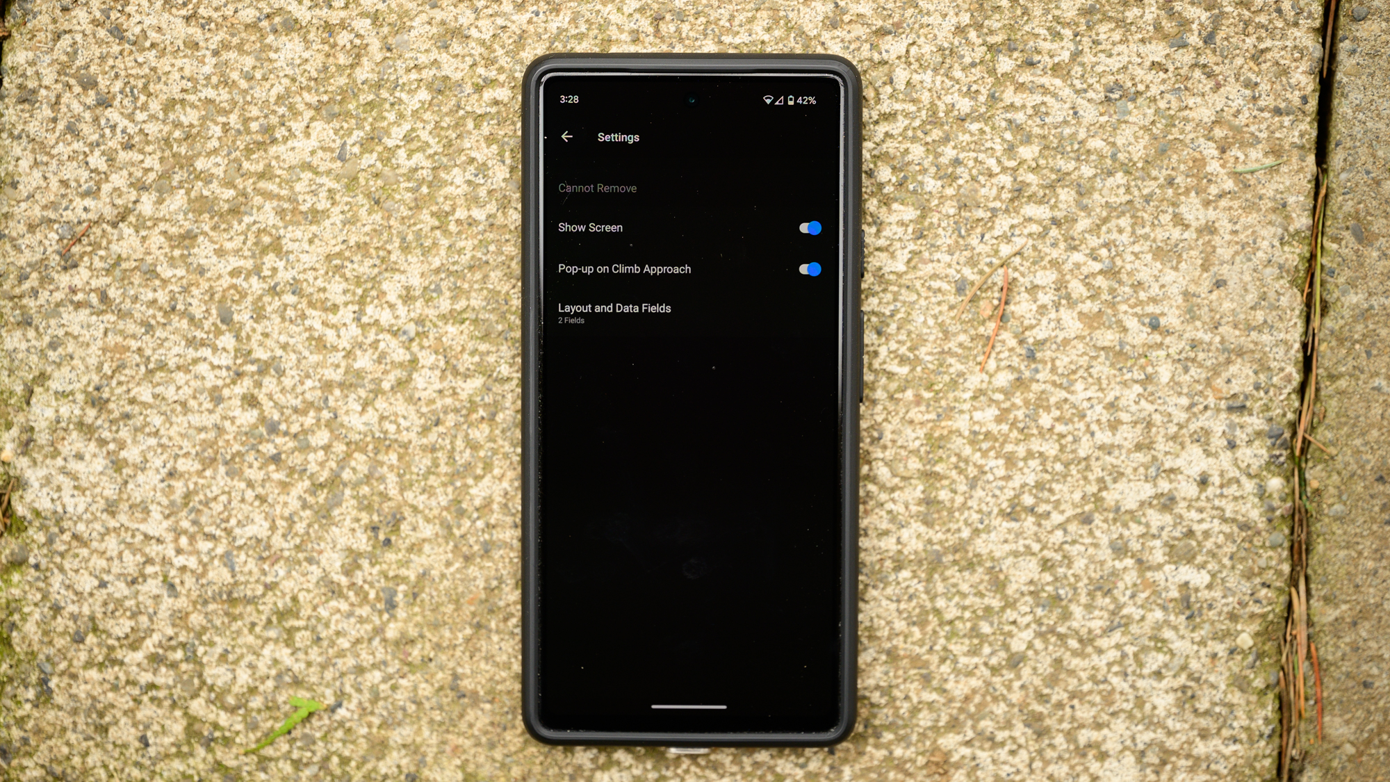
Having the details of each hill isn't nearly as useful for me. If you disagree though, it's there and it works. As you approach a hill, the screen will switch to showing the map at the top and the gradient down below. I also have my power and electronic gear viewable. If you turn before starting a hill the info will disappear. If that turn brings you to a new hill, the 540 doesn't suffer confusion. If you turn from a flat ride directly into a hill, it only takes a moment for Garmin to catch it.
The one detail that I did find I like about this arrangement is that at the top of the hill the 540 reports how long it took. That kind of constant information is perfect for developing your sense of time spent climbing. It might feel like you’ve been climbing forever but when you see it was actually only four minutes, that helps calibrate your internal timing.
Outside of the climbing screen, the other detail that I found unique to the Edge 540 is actually what I would consider a design error on the 1040. When I tested that computer there was one spot I regularly rode where all my sensors would suddenly drop out and then reconnect. It's not really an issue because they quickly reconnect but it does happen from time to time in other places as well. After months of riding with the 1040 I looked up one day and realised there was a cell tower right next to the bike path. I'd say the 1040 lacks enough internal shielding and while it's really not a big deal, the 540 seems to have fixed the issue. I tested multiple times in that same spot with no dropped sensors.
Verdict
I absolutely love the Garmin 1040 Solar. The battery life of that computer has changed the way I plan for adventures. I also understand that my need to have a computer last for more than a day is a niche need. Very few people need that and very few people need to pay for it. Plus, there are a lot of people that hate a touchscreen-only interface.
That's where the Garmin Edge 540 shines. This computer covers more than almost anyone needs and costs less than half the price. In fact, it's not even cutting it all that close. Even with my ridiculous ultra attempts, there is rarely an instance where I'd worry about 26 hours of battery life. The other coaching and pacing features are just the cherry on top.
The only downside is that you pretty quickly become aware of the relatively small screen and lack of a touch interface. The climbing screen showing a gradient, a map, and metrics feels crowded. Even that still works though, where things start to get grating is when you've got a crowded screen and no quick way to navigate it. It's not the screen size I find as a negative, it's the lack of creativity with what Garmin Connect does.
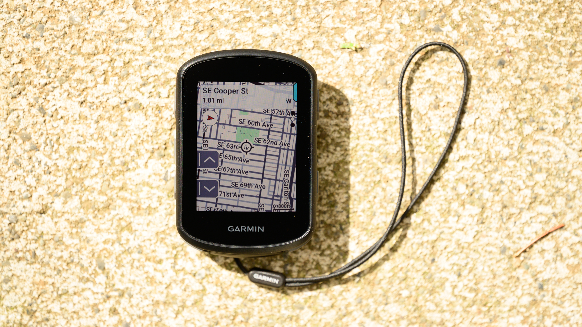
I'd really like to see Garmin push the integration with the phone more to alleviate navigation pain points with the smaller non-touchscreen unit. You can move around the map screen better than a Wahoo but wouldn't it be great if you could also pull out your phone then open Garmin Connect and scroll around the map there? It wouldn't be too far from what Wahoo does now except you'd have the better Garmin maps.
Garmin does actually offer an option to alleviate this issue, it just costs more money. The 840 also comes to market with the same features. With the 840 you can use buttons when you want but a touchscreen when it makes sense. For those that can afford it, I feel like that's the sweet spot. If you want a computer that just works though, the lowest-priced, non-solar, Garmin Edge 540 offers a whole lot of functionality.
In fact, the Edge 540 offers so much functionality, there is virtually no competition. The only product in the same class is the Wahoo Bolt released almost 2 years ago. It costs close to the same but has far less battery life and a smaller screen. It's not until you move into the pricing of the 800 series that the Hammerhead Karoo 2 offers a better screen in exchange for less battery life. If you want a smaller, cheaper, full-featured bike computer then the brand Garmin Edge 540 is the only choice that makes sense.
| Screen Quality | The non-solar is noticeably brighter but it still could still use the same updates as the 1040 Solar. A matte coating would be a big improvement and while Garmin isn’t alone in the giant bezels, it’s time for that to start shrinking. Despite all that, it’s clear, crisp, and bright. | 9/10 |
| Navigation Quality | Garmin navigation is really good. Functionally speaking, the only thing missing is a quick way to see how much is left on a route. The lack of touchscreen navigation does make things harder on the 500 series though. | 9/10 |
| Smart phone connection | This works almost flawlessly even though there is perhaps more functionality imaginable. | 9/10 |
| Battery Life | It doesn’t get better than this currently. | 10/10 |
| Value | Right now the only competition is the Wahoo Bolt. It’s a little less money but offers less functionality. If Garmin matched that price point this would get a perfect score. | 9/10 |
| Overall | Row 5 - Cell 1 | 90% |
Josh hails from the Pacific Northwest of the United States but would prefer riding through the desert than the rain. He will happily talk for hours about the minutiae of cycling tech but also has an understanding that most people just want things to work. He is a road cyclist at heart and doesn't care much if those roads are paved, dirt, or digital. Although he rarely races, if you ask him to ride from sunrise to sunset the answer will be yes. Height: 5'9" Weight: 140 lb. Rides: Salsa Warbird, Cannondale CAAD9, Enve Melee, Look 795 Blade RS, Priority Continuum Onyx
