You can trust Cyclingnews
This article originally appeared on BikeRadar
The Garmin Edge 1030 is the new flagship GPS cycling computer from the biggest name in the business. Bursting with features and connectivity, the Edge 1030 replaces the Edge 1000, and it brings the top-of-the-range device in line with the Edge 820's clean, modern aesthetic.
Garmin Edge 1030 specs and key features
- Monitors and records every cycling metric you can think of, plus a few more
- Up to 20 hours claimed battery life plus another 20 with optional Garmin Charge external battery
- Improved out-front mount places device flush with bar, accepts accessories including Garmin Varia lights, Garmin Charge
- Trendline popularity routing uses Garmin Connect data to offer better routes for cyclists
- 3.5in colour touchscreen claimed to work with gloves, or in the rain
- Pairs with iOS and Android smartphones via Bluetooth for easy transfer of data, extra functionality
- Rider-to-rider and rider-to-phone messaging, using pre-written notes
- WiFi connectivity, plus the usual ANT+ for external sensors
- Improved maps, with turn-by-turn navigation and alerts warning of sharp turns
- Enhanced Strava Live feature alerts rider to nearby segments
- Pre-loaded Strava Routes and TrainingPeaks Connect IQ apps, plus option to add more apps and 'widgets'
- Price: £499.99 / $599
- Weight: 123g (+47g for out-front mount including shim for 31.8mm bar)
- Dimensions: 59mm long x 114mm wide x 15mm thick (+3.5mm for protruding mount)
- Screen: 3.5in colour touchscreen
Unboxing the Edge 1030
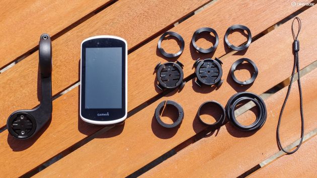
The Edge 1030 ships with Garmin's new flush out-front mount (with shims for 25.4mm and 31.8mm bars), two stem/handlebar mounts (with a choice of heights for the best fit) and a USB cable.

The Edge 1030 ships with two stem/bar mounts as well as the out-front option
It's also available as a bundle including heart rate and speed/cadence sensors.
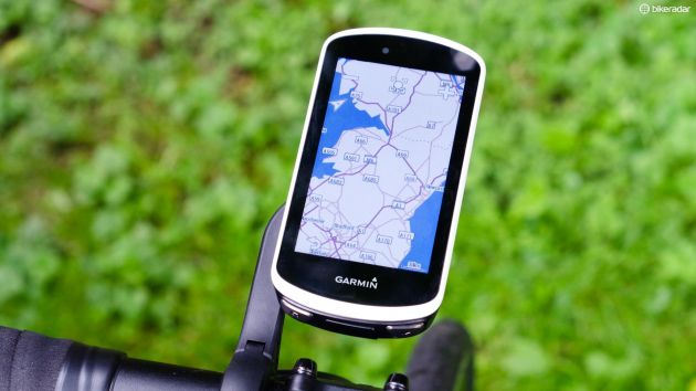
The most noticeable feature of the Edge 1030 is the new 3.5in screen, which occupies most of the face of the device.
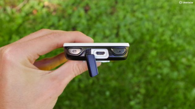
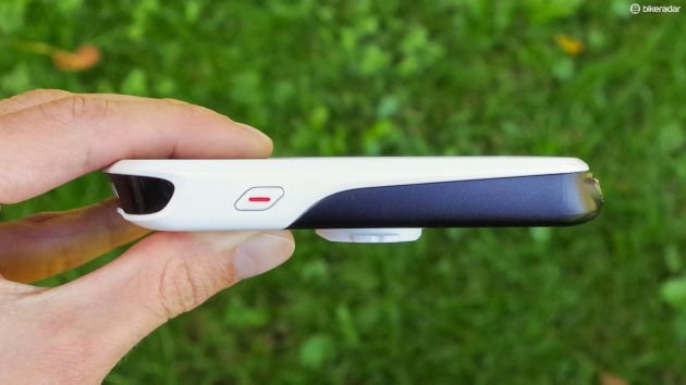
The Lap and Start/Stop buttons have moved to the bottom (or front, depending on how you're looking at it) of the unit along with the USB port, while the power button is in the same position on the left-hand side.

The Edge 1030's start/stop and lap buttons have moved to the bottom of the device along with the USB port
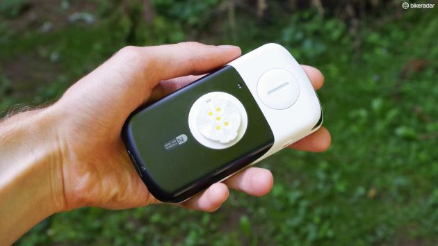
On the back of the device, a removable panel hides a microSD card slot for expanded storage, and the signature Garmin twist-lock mount has gained contacts which allow for a direct connection to the Charge external battery, without added cables.

Contacts on the twist-lock mount connect to the Charge external battery
A thousand splendid features
With so much functionality on offer, it's likely to take you some time to get your head around some of the 1030's features.
The interface is for the most part fairly easy to navigate, but finding specific settings can be a bit of a head scratcher at times as Garmin's logic isn't always completely intuitive.
To initiate a ride you simply select your preferred 'activity profile' (if it isn't already selected), and press the start button on the bottom of the device.
To switch between screens of data and/or maps, you swipe sideways, and to access 'widgets' (which includes essential stuff such as settings, as well as various option add-ons, weather, etc.) you swipe down.
Slightly confusingly, some settings are under 'settings', while others including fairly basic stuff, such as GPS mode, are under 'profile' because they are actually profile-specific.
When it comes to customising your Edge's setup, the touchscreen is invaluable. On non-touchscreen Garmins, an operation as simple as adding a new data field can take what feels like hundreds of button presses.
The 1030 will display up to ten fields per page of data, and you can customise things to your heart's content, adding or taking away pages and fields to create your ideal display.
Layouts are profile-specific, and by default, there are Road, Mountain and Indoor ones. There's nothing to stop you creating your own, of course.
You might for example want a more stripped down data display for races, with only power and time on show, whereas touring would demand a completely different set of metrics.
Navigation with the Edge 1030

The Edge 1030 offers a fully-featured navigation experience
Navigation with the Edge 1030 is about as advanced as you can get with a bike computer, with detailed maps, proper turn-by-turn instructions and warnings for sharp bends.
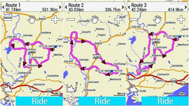
You can load courses onto the 1030 or use the 'course creator' to plan routes on the fly, letting the device suggest the best way to get between your chosen 'locations'.
If you're a real free spirit, selecting 'round-trip course', a compass direction and an approximate distance will generate a selection of routes for you to try.
I haven't had time to explore this feature fully yet, but the new 'popularity' routing should mean it's an improvement over the Edge 820's version, which didn't always produce the best results.

The Edge 1030 generates route options using Garmin Connect data
While it's capable, interacting with the 1030's mapping still feels clunky compared to simply firing up Google Maps on your phone.
Typing on the non-QWERTY virtual keyboard is slow and cumbersome, and you can't just fire search terms in and immediately get what you want as you would on your phone — you either need to scroll through a list of 'POI's (e.g. 'food and drink', 'shopping'), enter specific locations, or simply browse the map for relevant symbols.
In this respect, the Edge 1030 doesn't offer much improvement over the 1000.
Connecting all the things
Connectivity is a huge part of the Edge 1030 package. In addition to ANT+ sensors, the 1030 will connect to WiFi for data transfer purposes, and pairing with a smartphone using Bluetooth unlocks a wealth of features.
LiveTrack, Grouptrack and Incident Detection are carry-overs from the Edge 820, while rider-to-rider messaging is all new.
I'd love to be able to describe my experience with that last one, but while my test unit happily displays texts and lets me reply using helpful pre-written replies such as “Out riding-Sent from my Garmin Edge 1030”, I've yet to figure out how to initiate a conversation.
That smug signature can be disabled incidentally, but when you've spent the price of a whole entry-level road bike on your GPS, you want people to know, right?
Strava Premium users will benefit from the very latest version of Strava Live, which offers second-by-second, real-time comparisons with personal bests as you're riding segments.
You can also install third party apps from the Garmin Connect IQ store, including some cool stuff, including custom tachometer-style readouts for heart rate, power etc.
Simply uploading rides to Garmin Connect is a pleasingly seamless activity which happens in the blink of an eye.
With Strava syncing enabled, there's a minimum of fuss, although you'll have to go in and make manual edits if you want to change ride attributes, e.g. choice of bike.
Early impressions
As a piece of packaging, the Edge 1030 is as slick and accomplished as I'd expect from Garmin. It looks good, feels solidly constructed, and it comes with a really nice mount.

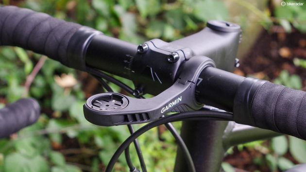
Garmin's new out-front mount is super solid, and it places the Edge 1030 flush with the top of the bar
Headline features, such as popularity routing, are genuinely cool, although we'll need to spend more time trying them out in varied locations to see if they come good on their promises.
The same goes for the battery — an increase in capacity from the Edge 1000's 1100mAh to 1900mAh should be a big step up, even with a bigger screen — but we need to put the 1030 through a few more charge-discharge cycles in different conditions before we can say if the 20 hour figure is actually achievable.
With the Edge 1000, battery life suffered badly with GLONASS and navigation switched on, and it's probably safe to say that 20 hours is a best case scenario, not the norm.
Our biggest bugbear so far with the Edge 1030 is its screen, which just isn't very impressive.
Even at 100 percent brightness it's not actually all that bright, and while it does a passable job when you're navigating through menus, it's hit-and-miss on the bike.
Swiping to switch pages or access the widgets often doesn't seem to register, and you have to be quite positive in your virtual button presses.
Garmin makes a point of saying that the 1030 works in the wet and with gloves on, and while my colleague Ben Delaney has found the first claim to be true, my experiments with gloves have been distinctly underwhelming.
Early verdict

The Edge 1030 is a slim and slick piece of design
The Edge 1030 is clearly a hugely capable device and in many respects it's a logical progression from the Edge 1000.
It doesn't seem like a great leap forward however, and some of our criticisms of the Edge 820 can equally be levelled at the 1030.
It's very expensive, and while its touchscreen gets the job done, it performs poorly compared to even pretty basic modern smartphones.
I'm looking forward to spending more time with the Edge 1030 to gain a fuller appreciation of its qualities and I'll be updating this review in the coming months.
For the time being, it's a qualified recommendation. The Edge 1030 offers a great deal, but it's some way from perfection.
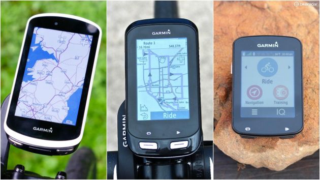
Edge 1030 vs. 1000 vs. 820

The Edge 1030 is certainly an upgrade from the 1000, but can it justify the premium over the 820?
The big question for most us will be whether the Edge 1030 justifies the £130 / $200 price premium it carries over the Edge 820.
If you want the flagship device with every possible feature, then clearly it'll have to be the 1030.
It gets the latest navigation features including Trendline, and the most sophisticated iteration of Garmin's Strava Live integration.
It's also got a bigger screen and more battery life, is that enough? I'm not totally sure.
If you've got an Edge 1000 already, the 1030 probably only makes sense as an upgrade if you're desperate for more battery life, or if you feel like you've actually been missing out on specific features such as rider-to-rider messaging.