Pro kits through time: Team Sky / Ineos Grenadiers
Charting the evolution of the British team's look, from black-and-blue origins to navy-and-red, via rainforests and orcas
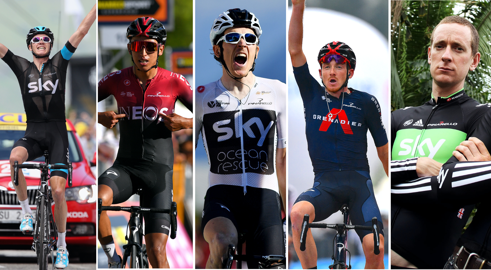
In a new series, Cyclingnews is delving through the back catalogues of professional cycling team kits.
Which designs have earned iconic status? Which are the ones that should never be seen again? And which have you completely forgotten about?
First up we have Ineos Grenadiers, formerly known as Team Sky.
The British team, born as an offshoot of the British Cycling national track racing programme, burst onto the WorldTour scene in 2010 and quickly established themselves as a superpower in the sport, winning the Tour de France seven times, the Giro d'Italia three times, and the Vuelta a España twice.
Read on to see how their kit evolved from the black-and-blue origins to the navy-and-red of today, via rainforests, Space Invaders and orca whales. And don't forget to let us know your favourite in the comments section below.
2010
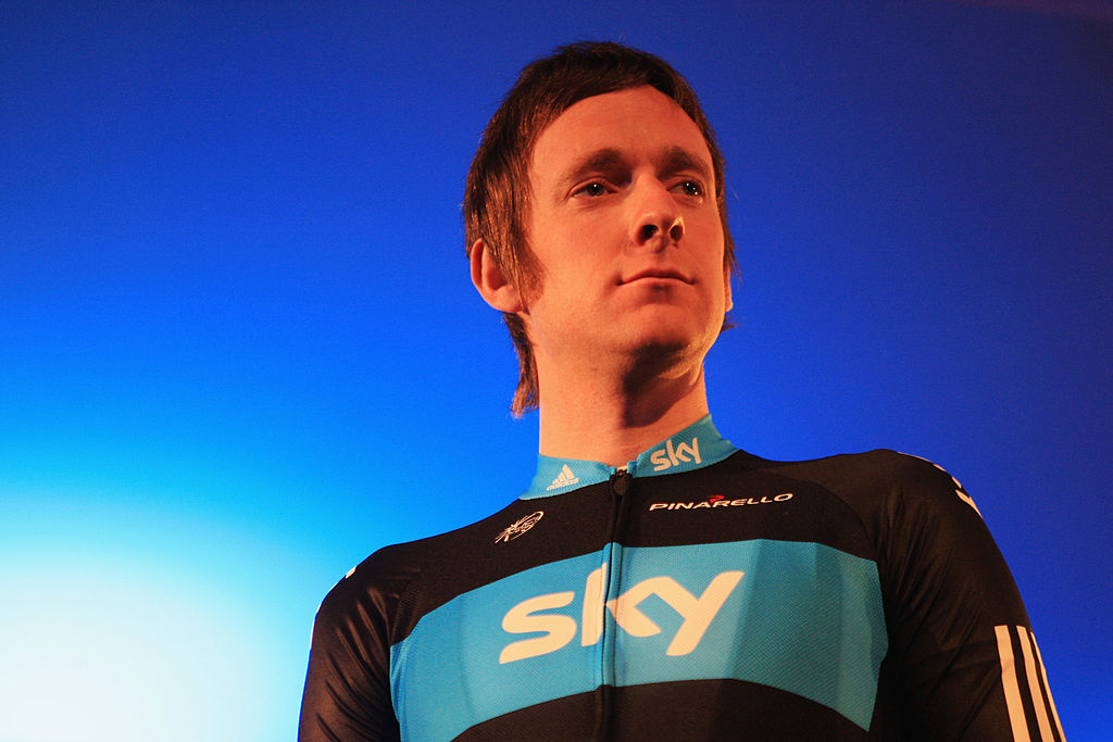
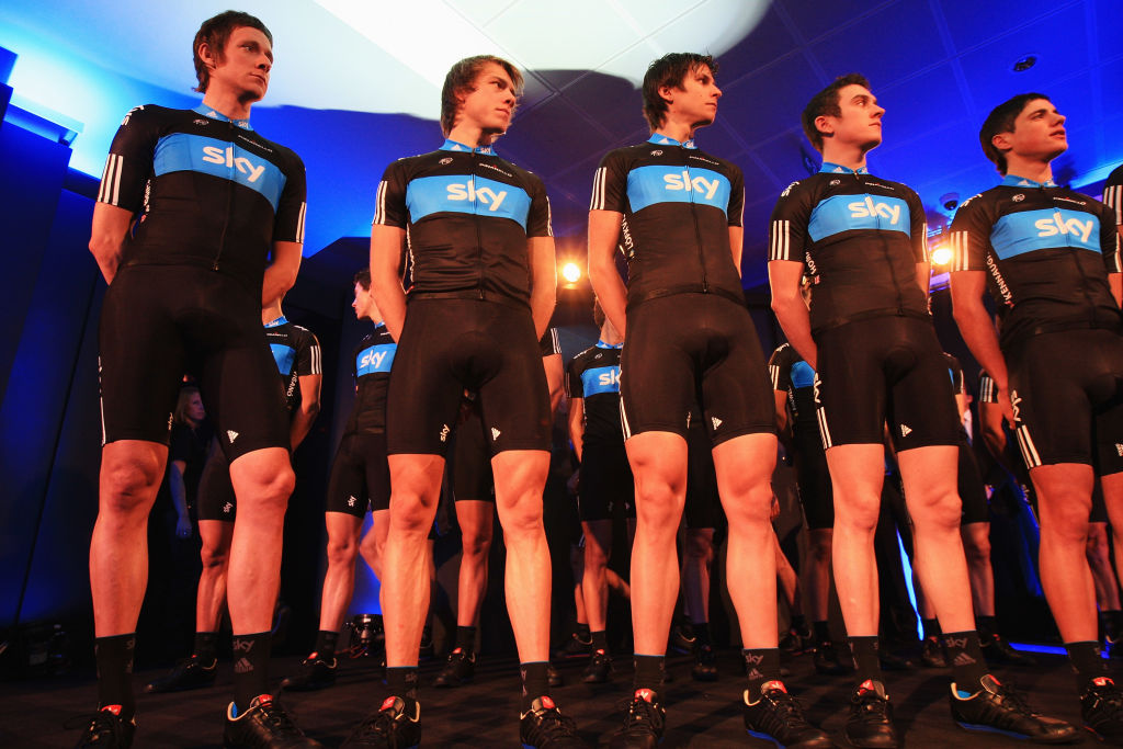
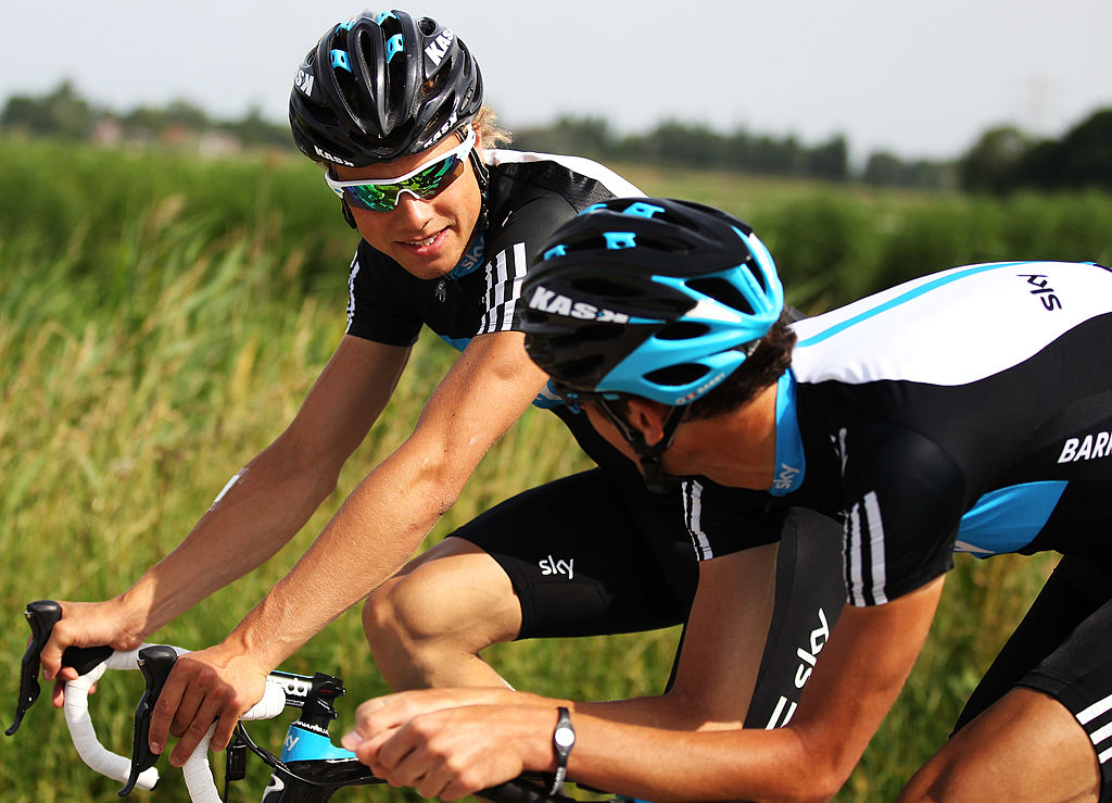
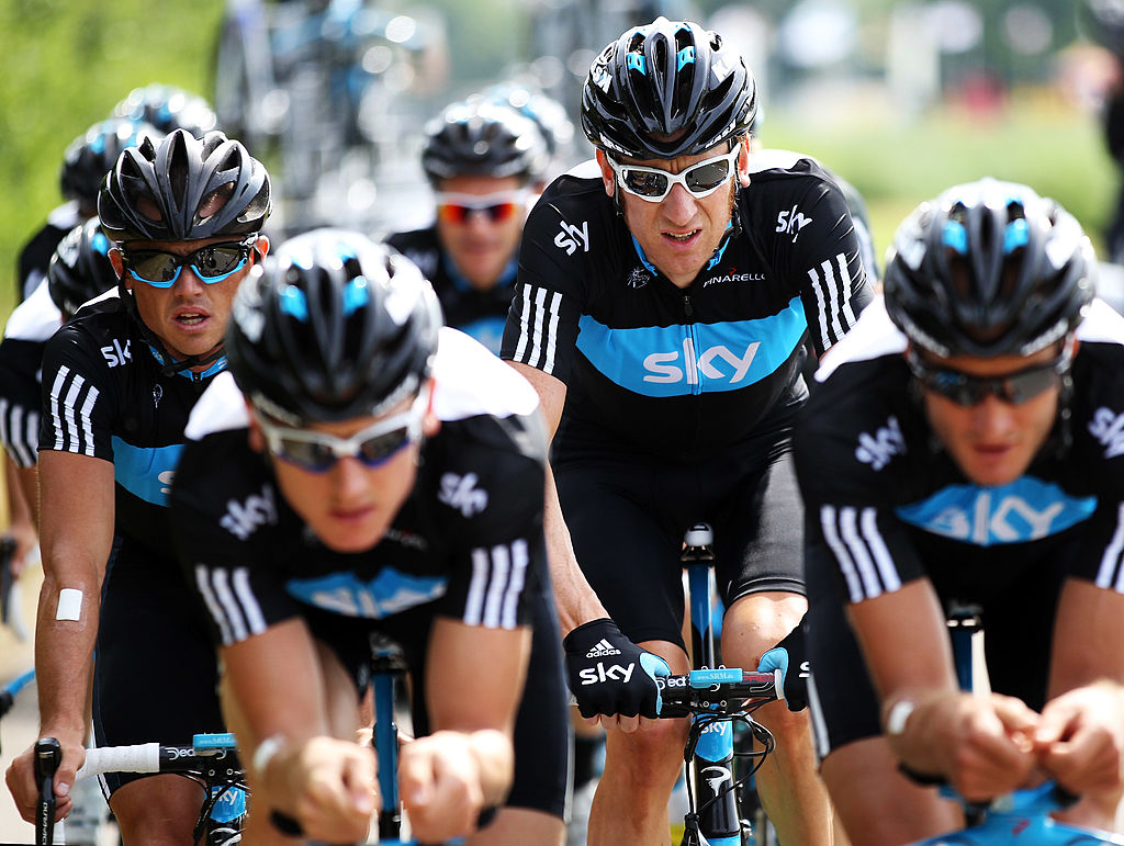
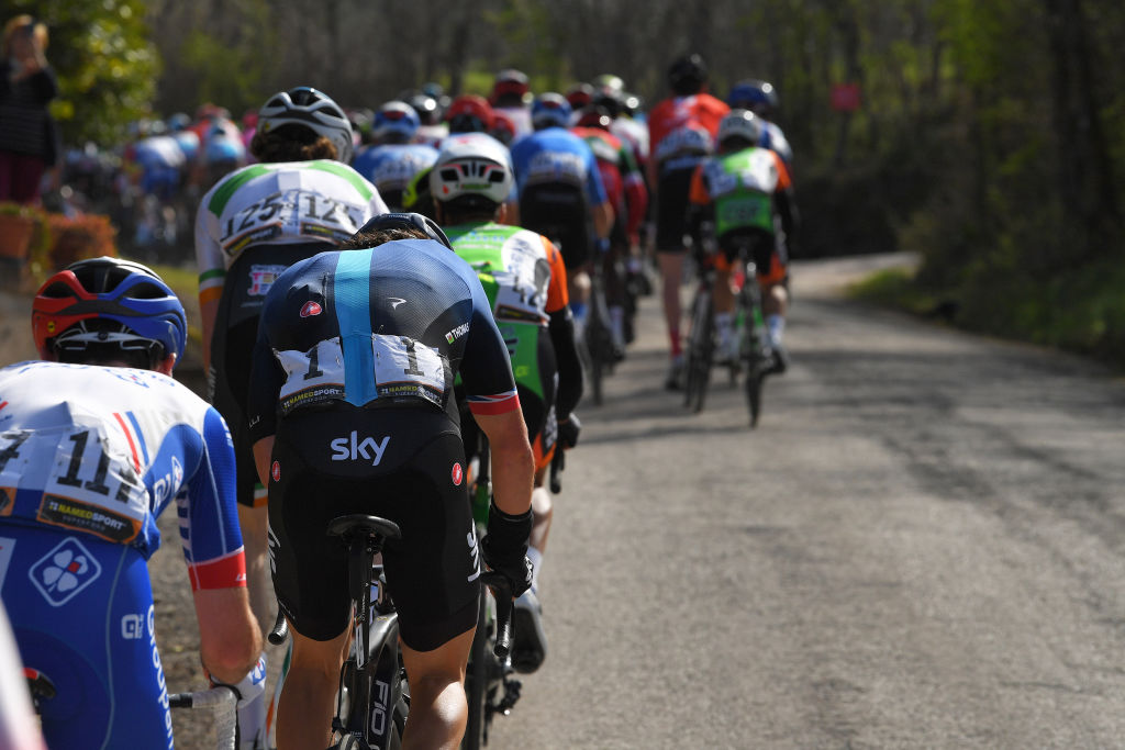
The British team hit the road with a black-and-blue kit that would build a strong identity over the best part of the following decade. The simple and uncluttered design has a largely black torso with one bright blue panel on the chest-baring the logo of Sky in white.
The back, however, is where you find what will become something of a signature, not just for the kit, but the team as a whole: the thin blue strip running down the middle. This is taken from the blue racing line on the velodrome and used as a sort of visual metaphor for – amongst other things – the line between right and wrong. Cycling was still between doping scandals and the team entered the sport promising to win clean, but the navigation of that line would soon come under intense scrutiny.
Get The Leadout Newsletter
The latest race content, interviews, features, reviews and expert buying guides, direct to your inbox!
The other standout feature of the kit is the three white stripes down the arms and legs: the unmistakable mark of Adidas. The German sportswear giant had previously made the pink kits for the Telekom/T-Mobile team but otherwise hadn’t done much in cycling. That makes this kit, and by extension, the team, feel a little like outliers in the pro peloton.
- Supplier: Adidas
- Notable wins in the kit: Stage 1 Giro d'Italia, Omloop Het Nieuwsblad
- Verdict: A true tone-setter and the Adidas stripes just add to the retro vibe
2011
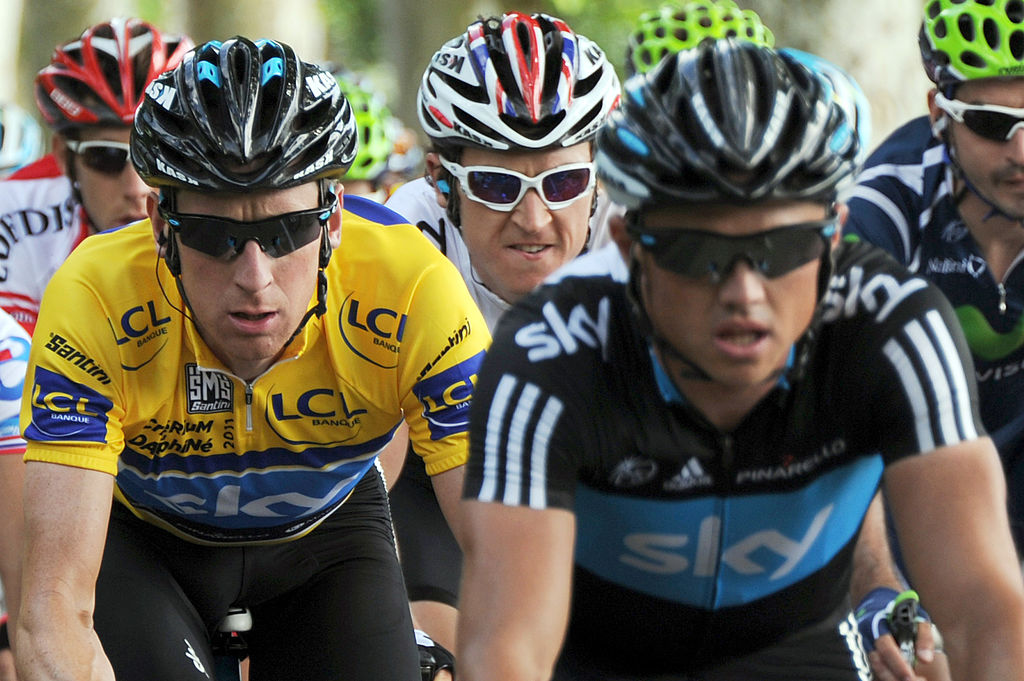
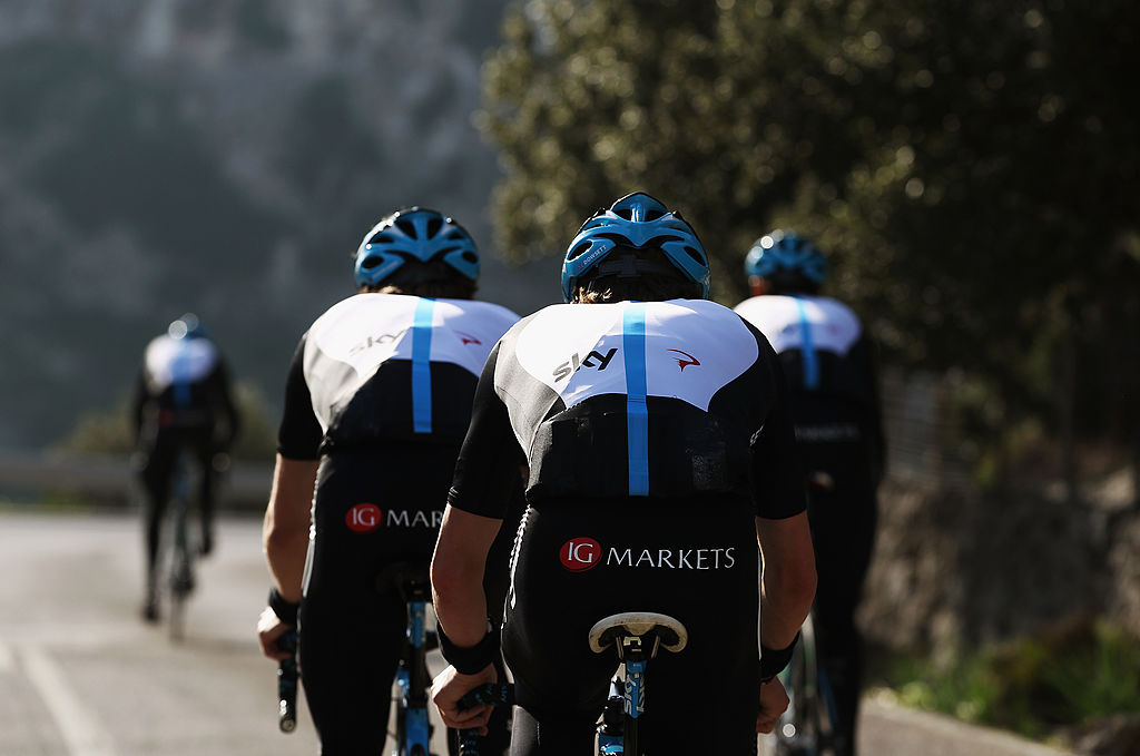
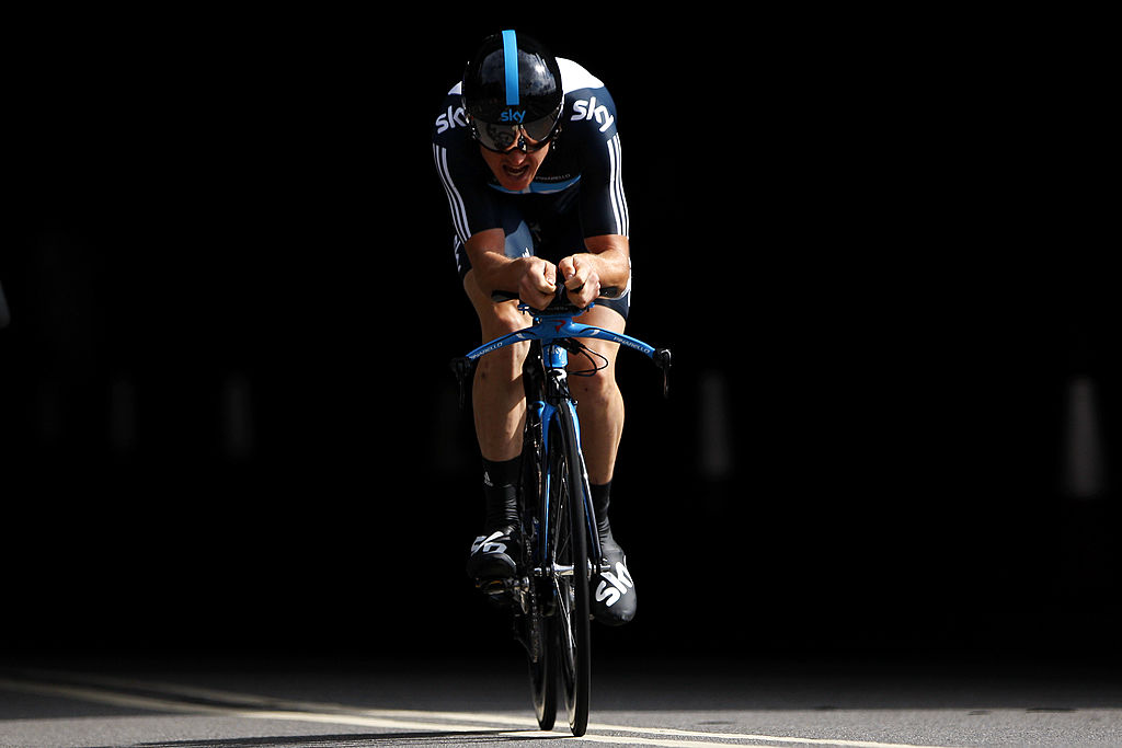
There’s scarcely enough of a difference for us to classify this as a new kit, but the eagle-eyed among you will have noticed a reduction in the blue trim on the collar, and the secondary-sponsor logos pushed down on top of the blue chest panel.
- Supplier: Adidas
- Notable wins in the kit: Vuelta a España, Critérium du Dauphiné
- Verdict: We miss the blue collar
Special-edition: Rainforest green
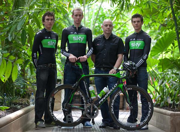
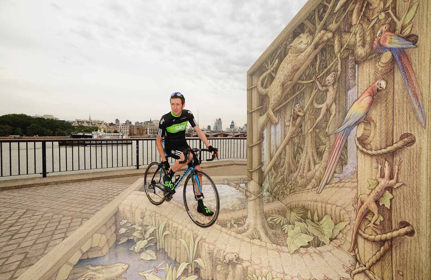
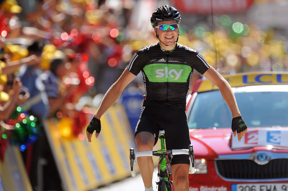
Towards the end of their first season, the team decided to mark their debut appearance at their home race, the Tour of Britain, with a special-edition kit. At the time, Sky was running an environmental campaign named Rainforest Rescue, and so the blue was swapped for a bright green.
The kit, which features the logo of World Wildlife Foundation, was such a hit that it was rolled out again for the 2011 Tour de France, with those subtle changes to the standard-issue kit reflected. Bradley Wiggins and Geraint Thomas were called to some unspecified botanical garden to model the new jersey, in one of the more enduring pro cycling photoshoots (though nowhere near matching up to the mattress ads with Tom Boonen and his QuickStep teammates).
- Supplier: Adidas
- Notable wins in the kit: 2x Tour de France stages
- Verdict: Maybe it’s the photoshoot, but this is the one we'd save from a burning building
2012
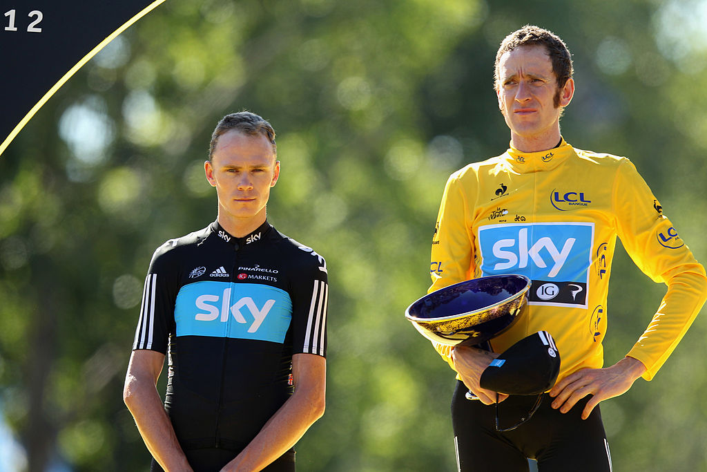
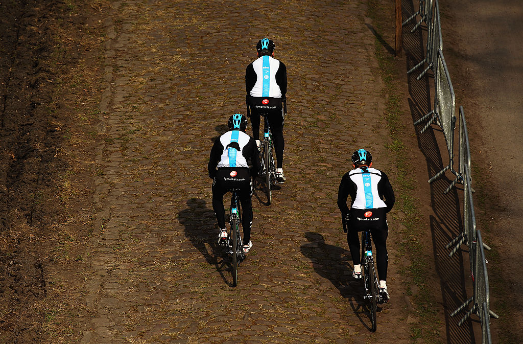
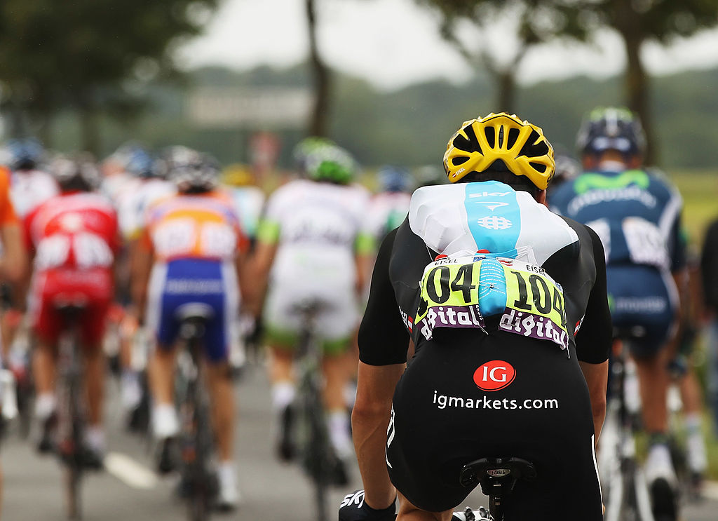
Again, only subtle changes as the overall design and feel of the kit remains in place. The gradual cluttering of secondary sponsors continues with the addition of IG Markets to the chest, but it’s the rear of the jersey that house the more significant development.
That blue line has now been expanded, doubling or quite possible trebling in width. It now houses a few logos but, more importantly, a mini essay/poem on the ethos behind that line:
“This is the line | The line between winning and losing | Between failure and success | Between good and great | Between dreaming and believing | Between convention and innovation |Between head and heart |It’s a fine line |It challenges everything we do |And we ride it every day."
- Supplier: Adidas
- Notable wins in the kit: Tour de France, Critérium du Dauphiné, Paris-Nice
- Verdict: It’s too easy to mock the poem, but it clearly ruins the kit.
2013-2014
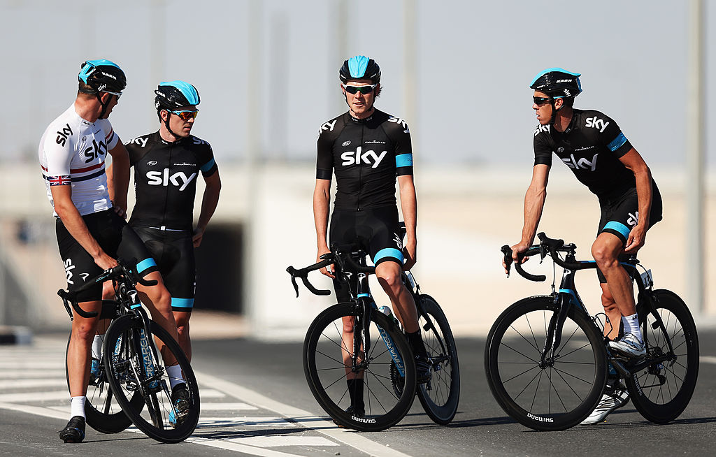
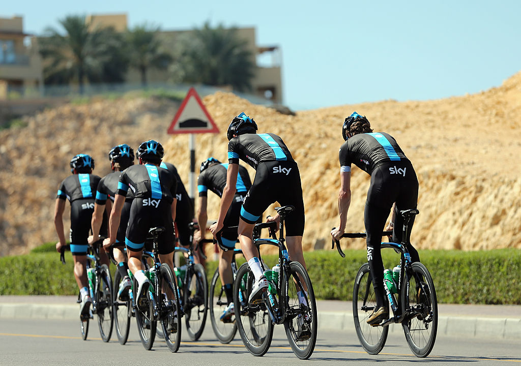
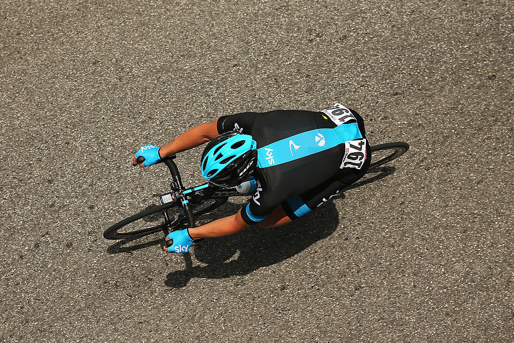
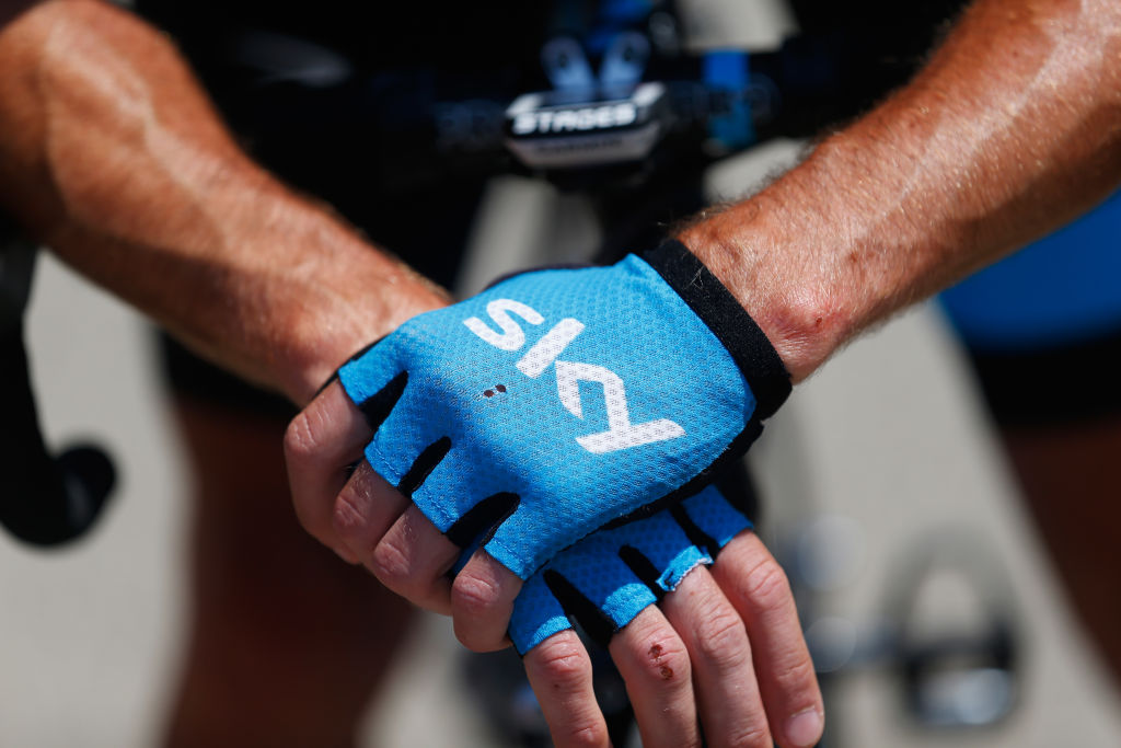
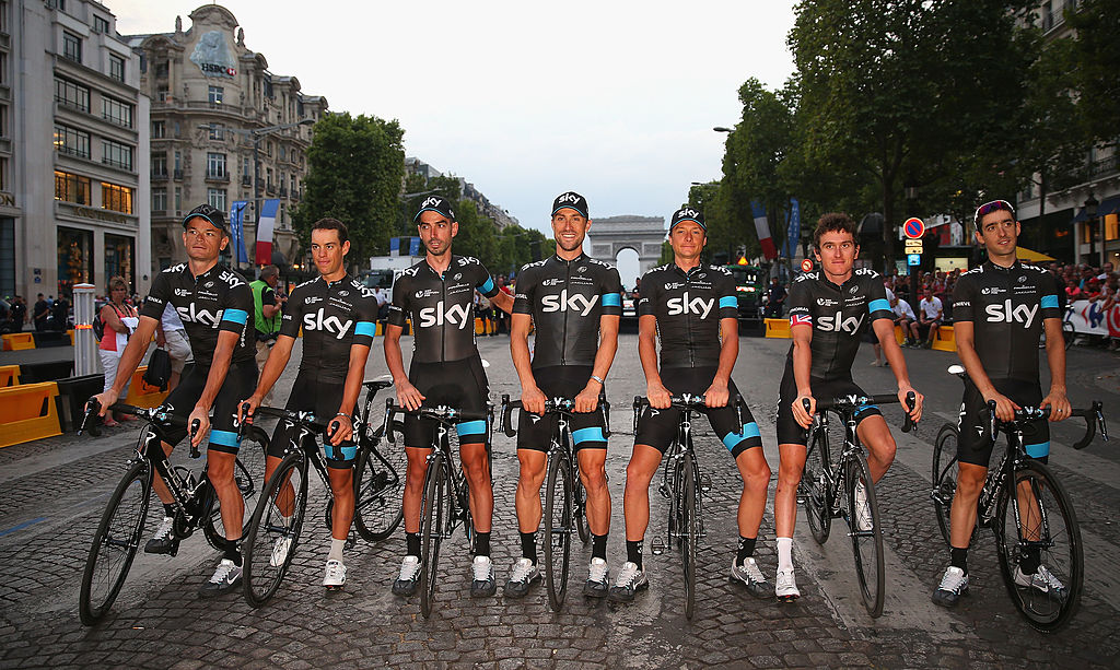
This is where the kit really starts to evolve. Adidas are waved aside and the relatively new British cycling apparel company, Rapha, are ushered in. Rapha was long associated with the boom in cycling in the UK, and the infamous Middle-Aged Men in Lycra (MAMIL) who had more money than sense, but they’ve established themselves at the luxury end of the market globally, and made some kits that earned their place in history as Chris Froome kept the Tour de France wins flowing.
The first effort is simplistic, and some would say overly so. It’s essentially an all-black kit, with the blue limited to single hoops on the left arm and leg, and the blue band which remains on the back (albeit without the poem). The kit is rolled out again for 2014, essentially unchanged, but for the Jaguar and 21st Century Fox logos added to the chest.
Some would say it’s uncomplicatedly stylish, others would say it has nothing to it at all. In fact, as fans and Tour de France race directors alike became frustrated with the team’s crushing dominance, the predominance of black was associated with a perceived lack of colour in their racing style.
- Supplier: Rapha
- Notable wins in the kit: Tour de France, Critérium du Dauphiné, Paris-Nice
- Verdict: Ruthlessly efficient and not much fun, it’s hard to love this kit but it feels like it encapsulates a moment and therefore stands the test of time.
2015
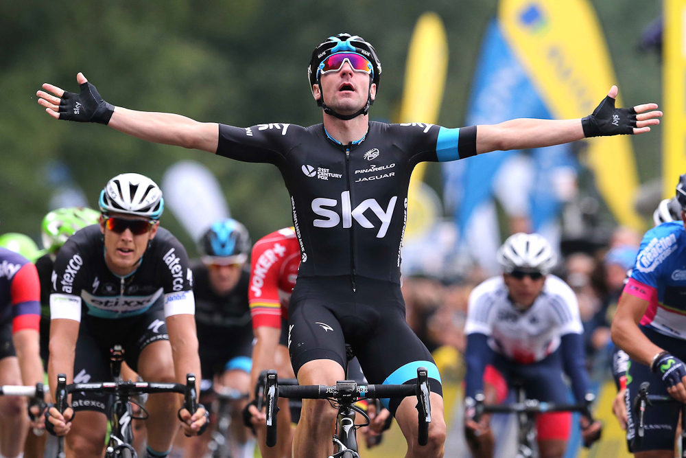
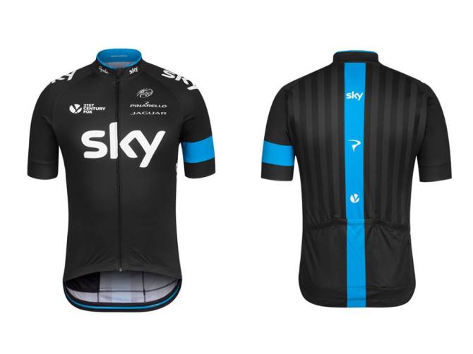
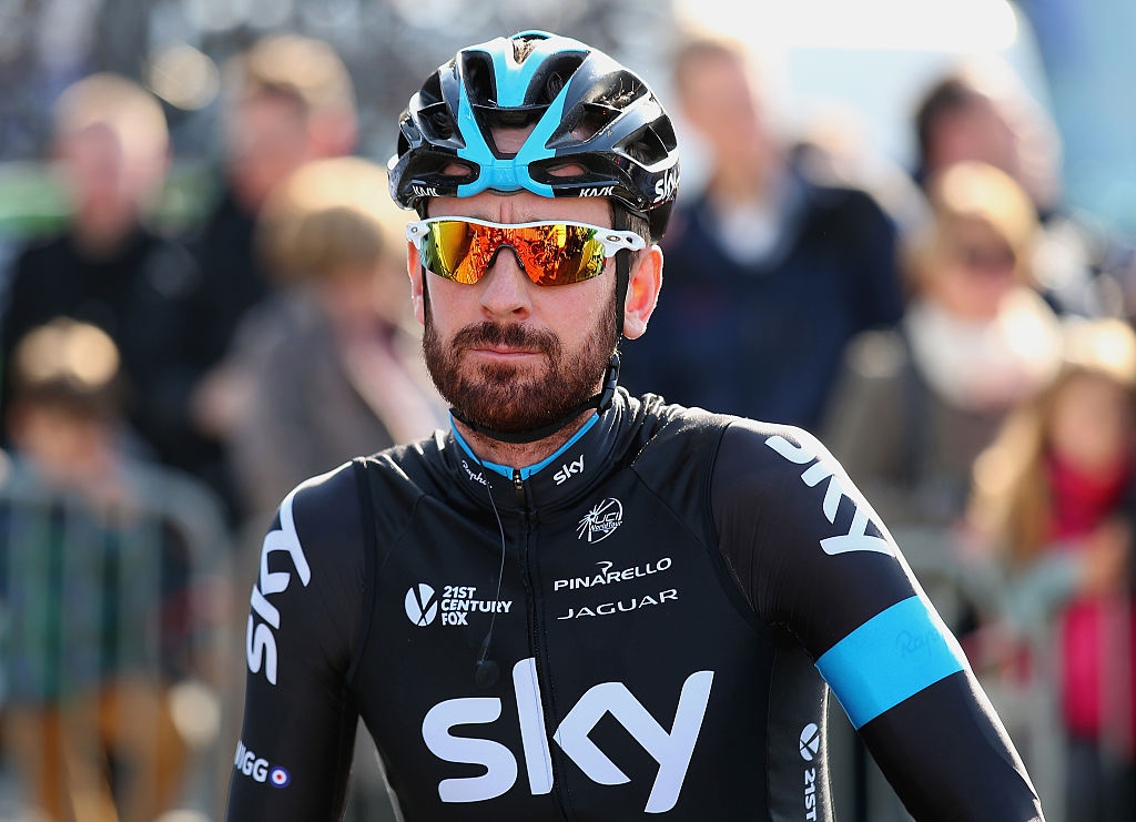
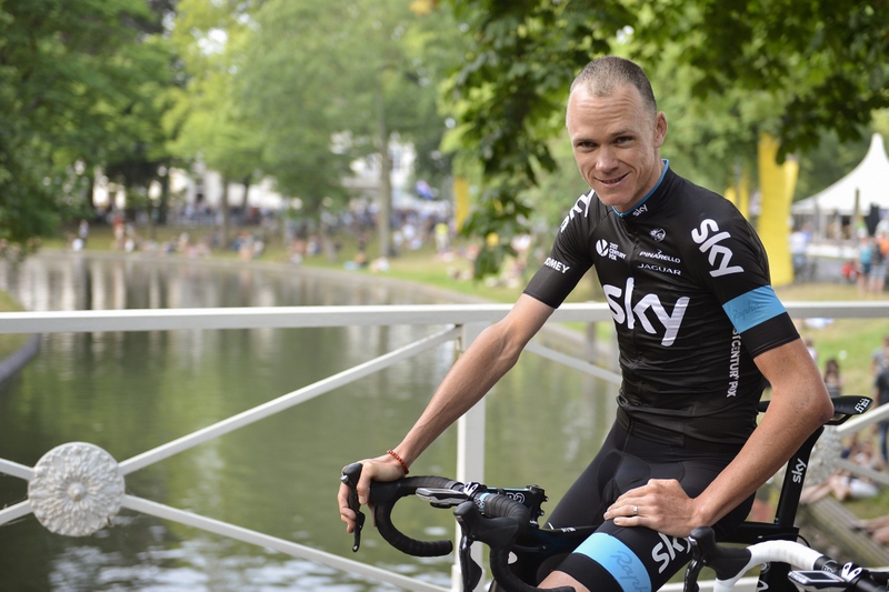
Again, just enough changes here to mark it out as a ‘new’ kit but, for all intents and purposes, it’s the same kit. There are faint vertical stripes on the rear, with light and dark tones of black, while a thin strip of blue trim is added to the collar.
- Supplier: Rapha
- Notable wins in the kit: Tour de France, Critérium du Dauphiné, Paris-Nice
- Verdict: As above; it’s the same kit.
2016
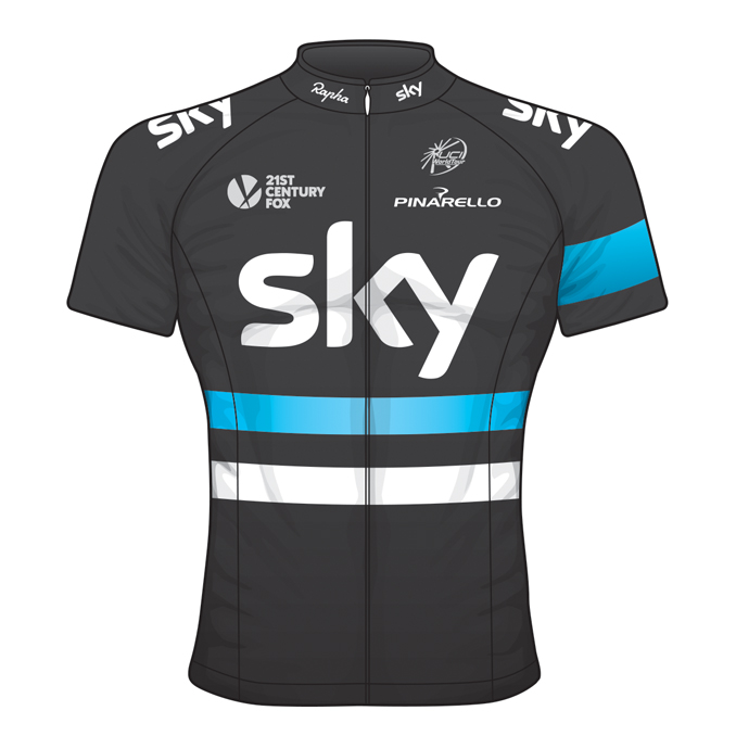
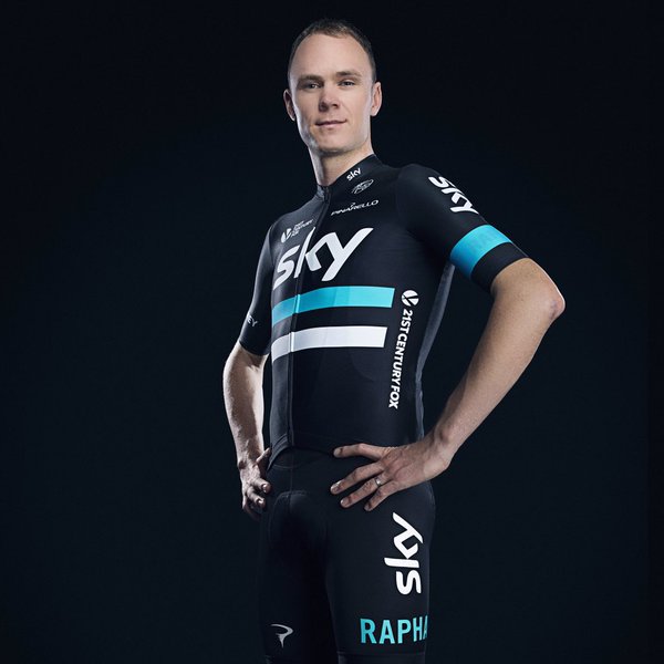
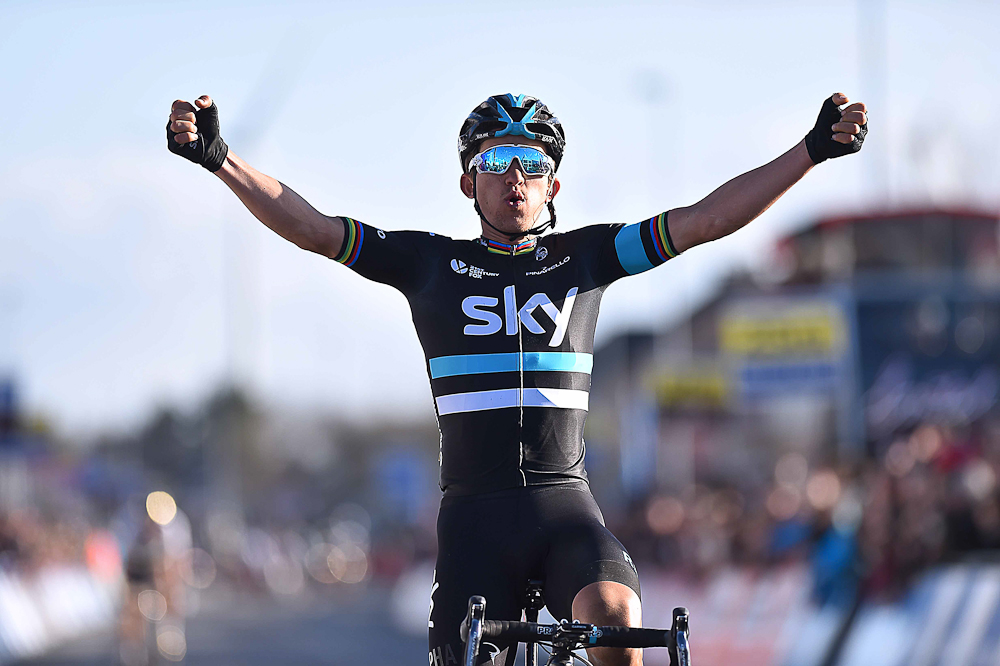
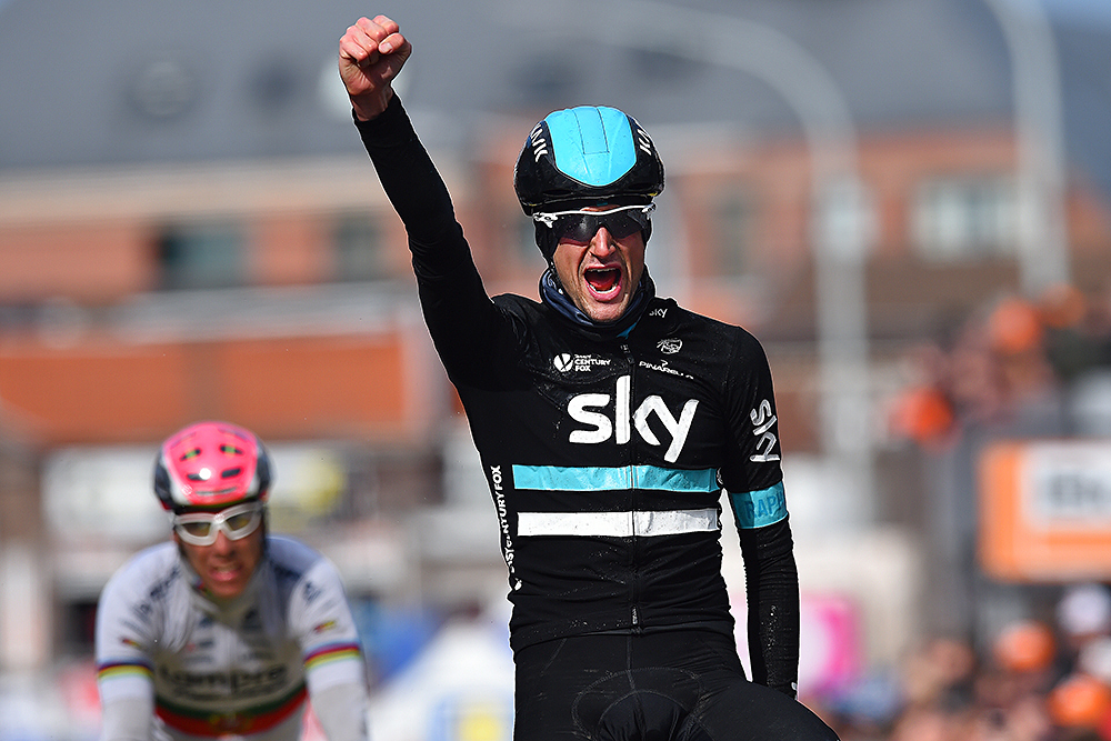
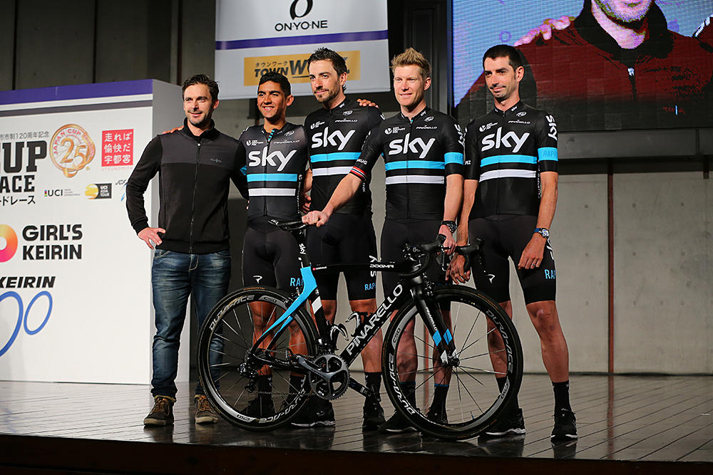
After three years, and with their contract running out at the end of the year, Rapha decide to shake things up and produce something new. Ok, ‘shake things up’ might be a stretch for the addition of one stripe of blue and one stripe of white, but it certainly brightens things up. That’s maybe also because there’s a subtle lift in the shade of blue, moving it more towards a true sky blue.
As with the previous design, the newfound splash of colour is arguably reflected on the road itself. The Tour de France is a similar story, with Froome collecting his third title, but the heavy-handed stage race success is accompanied by a breakthrough in the Spring Classics – once considered beyond the reach of their controlling instincts. Wout Poels bags the team’s first Monument at a snowy Liège-Bastogne-Liège, while Michal Kwiatkowski wins on the cobbles of E3 Harelbeke, and there are further Monument podiums through Ben Swift at Milan-San Remo and Ian Stannard at Paris-Roubaix.
- Supplier: Rapha
- Notable wins in the kit: Tour de France, Liège-Bastogne-Liège, E3 Harelbeke
- Verdict: Those two stripes have made all the difference
2017
Goodbye Rapha, welcome Castelli, just 128 years older, with roots going back to a Milan tailor and founded in 1876.
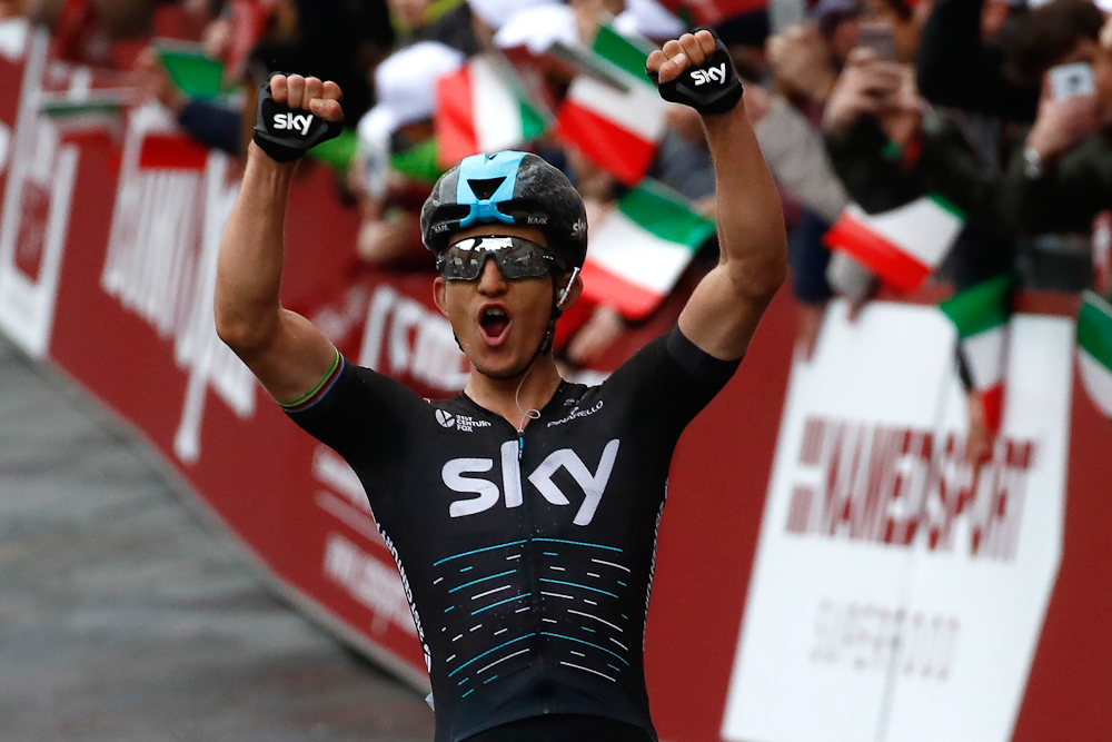
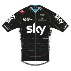
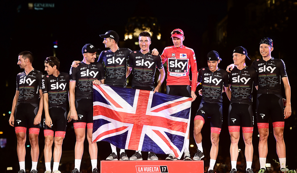
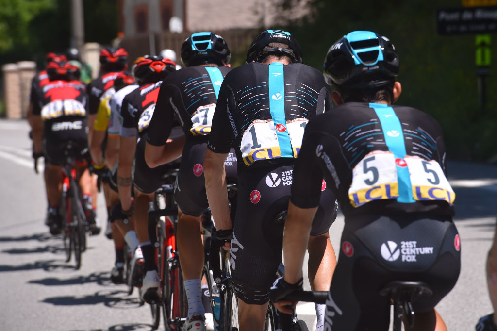
The first offering stays true to the style and overall design in place since 2010, with a lot of black, hints of blue, and ‘Sky’ written across the chest in white. The fabric on the main jersey is also slightly meshed, giving a more textured look than the slick Rapha kits.
However, the key design feature of this kit are the fragmented blue and white lines, which appear on the torso, the back, and also on the socks and the trim of the shorts. These lines represent the team’s victories. The blue ones are WorldTour wins, the white ones are non-WorldTour wins, and the length of the lines indicate the length of the race, so the full-length blue lines are Grand Tour titles.
"We wanted to find a way of celebrating the success we have had as a team, but also to make sure we keep our mind firmly on the future," Brailsford says.
- Supplier: Castelli
- Notable wins in the kit: Tour de France, Vuelta a España, Milan-San Remo
- Verdict: It might be Space Invaders, it might be something else, but either way, it’s a retro arcade video game, which is perhaps not such a bad thing.
Special-edition: White
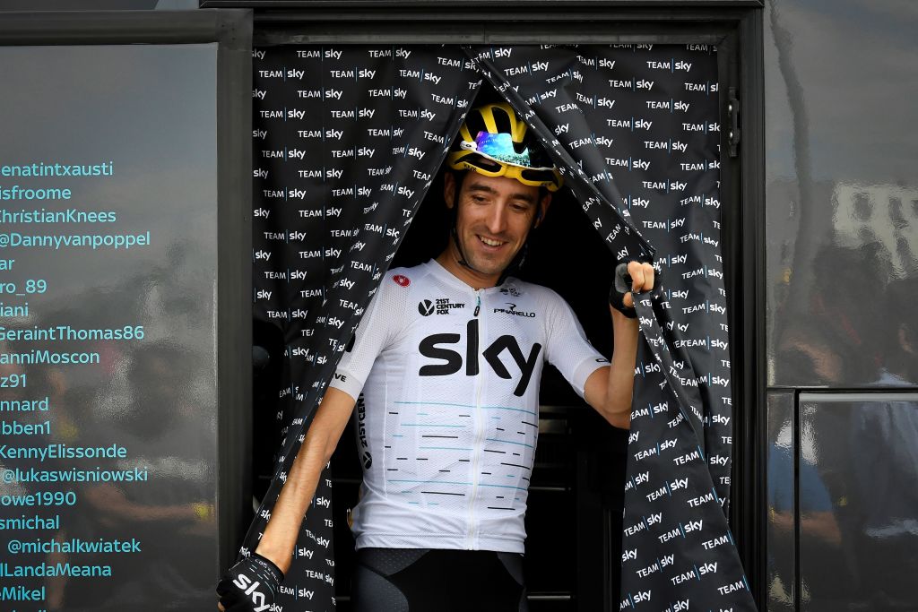
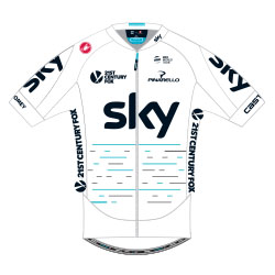
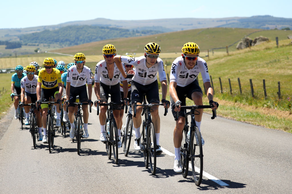
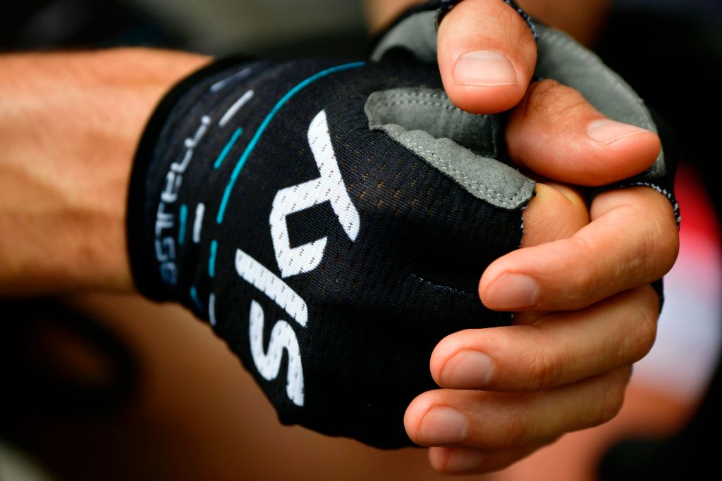
In what was at the time a Cyclingnews scoop, the team decide to do another Tour de France special, but this one’s a radical change. For the first time, the black is shelved and is replaced by white, in what is basically a simple reversal of the colour ways.
Some speculate that this is the latest marginal gain, white supposedly being cooler in the summer heat. Others see an attempt to literally whitewash their image given the aforementioned connotations of the old black kit and, more pressingly, the controversy surrounding the team following the Jiffy bag and TUE scandals. As it was, black kits are still tweaked to repel heat, and Castelli had apparently suggested a white kit from the start.
Thankfully, the shorts are still black.
- Supplier: Castelli
- Notable wins in the kit: Tour de France
- Verdict: For some reason, the Space Invaders thing works much better on white.
2018
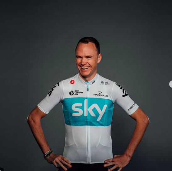
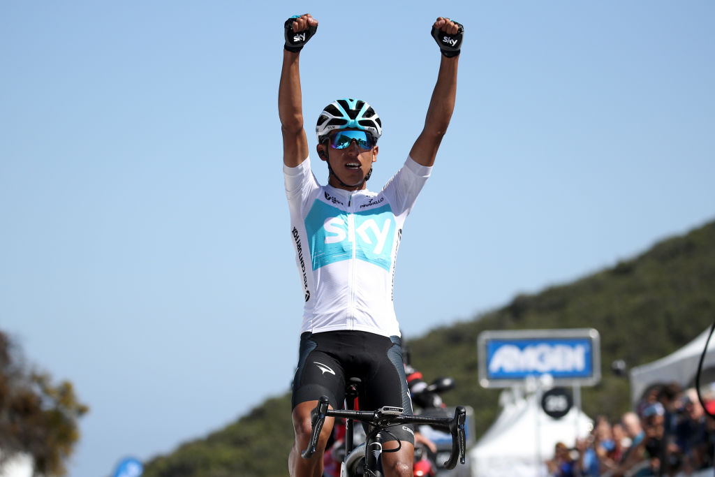
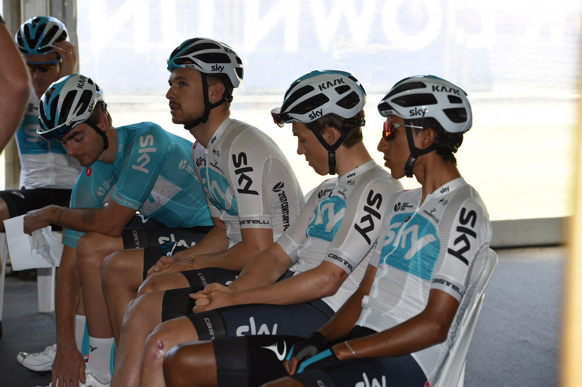
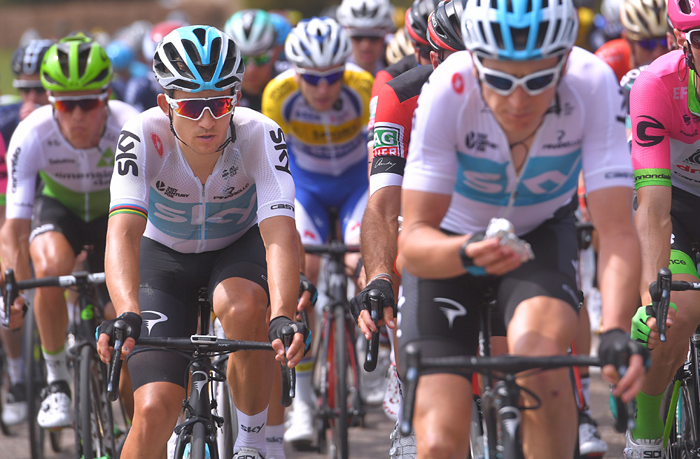
The Tour de France went so well that they decided to switch to white on a full-time basis. It’s a substantially different design to last July’s kit, with the return of the blue chest panel to house the ‘Sky’ logo for the first time since the Adidas days.
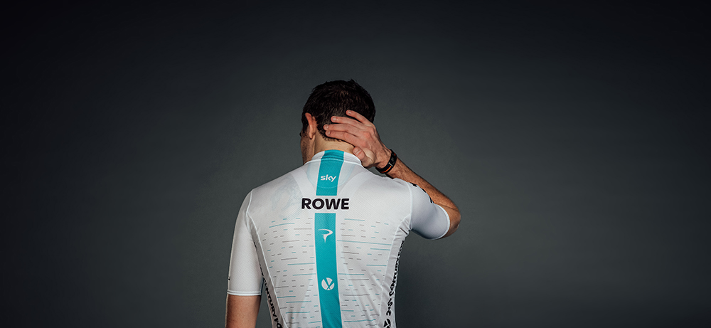
The fragmented lines are still here but they’re moved up to sit inside this panel – in this case representing all the wins from the 2017 season. On the rear of the jersey, this idea is expanded so that almost all of the space either side of the blue line is taken up by the dashes, representing all of the team’s wins between 2010 and 2016.
Another new feature is the addition of riders’ names in black on the rear and again this harks back to the Adidas days. Back in the first couple of seasons, names were printed on the sides but are now given a more prominent position on the rear, a welcome development, no doubt, to television commentators.
- Supplier: Castelli
- Notable wins in the kit: Giro d'Italia, Tirreno-Adriatico, Critérium du Dauphiné
- Verdict: Clean but fresh, this is, surely, objectively the nicest kit the team have produced
Special-edition: Ocean rescue
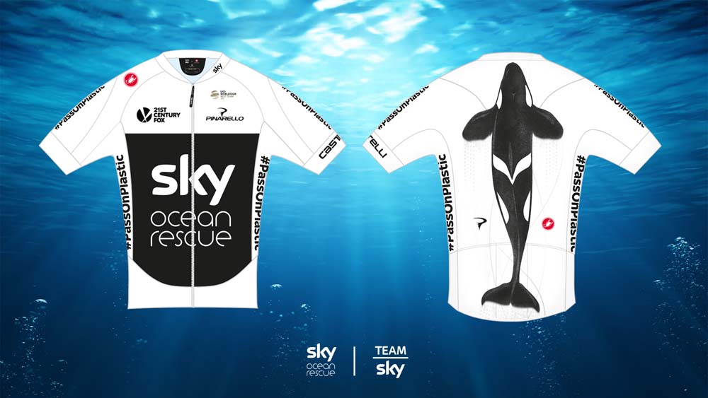
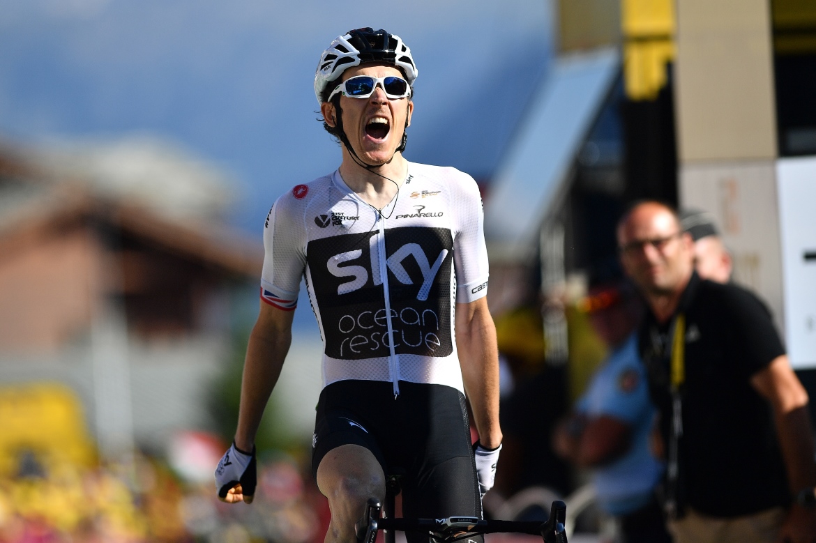
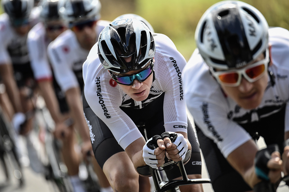
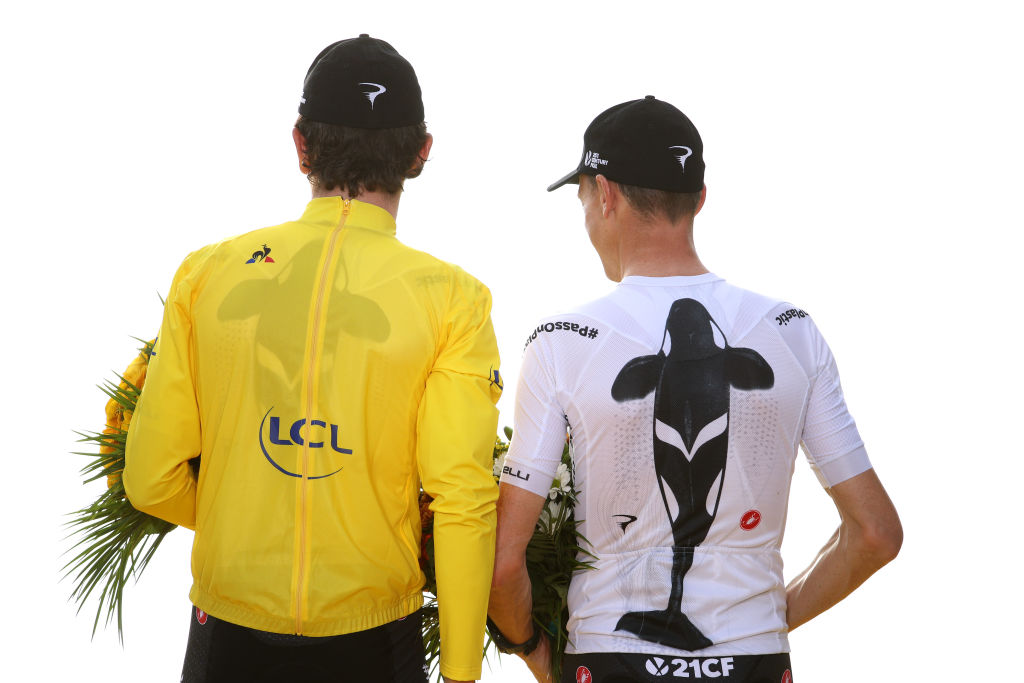
Another year, another Tour de France special, and this one picks up the environmental baton laid down after the Rainforest kit of 2011. This time, Sky are fighting for our polluted oceans with a campaign named Ocean Rescue, and the cycling team’s kit is a key part of the publicity push.
However good the cause, the cynical eyes see an attempt to curry favour and distract from the controversy surrounding Froome’s salbutamol case, with the four-time champion nevertheless booed at the teams presentation in Brittany.
The kit itself is entirely black and white, with only the faintest hint of blue on the zip. It’s odd that the blue would be discarded on an ocean-themed jersey but then the lack of colour perhaps underlines the threat to the oceans that is being highlighted.
The front of the jersey itself looks like an oil spill, with the torso mostly taken up by a large black panel containing the logos of Sky and Ocean Rescue. The biggest flourish, however, is on the back, and is the most adventurous thing the team have ever done with a kit. It’s an image of an orca whale, in motion, spanning the length of the jersey.
- Supplier: Castelli
- Notable wins in the kit: Tour de France
- Verdict: They might have pulled it off, had they not gone on to partner with one of the world’s largest plastics and petrochemicals producers.
2019
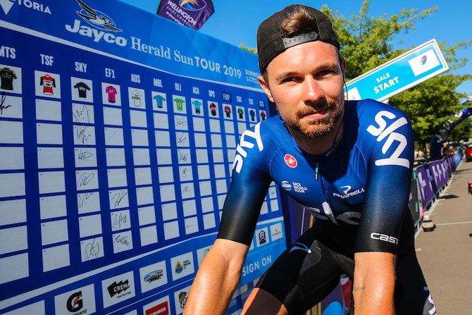
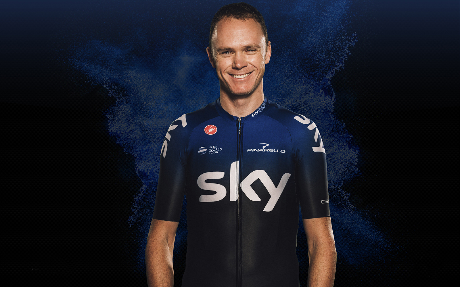
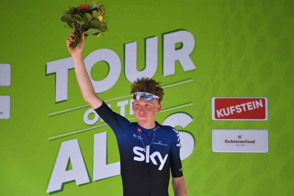
A bit of a collector’s item, this. We just included a reference to the team’s future sponsor, and the arrival of Ineos ends up coming mid-way through 2019, with a James Murdoch-less Sky happy to beat an early retreat. As such, the initial 2019 kit is only in use for four months.
The love-affair with white is a thing of the past and it’s back to dependable old black and blue, although this is notably different to previous designs. The two colours are not clearly separated but sort of blended together to make a jersey that starts off blue and effectively fades to black. Still, it’s more of a midnight blue, and the whole effect is a lot darker than the earlier colour schemes.
The secondary sponsors are pared back, while the blue line on the back is only flanked by small logos for Castelli and Pinarello, making for another sparse design.
- Supplier: Castelli
- Notable wins in the kit: Paris-Nice, Tour of the Alps
- Verdict: It’s almost like they knew they’d be discarding it in a few months anyway
2019-2020
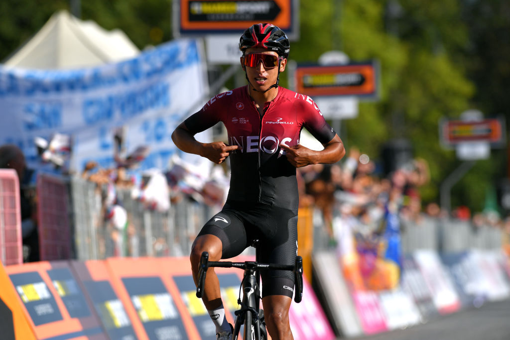
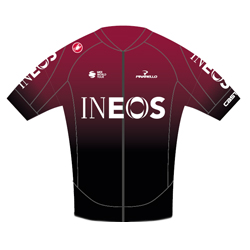
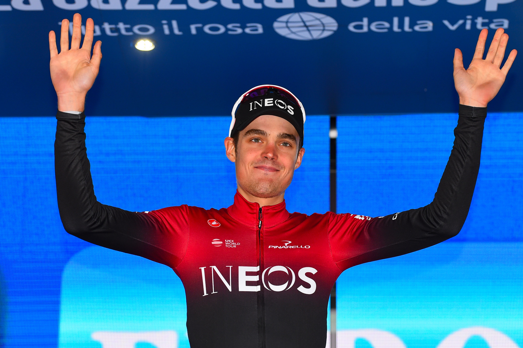
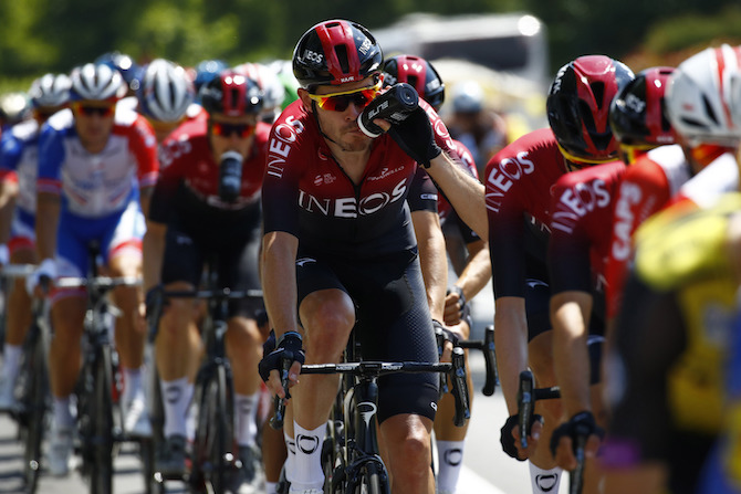
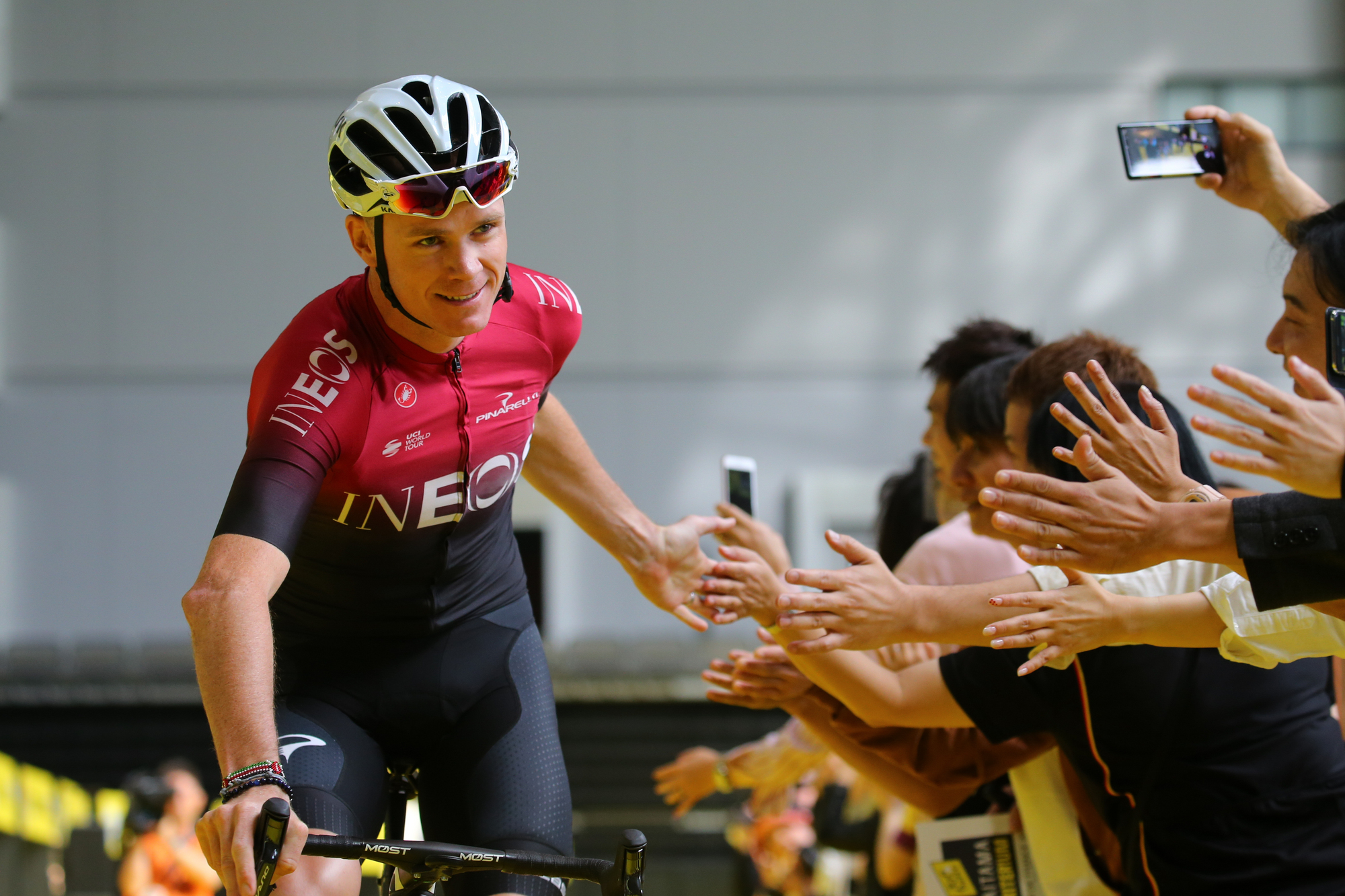
Ineos’ arrival comes at the end of April and, after an awkward plain one-off kit for the Tour de Romandie, the team’s new identity is officially unveiled on home soil at the Tour de Yorkshire.
It feels like a big departure but, at the same time, isn’t really a big departure. The red is clearly the most significant development, introducing a completely new colour scheme and leaving blue hanging out to dry after a decade of service. However, the new sponsor’s name is still written in white across the chest and shoulders, the ‘line’ is still on the back, and it’s still a relatively plain and clutter-free design.
It’s basically just the previous kit, but in red – albeit the red is much brighter than the old blue, and the fade to black is far more abrupt.
- Supplier: Castelli
- Notable wins in the kit: Tour de France
- Verdict: The design works better in red, but not by much
2020-2021
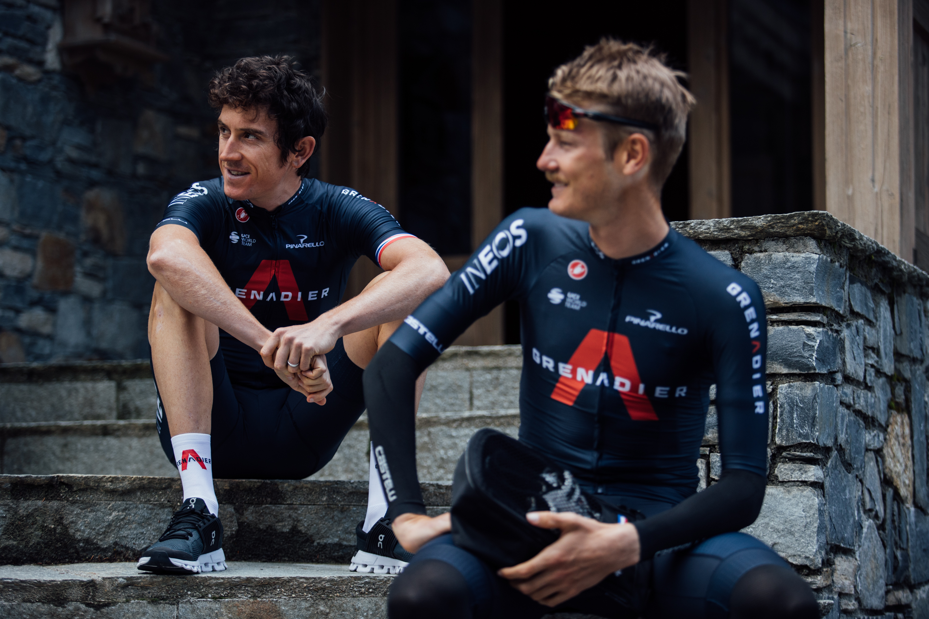
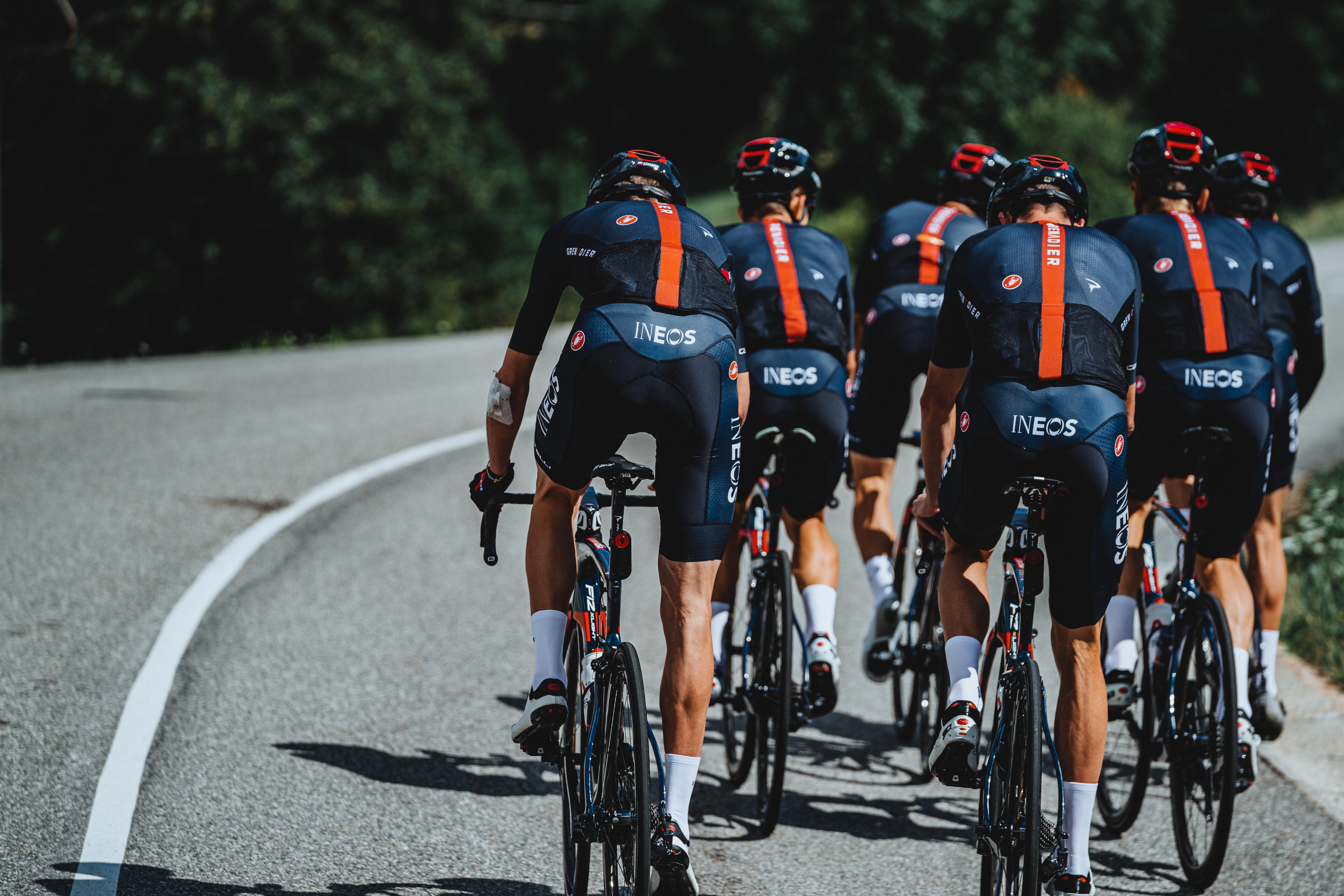
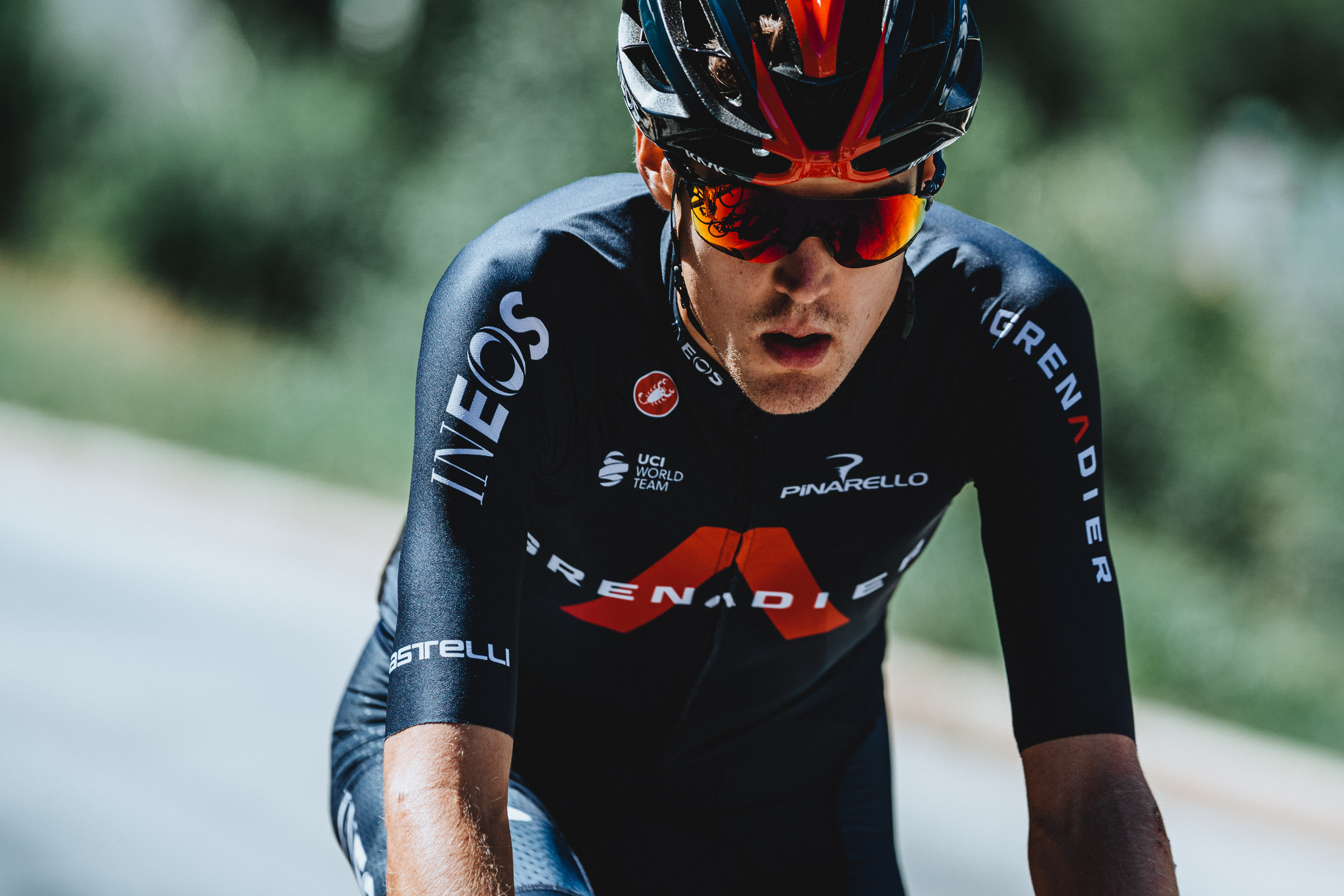
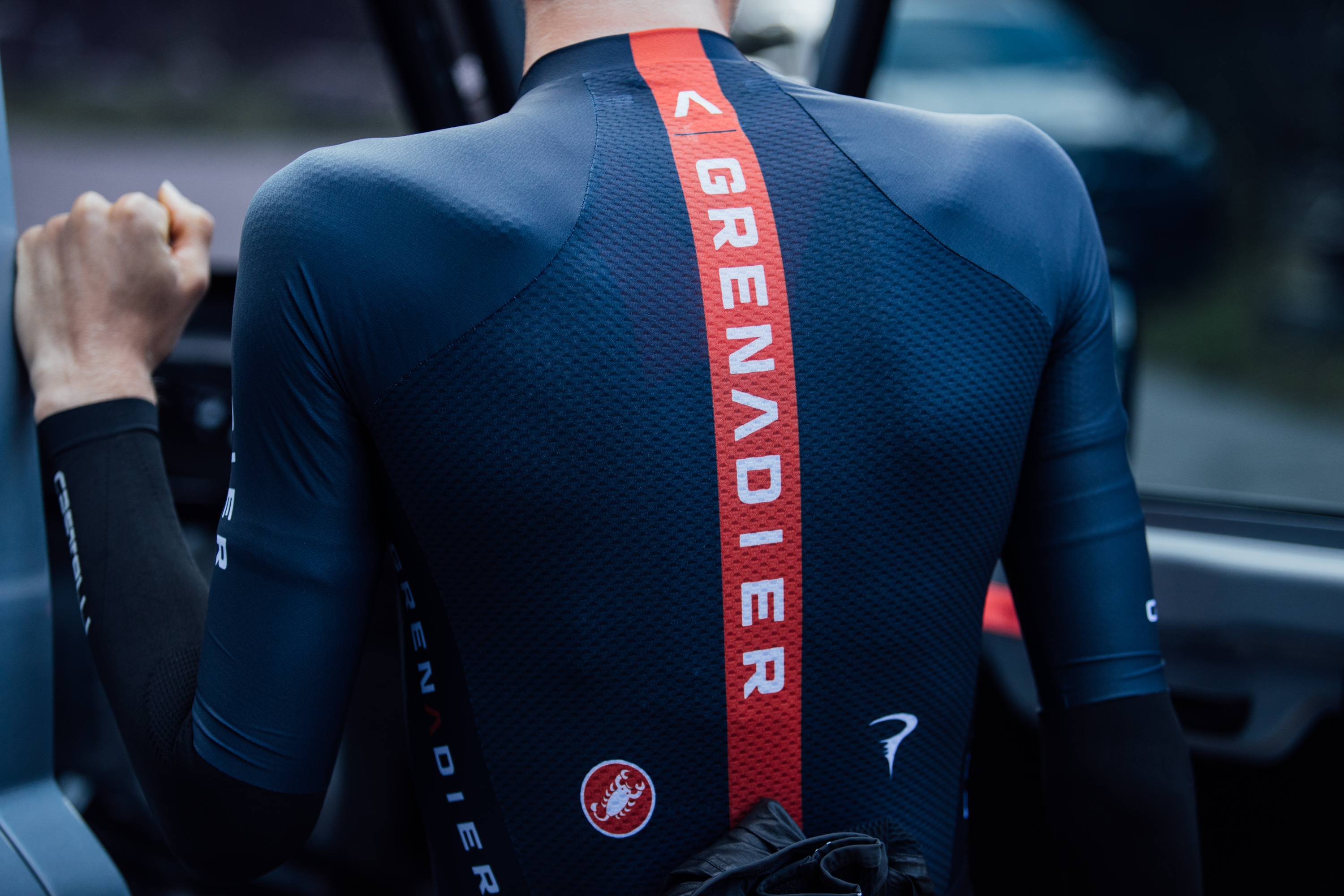
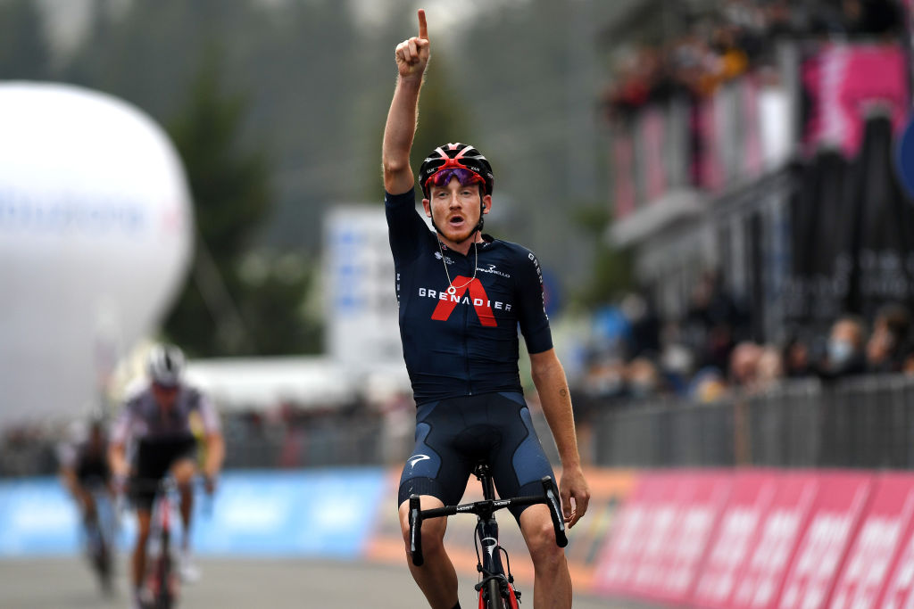
After six new kits in the space of two-and-a-half years, the team strike upon the kit they’re still wearing to this day. It’s too soon to change after just half a season, so the initial red Ineos kit is carried through the off-season and into the pandemic disrupted 2020. However, Ineos are launching a new 4x4, the Grenadier, and so the whole team undergoes a rebrand, timed for the Tour de France but not just a one-off.
The new kit is navy, with the chest now featuring the word ‘Grenadier’ in white, superimposed on the car’s red arrow-shaped logo. The Ineos logo appears on the right sleeve, with Grenadier appearing on the left, and again on the collar, and for a fourth time running down that ever-present line on the back, which is itself red.
The kit does not get a good debut as the team are humbled at the Tour de France but there’s redemption as Tao Geoghegan Hart snatches a thrilling Giro. Again, it’s not been around long enough to warrant a change, so they’ve stuck with it throughout the 2021 campaign.
- Supplier: Castelli
- Notable wins in the kit: Giro d’Italia x 2, Critérium du Dauphiné, Tour de Suisse
- Verdict: Another fairly straight-forward design, but the new logos and colours give it a bit more life and make for a classy look
2022?
Ineos Grenadiers will part ways with Castelli at the end of the year, switching to Belgian company Bioracer. There's sure to be a new kit in the works, which is set to be revealed before the end of the year.
Patrick is a freelance sports writer and editor. He’s an NCTJ-accredited journalist with a bachelor’s degree in modern languages (French and Spanish). Patrick worked full-time at Cyclingnews for eight years between 2015 and 2023, latterly as Deputy Editor.
