Object of Desire: The hidden gems on EF's new jersey
"That is so lame", "what the duck" and other hidden surprises found on the new EF Education-Nippo jersey
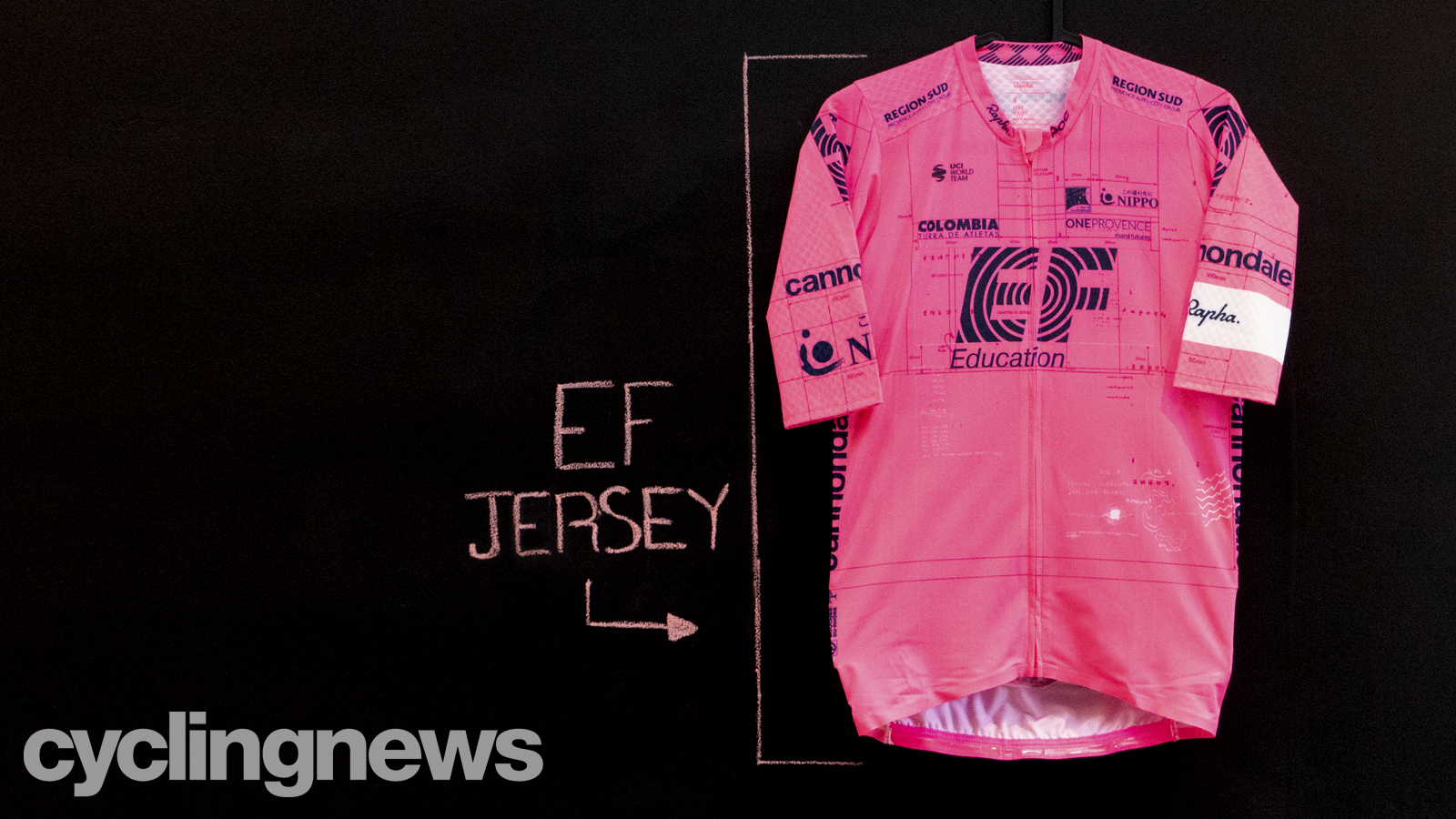
At the beginning the 2021 season, EF Education-Nippo was the last to launch its new jersey design. So late it was that the Cyclingnews 2021 WorldTour kit 'definitive' ranking was delayed, then delayed some more, and then we ran it anyway without them - choosing to add them later.
After the popularity of previous years' designs, the 2021 kit was always going to be highly anticipated, but after the team's kit collaboration with skateboard brand Palace for the 2020 Giro d'Italia broke the internet, the expectation was high for the latest kit.
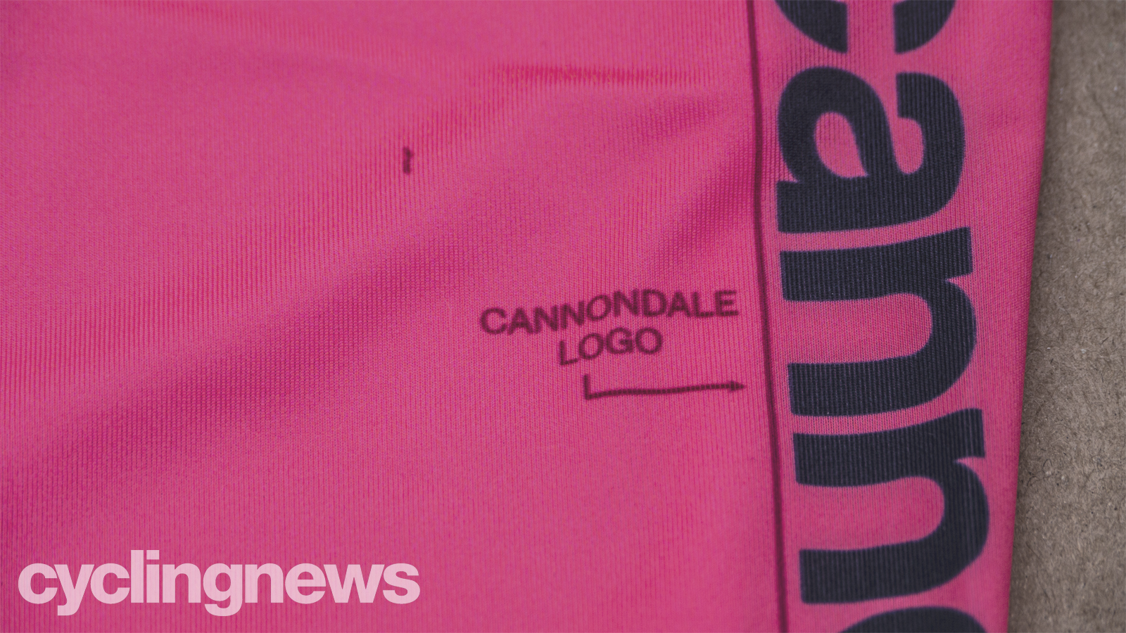
It didn't disappoint. The tongue-in-cheek design concept took direct aim at the UCI's stringent rules around kit design, a direct response to the fine the team received for the outrageous design's late registration. The main theme of the design is the guidelines printed throughout the jersey, ensuring the logos were positioned correctly and keeping the jersey compliant.
However, aside from these guidelines, there are also endless scribbles, notes, sketches and doodles from the designer that made it onto the final jersey. These include references to designs from years past, a duck (we'll get to that later), ideas that were bounded around Rapha HQ in the concept process, as well as the forward-thinking principles that define the team and embody the team's partnership with Rapha.
These subtle design quirks are impossible to spot on the TV, especially when it comes to helicopter footage, so Cyclingnews got our hands on the jersey and have taken a super-detailed look just for our readers. We also spoke to Felix Kraus, one of the designers, to help us understand the meaning behind each aspect.
Also, a warning before we start. This is the pinkest collection of photos you'll see all year, so if you want to go and get your sunglasses, we'll wait right here. Oh, and we've saved the best 'til last.
The EF logo
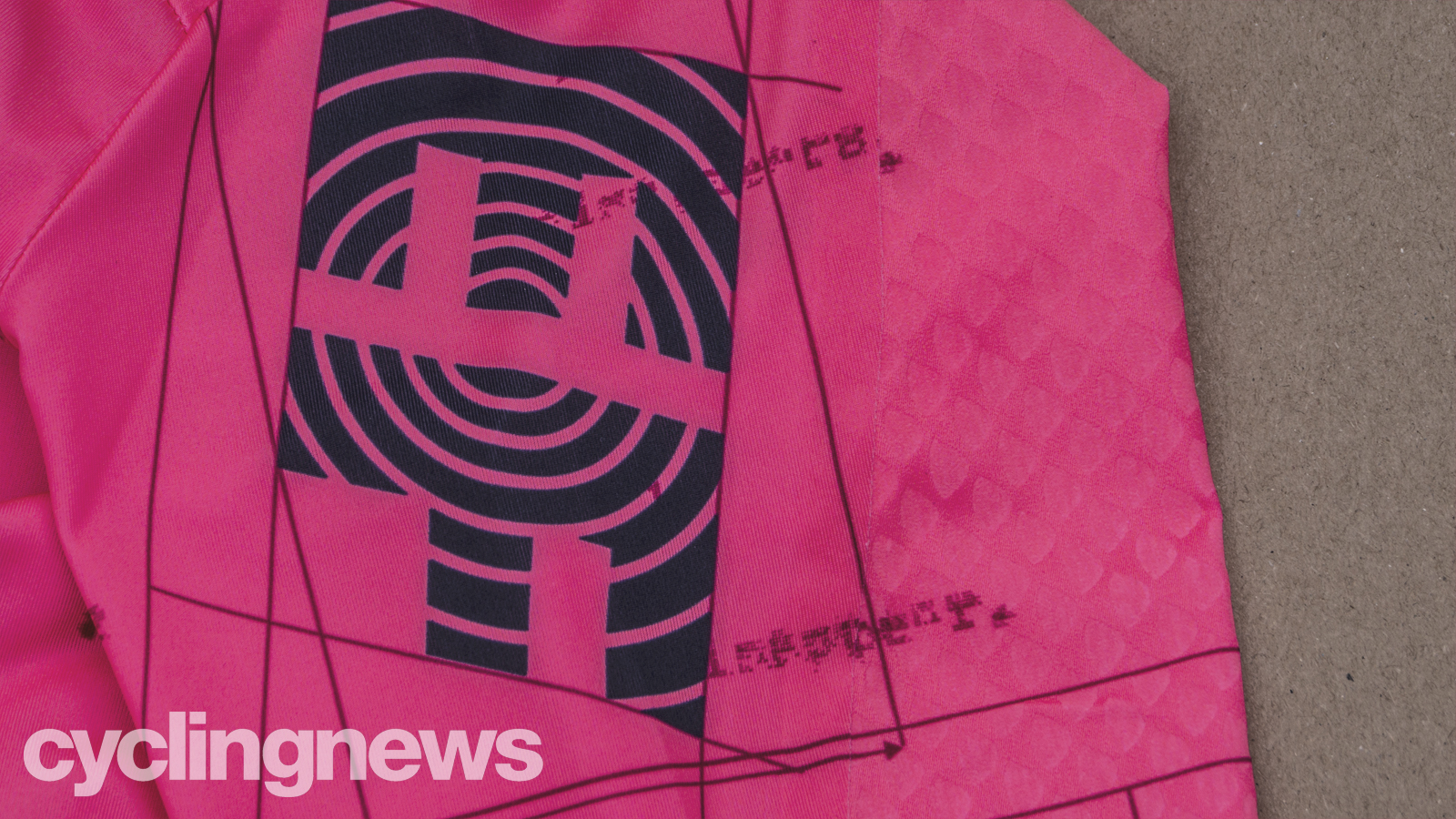
The EF logo itself is the least hidden part of the jersey, and it's entirely visible from helicopter footage, but we're starting here for a reason.
Get The Leadout Newsletter
The latest race content, interviews, features, reviews and expert buying guides, direct to your inbox!
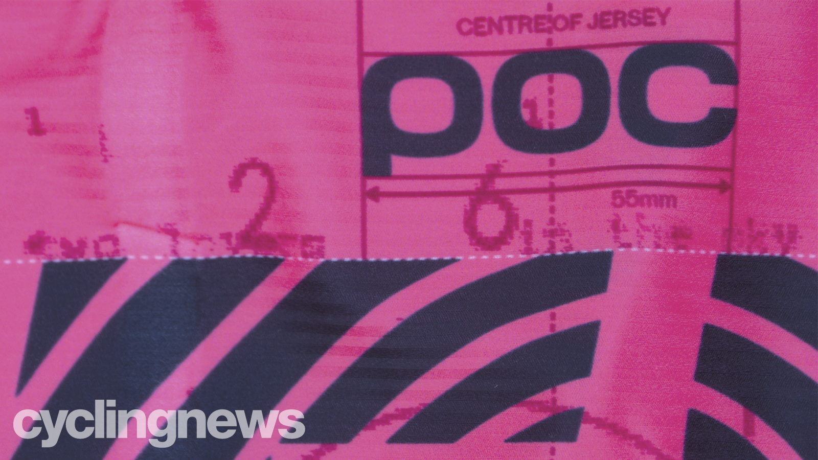
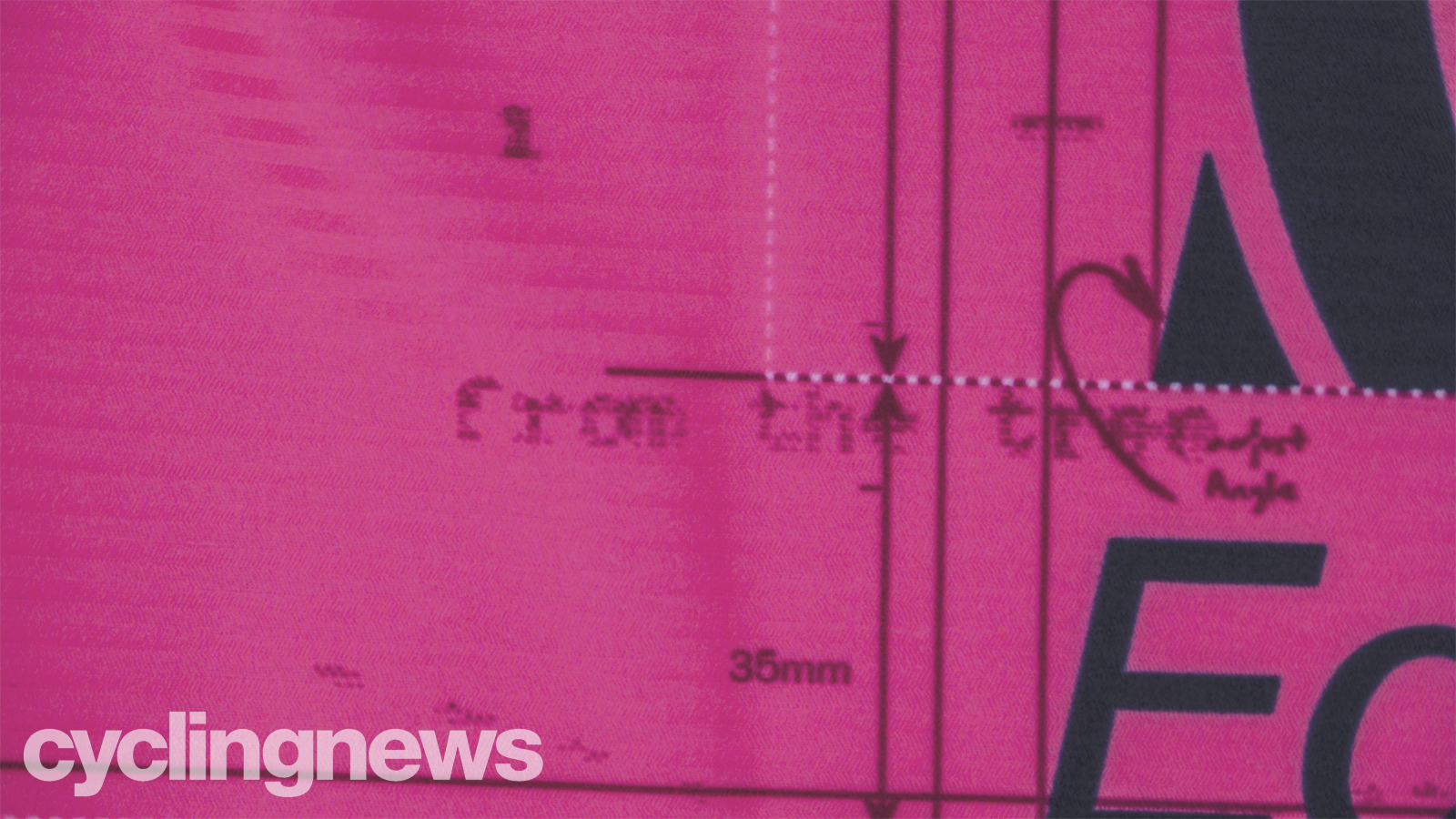
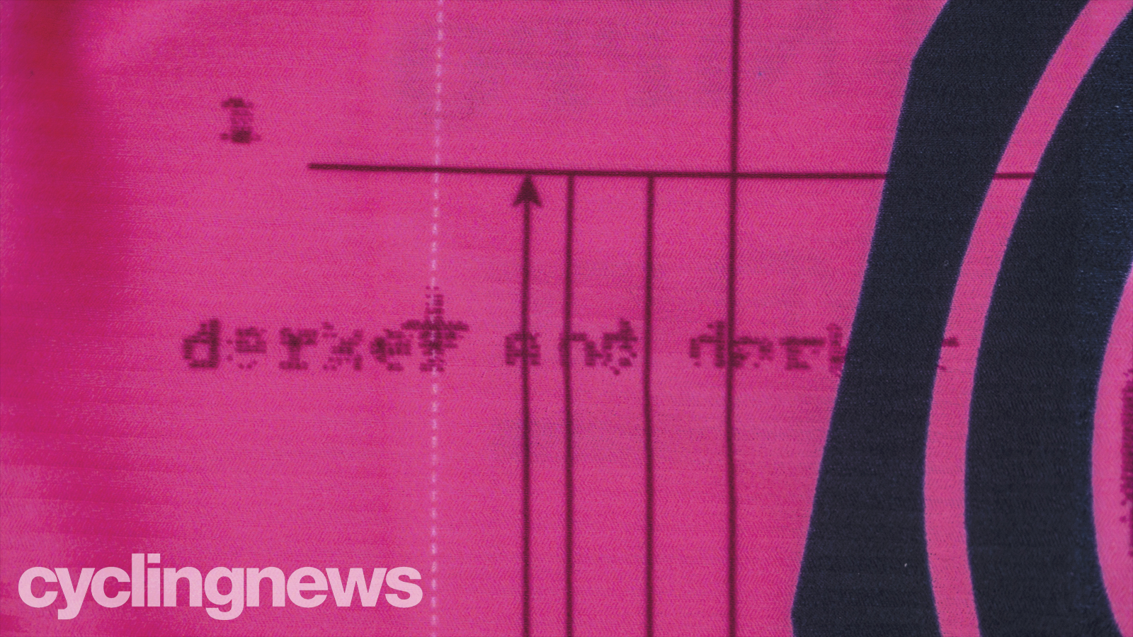
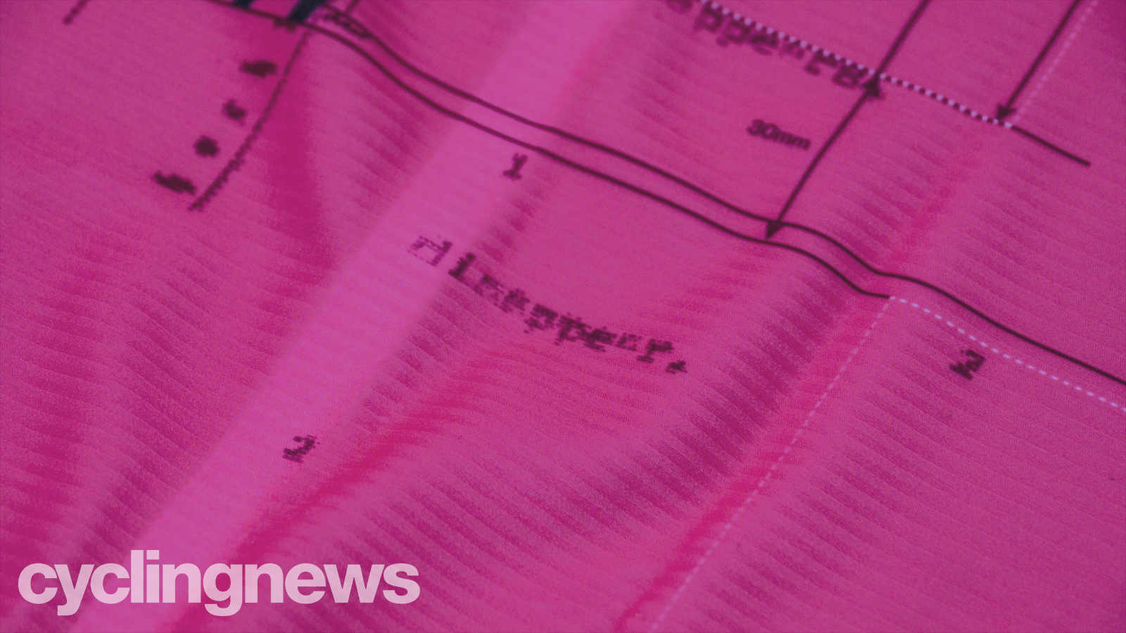
While the large EF lettering is blatant and obvious, there are hundreds of little easter eggs around it that you don't get to appreciate from the TV footage. In the photos below, you'll get a feel for exactly how many of them exist. Hopefully, this gives you an idea of what's to come as you continue scrolling.
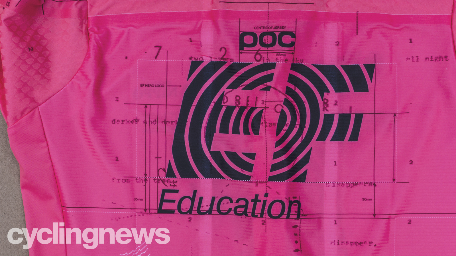
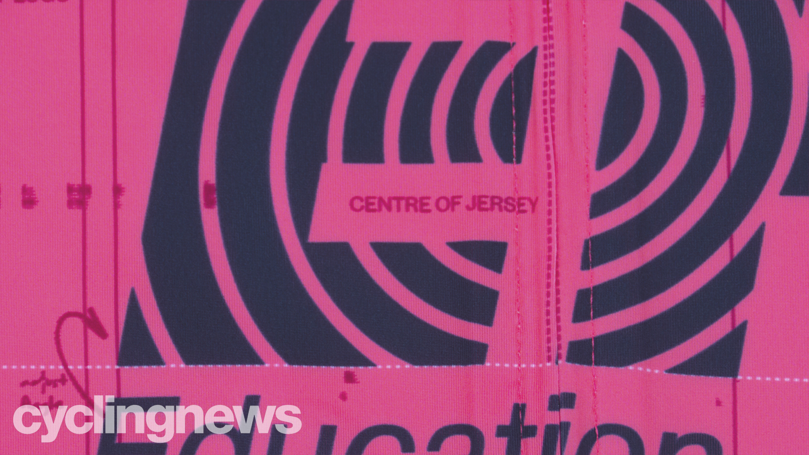
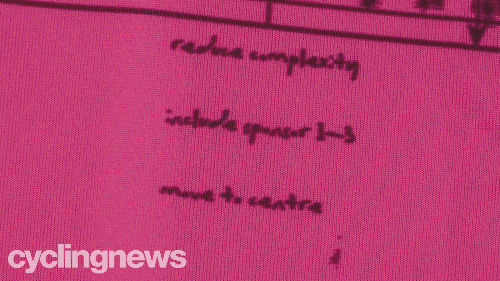
"Words and thoughts"
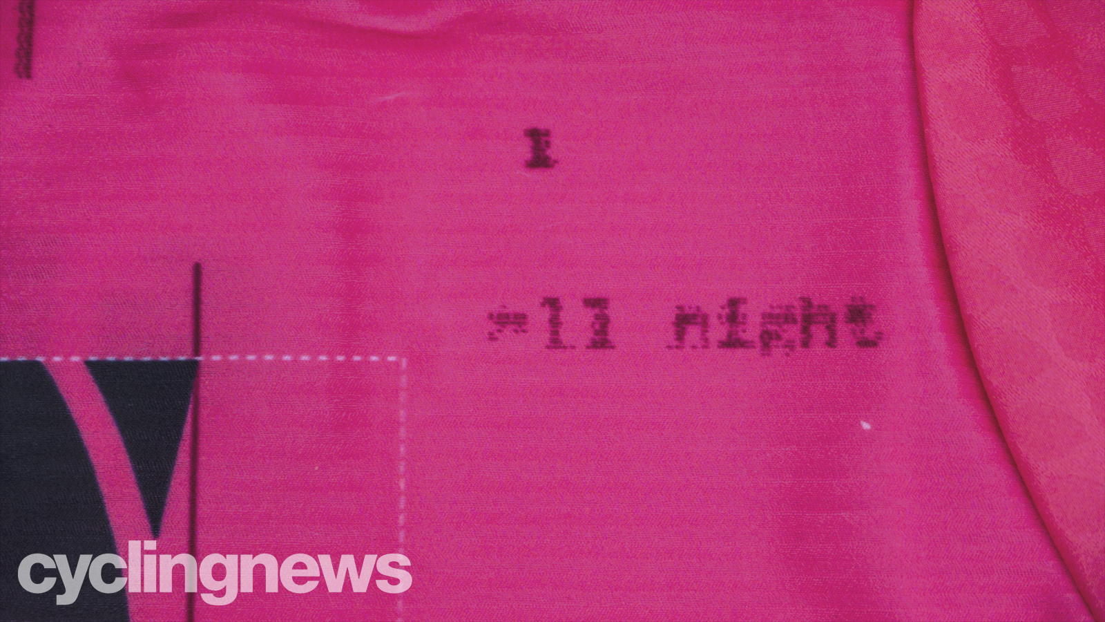
Among these hundreds of scribbles and notes, there are words and phrases dotted around. According to Kraus, they have no meaning at all.
"These are words and thoughts that were pinged around during the design process, rather, they have no answer or meaning."
He went on to explain what their lack of meaning is the reason they are blurred out slightly, while the eventual design concept – the UCI guidelines and parameters – remain in sharp focus.
Oil
On both the front and rear of the jersey, there are sketches from the designers.
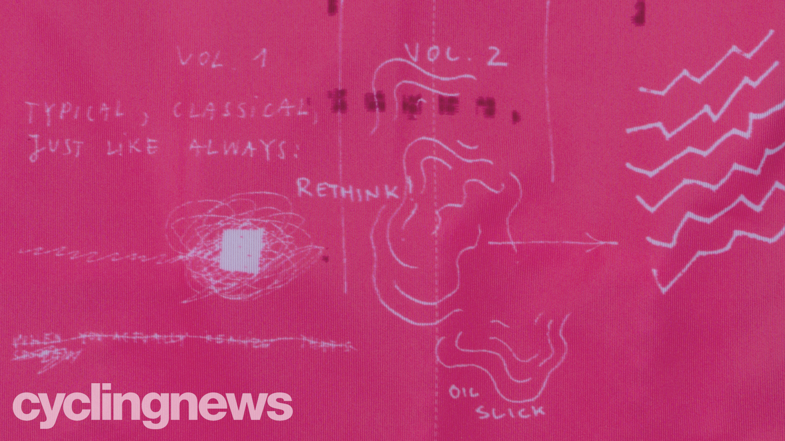
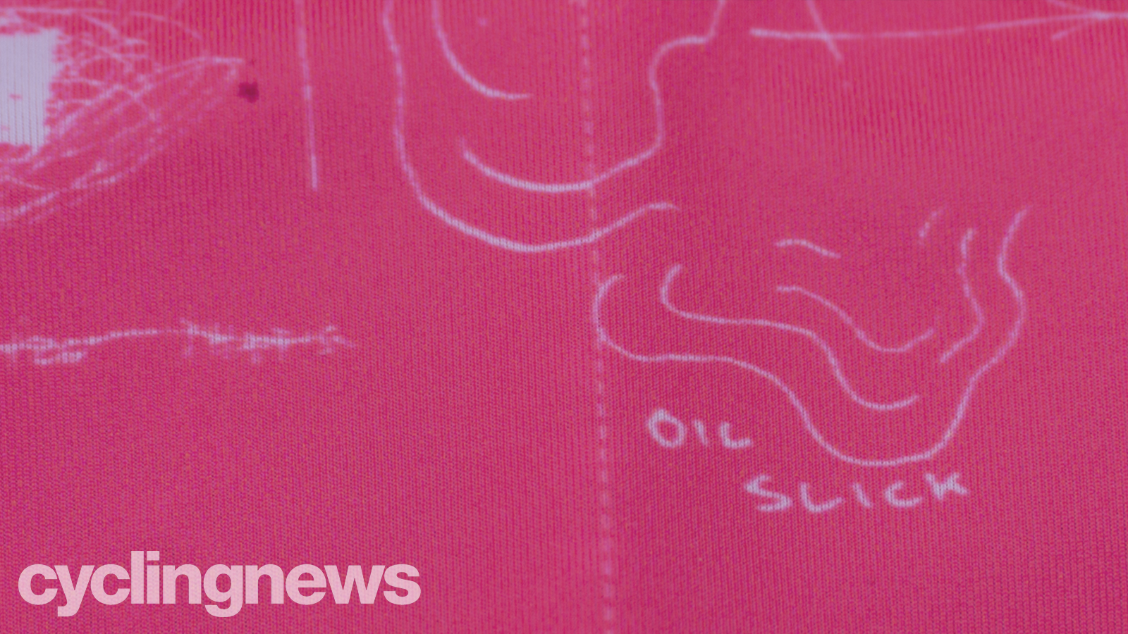
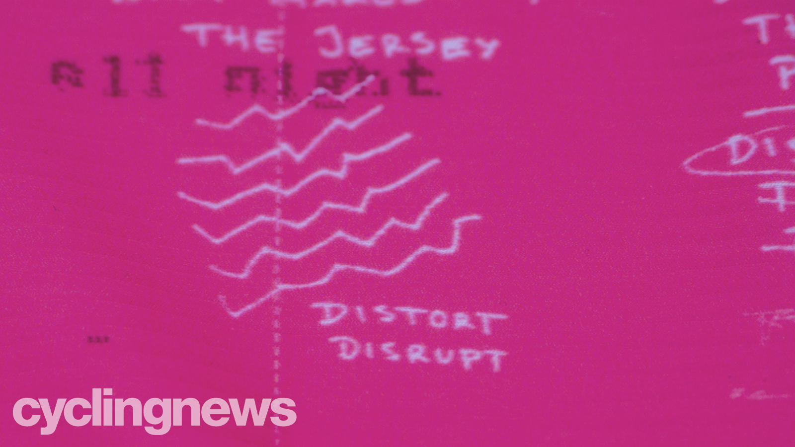
On the front, this section includes an oil slick, but rather than being a reference to the common shout of 'oil' - meaning danger - you'll hear in pelotons around Europe, it's actually a reference to the oil slick design of 2018.
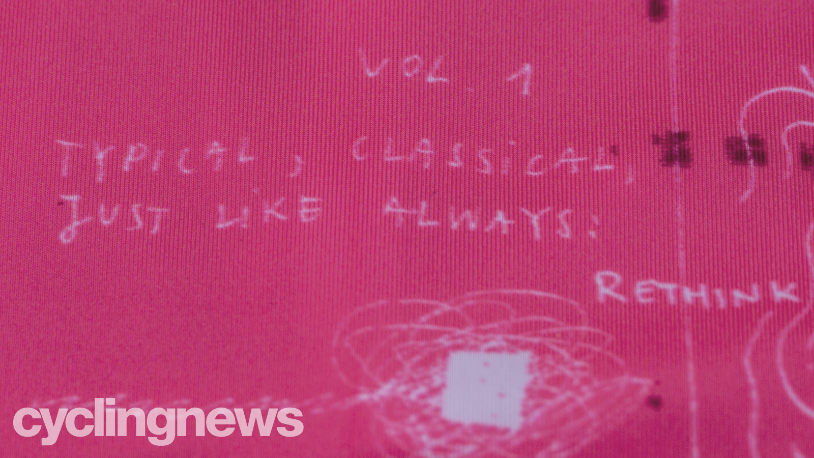
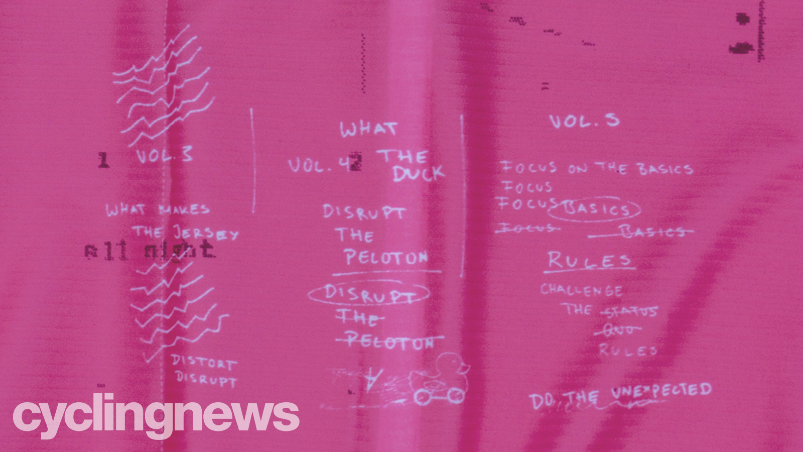
According to Kraus, the Vol.1/2/3/4/5 is a reference to specific jerseys that have been milestones in the EF x Rapha Partnership. In the images below, you'll see the quote 'Typical, classical, just like always', which is a reference to Vol 1.
"These words are somewhat forbidden to use in our EF x Rapha jersey design presentations," explains Kraus. "From the beginning, it should be made clear that this 'classic, just like always' approach would not work, and is not what we want for this partnership – it would lead to nothing."
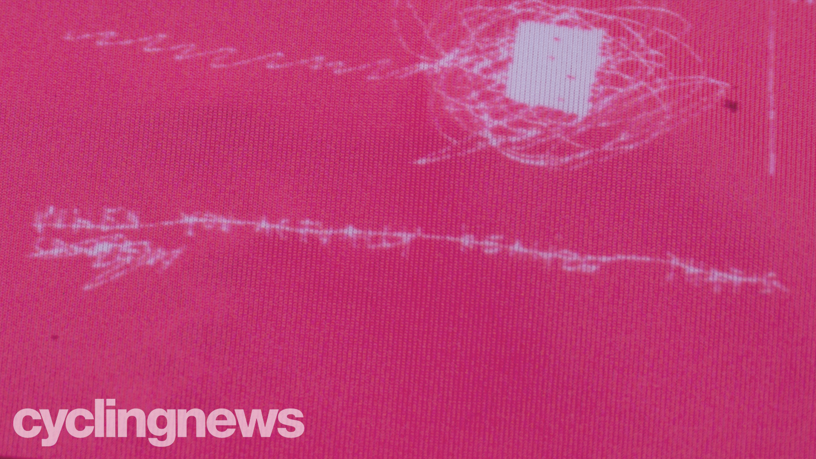
At the bottom of this Vol.1 section, you see the words "When you actually realize – that is so lame" crossed out, and the transition into Vol.2 is accompanied by "rethink!" – a mindset that has continued to define the partnership ever since.
Think
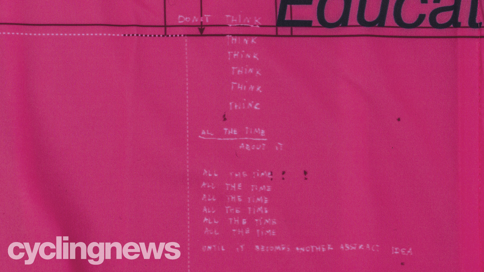
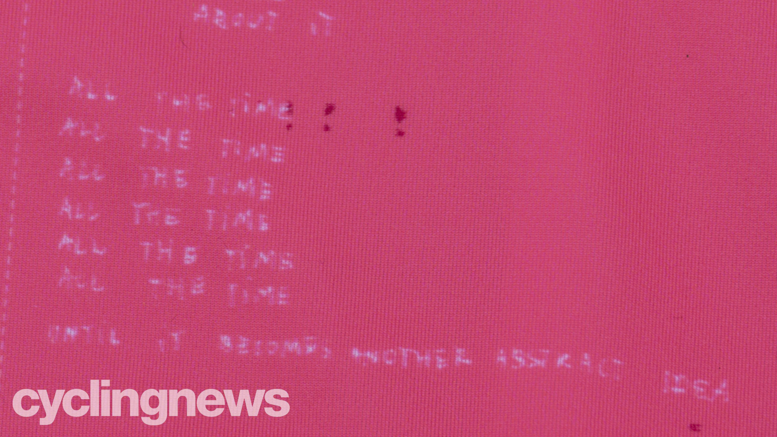
Also on the front is this, a reference to the continuous yet progressive thought processes going through the designer's minds.
It reads:
"Don't think, think, think, think, think, think,
All the time about it.
All the time, all the time, all the time, all the time, all the time, all the time,
Until it becomes just another abstract idea."
Pocket and a mascot
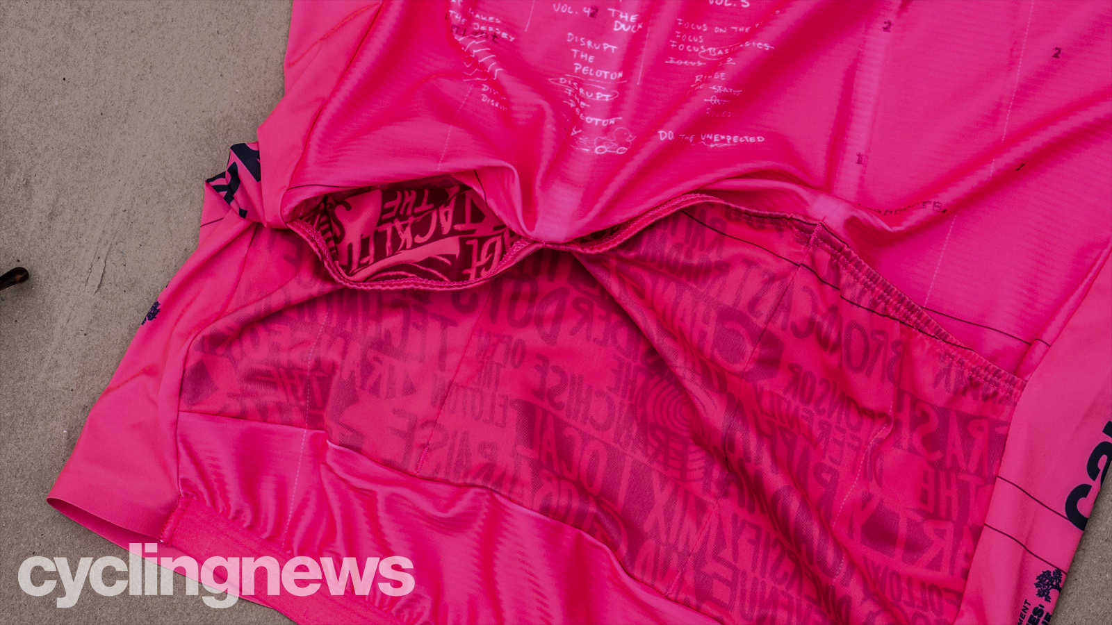
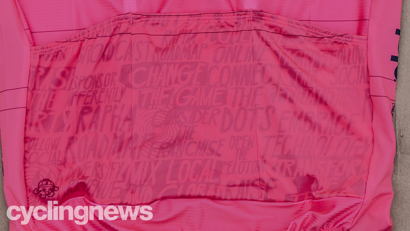
The pockets are a little different to the rest of the theme in design, but the message still speaks to the team's do-things-differently approach. It features a host of phrases such as "sponsor differently" and "diversify revenue." However in true EF form, to add another level of abstractness they've printed the whole design onto the inner face of the pockets.
As a result, all the words display backwards on the outward-face. Luckily, Photoshop exists, so we flipped it for you to make them easier to read. You're welcome.
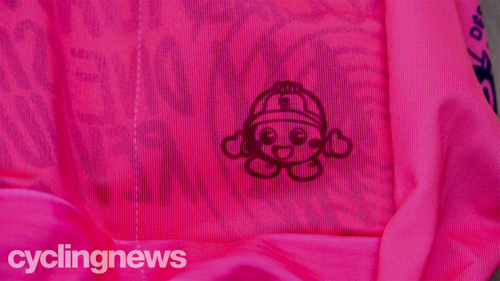
There's also a little mascot who lives on the bottom-right-hand corner of the pockets. We're told he is a mascot of the Nippo brand, and has featured on all jerseys sponsored by Nippo over the years... I feel a 'find the mascot' gallery on the way.
Boring, but not
More than just doodles, scribbles, sketches and notes, there are a few design inclusions that, in all honesty, are probably considered boring by EF's typical standards, but we like them, and we'd be remiss to neglect them.
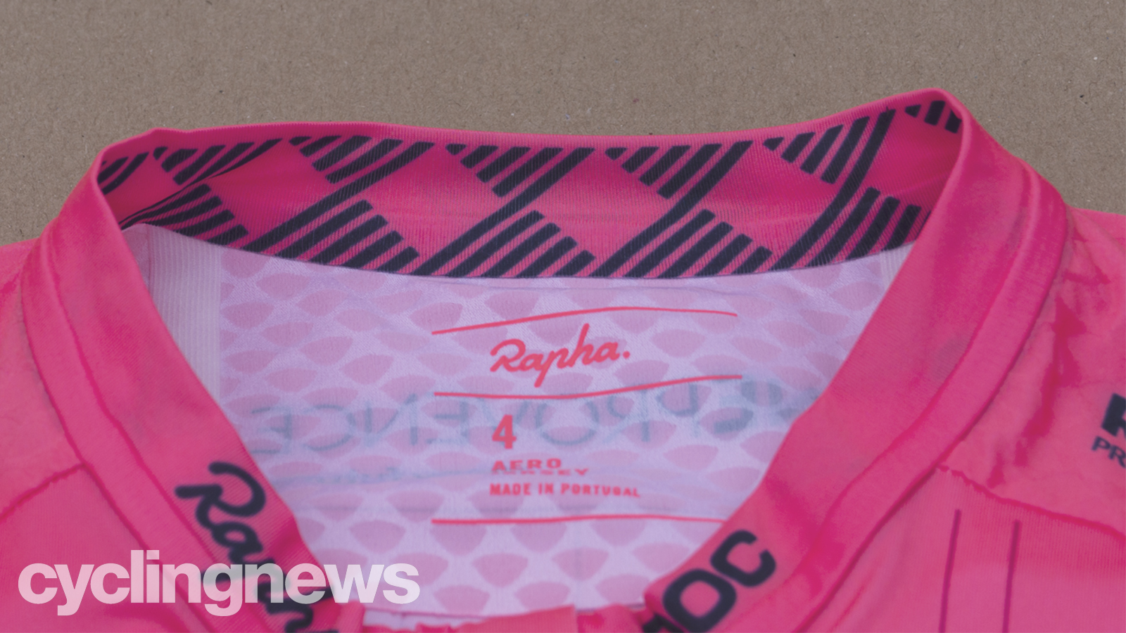
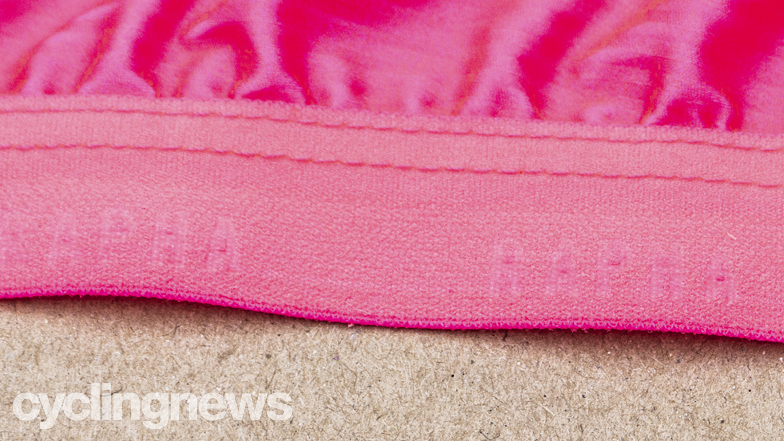
The two standout features for us are the inner collar, which is a tasteful nod to the argyle prints found on older Slipstream Sports (the name of the operating company behind the team) kits in its pre-Rapha era, as well as the very-hard-to-see (it's even harder to photograph) Rapha embossed logos on the hem.
What the duck?
Alas, we've arrived. We promised we've saved the best 'til last, and here we are:
As we mentioned earlier, the front and rear have sketches referencing the jersey designs of old, and the journey toward the do-things-differently approach that defines the team.
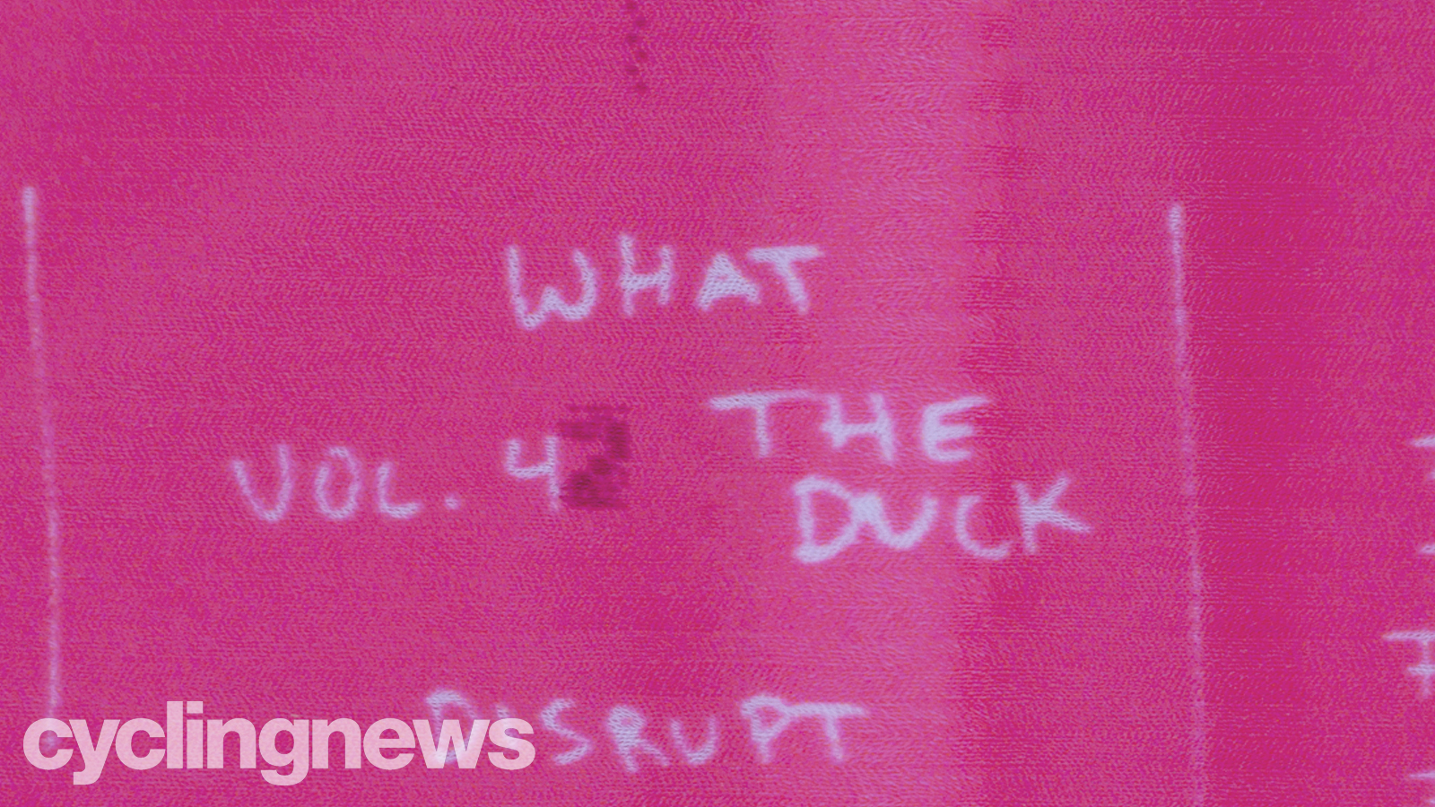
Without a doubt, the best sketch on the jersey is the picture of a duck, on wheels no less - a clear reference to that EF x Palace Giro d'Italia design. The duck is accompanied by "Vol. 4" – the fourth step on the aforementioned journey.
Accelerating off into the distance, the duck leaves behind it the letter A in a trail of dust.
"It's actually three A's," Kraus explains. "The triple-A standard of jersey design is disrupted by the ducks rushing through."
Of course, Vol. 3 was last year's design, represented by the ZigZag graphic found throughout the jersey, while Vol.5 leads us to today.
"Focus on the basics" was the concept, before the typical Rapha x EF partnership of "challenge the status quo" became a plan to challenge the rules. Designers eventually settled on doing "the unexpected".
It's safe to say, nobody expected this.
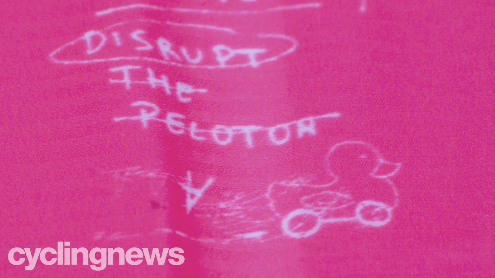
Unfortunately, the duck is yet to be given a name, so we suggest either Quacklan Morton or Mitch Ducker, or perhaps there's a mid-season transfer on the cards for Rudy Mallard.
... No?
We'll see ourselves out.

Josh is Associate Editor of Cyclingnews – leading our content on the best bikes, kit and the latest breaking tech stories from the pro peloton. He has been with us since the summer of 2019 and throughout that time he's covered everything from buyer's guides and deals to the latest tech news and reviews.
On the bike, Josh has been riding and racing for over 15 years. He started out racing cross country in his teens back when 26-inch wheels and triple chainsets were still mainstream, but he found favour in road racing in his early 20s, racing at a local and national level for Somerset-based Team Tor 2000. These days he rides indoors for convenience and fitness, and outdoors for fun on road, gravel, 'cross and cross-country bikes, the latter usually with his two dogs in tow.