2013 WorldTour jerseys: 18 ways to avoid blending in
Cyclingnews reviews this year's team kits


The new year always brings confusion to cycling fans as teams roll out their new looks for the first races and we all struggle to identify riders. Some years too many teams choose similar colours and they are hard to tell apart: a few years back many teams were red. Then we shifted to blue and black, but finally in 2013 some balance has been restored. The trend is toward simple design, with three teams, Sky, Cannondale and Blanco, opting for vertical rather than horizontal layouts.
A variety of colour combinations and matching helmets helps to distinguish, for example, Sky from Movistar, Garmin from Omega Pharma-Quick Step, and as always, the easter egg hues of the Italian teams Lampre and Cannondale stand out from the crowd.
Cyclingnews's editors have thought long and hard about which teams succeed and which teams fail in their kit designs and we present our opinions here.
AG2R La Mondiale
Visibility: AG2R's Mad Men-inspired colour scheme and design remains practically unchanged from 2012, which absolutely helps in the recognition department, however we can't help but be disappointed that we will continue to have to look at those mud brown shorts again this year.
Design: Nothing says investment banking like squares and dull colours. The team has done what it can to try and spice up the corporate identity of its supporter but there's only so much you can do with this kind of starting material.
However, as objectionable as brown cycling shorts might be, the classic styling of AG2R have become iconic and are actually starting to grow on us. While the rest of the peloton continues to pull from the PlaySkool colour palette, the sophisticated sky blue and earthy brown could have been pulled from a Matisse. It's soothing, but it doesn't stand out, kind of like the team's performances on the bike.
Get The Leadout Newsletter
The latest race content, interviews, features, reviews and expert buying guides, direct to your inbox!
Colours: Brown and blue are quite popular for that mid-century modern-loving interior design crowd. In the cycling world? Maybe not so much. However, a bright spot for those who disapprove will be Gediminas Bagdonas, the Lithuanian champion, who sports a bright yellow, green and red horizontal stripe with matching red side paneled shorts, and Yauheni Hutarovich, the Belarus champion, with a mainly white jersey with horizontal red and green stripe.
Argos-Shimano
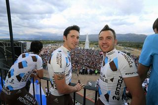
Visibility: The Argos-Shimano team stuck to its mostly white kit design, while toning down the previously bright green accents that adorned the arm cuffs and lower torso and helped it stand out. The dark blue background on the Shimano logo provides the only distinctive reference point for easy identification. Luckily FDJ added more blue to their kit or we’d never tell the two teams apart in the peloton.
Design: There's nothing splashy, there's nothing offensive, but we just think the design is a bit too safe. The logo placement is uncluttered, but plain.
Colours: Mostly white and blue with a little bit of red and green as accents. It's a good start, but we really think they could have done more with the palette.
Astana Pro Team
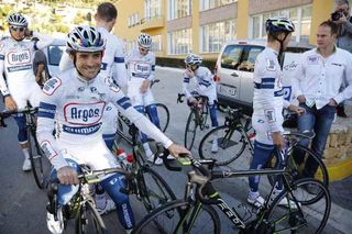
Visibility: The Astana team has forged its identity around the Kazakh national colours of aqua blue and yellow, and in the world of cycling they stand out against a backdrop of primary colours, blacks and whites.
Design: The Astana logo gets displayed in a jaunty arc across the upper chest for 2013, while the golden eagle wings get relegated to a blue-on-blue silhouette. Everything on the front of the jersey just looks a bit shoved up too high: the Astana logo touching the Specialized logo, the single gold swoop on the right shoulder and the circular format serves to make the riders look like they're in a permanent, confused shrug.
Colours: The blue of the Kazakh sky gets a bit lighter for 2013, while the gold is placed on a white backdrop on the shoulder and side panel, with a touch of gold on the leg band. Classic Astana palette.
Blanco Pro Cycling
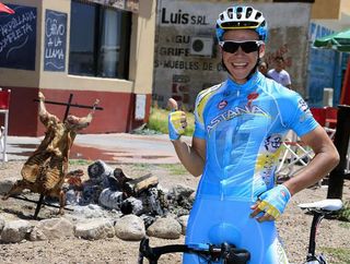
Visibility: While the team's color choice draws from the black, blue and white palette of Sky, from the top and most definitely the side there's plenty of differentiation to keep the teams separate. From the overhead shots this team is the easiest to spot thanks to the bold vertical stripe.
Design: The former Rabobank squad underwent the most radical kit makeover of any WorldTour team as the Dutch bank's withdrawal subsequently eliminated the team's characteristic orange and blue hues from the peloton. "A new team, a fresh start, a blank canvas" says the team's website and their kit is just that, bisected vertically into black and royal blue panels with a column of white along the zipper and nearly devoid of any logos. A script "Blanco" is situated on the upper chest accompanied by a small Giant logo over the heart for the team's bicycle sponsor. The color scheme is repeated on the back, but absent of any text. A nice touch is having each rider's name and national flag along the left side panel for easy identification while on the bike. The shorts are black with white side panels.
Colours: Your standard black, blue and white. The yellow and red highlights on former Spanish road champion Juan Manuel Garate's kit (collar and sleeve cuffs), however, are striking when seen in the context of a team group photo.
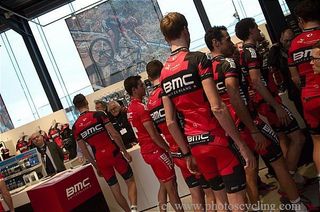
BMC Racing Team
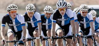
Visibility: The BMC team has stuck with the formula for 2013, keeping its deep red and black design with little change over last year's kit. A bit more black on the shoulders could actually confuse us in identification, especially in a tightly packed bunch, with Sky and Movistar also favoring dark colors. The arms are almost entirely black, with just a red band.
Design: The BMC kit strikes us as an ongoing game of Tetris, with huge, pixelated blocks of black gradually filling in a red background as the years go on. It gives a mechanical feel, one that we suppose is supposed to speak to Swiss precision, but fails to give the kind of speed or flow you might expect in a cycling-specific design.
Colours: Red, white and black aren't exactly unique, but the number of teams clad in red has gone down over the past few seasons, perhaps in reflection of the overall haematocrit in the bunch.
Cannondale
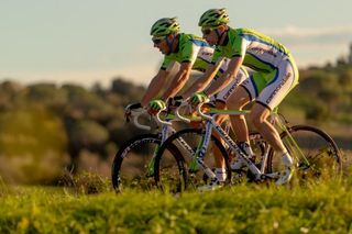
Visibility: Although the Italian team lost Liquigas, it kept the startlingly bright green for 2013, both in the kit and helmet, which helps the riders stand out like neon signs. The vertical stripe, a la Blanco, only adds to the distinction. The only issue is Bardiani-CSF Inox copped their colours a bit, so in a tight bunch from the side it can be confusing.
Design: The design is very simple for 2013, with only the vertical stripe to break up the Kermit the Frog green on the front and back, with a white stripe on the side to highlight the title sponsor's logo, accented in blue.
Colours: Green, white, blue. The colours are the same, the design quite different from 2012's.
Euskaltel-Euskadi
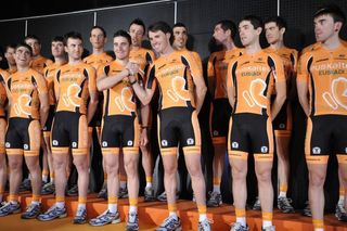
Visibility: With its trademark, vivid orange kit, there's never any question as to where Euskaltel-Euskadi riders are in the peloton, especially now with Rabobank gone.
Design: Eusaltel-Euskadi has added black accents to the sleeves and flanks of the jersey. The telecom company's logo, which resembles a butterfly, makes an appearance on both the front and back of the jersey which was previously just solid orange with text. The shorts remain predominantly black and thankfully the orange panel at the rear which made the jersey appear to extend down to the saddle is no more.
Colours: Euskaltel-Euskadi still sports very much an orange kit, but the palette choice is more muted for 2013, from a bright orange to almost a shade of peach.
FDJ
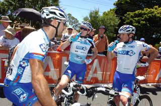
Visibility: Solid white jerseys stand out in a sea of blue and black, but just don't get too close to Argos-Shimano or leaders of young rider classifications.
Design: The kit incorporates more blue than in 2012, and removes BigMat from the jersey after the co-sponsor opted not to continue supporting the team for 2013. FDJ riders remain in white jerseys for 2013 with blue accents on the side panels, collar, sleeve cuffs and around the sponsor logos. Shorts are now blue instead of white, riders no longer have to sweat unintended transparency when rain begins to fall.
Colours: White and blue with a touch of red, just like title sponsor FDJ's logo.
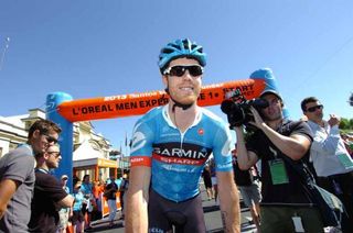
Garmin-Sharp
Visibility: While there is plenty of blue and white on kits in the WorldTour peloton, the black and red panels across the upper chest and back plus the oversized Cervelo logo on the back should provide sufficient brand identity to call out Garmin-Sharp riders in the peloton.
Design: From the front, the jersey appears virtually identical to the kit unveiled mid-year when Sharp came on board as a co-sponsor, with Garmin and Sharp text vertically stacked and highlighted by a black and red band respectively on the chest while the squad's trademark argyle takes up the lower half of the jersey. While last year the back panel was white, for 2013 the blue argyle present on the front continues as the background for the entire back while a large, white Cervelo logo (previously black in 2012) is situated beneath the same Garmin and Sharp panels which repeat from the front. Traditionalists will be delighted to see that the squad's shorts remain solid black set off by blue bands at the cuff of each leg.
Colours: Garmin-Sharp draws from the same 2012 palette of muted blue argyle background, white text, plus black and red panels that really pop.
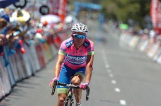
Lampre - Merida
Visibility: If your riders aren't hugely successful or have a bad reputation, then what better way of capturing everyone's attention than bright, garish team colours? That seems to be the jersey-design strategy at Lampre-Merida. Their clothing certainly stands out, even in the modern, multi-coloured professional peloton.
Design: Sir Paul Smith said his design of the Giro d'Italia maglia rosa was inspired by pop artist Andy Warhol and his ability to mix bright colours. It seems unlikely that any creative thought process was involved in the design of the Lampre-Merida kit, with the blue sections across the jersey and shorts simply used to highlight the sponsors' names.
Colours: The Italian team is known for its blue and pink jersey and the arrival of the bike sponsor has seen a splash of bright green added to the palette. Green is a Merida favourite but it is not clear if blue and pink is related to Lampre's laminated steel products or just the favourite colours of team manager Beppe Saronni.
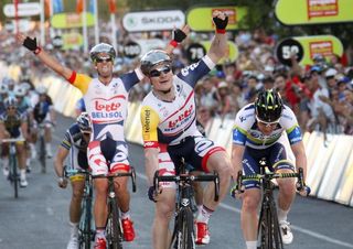
Lotto Belisol
Visibility: The mix of white, blue, red and yellow makes the Lotto Belisol jersey almost too visible. It screams at you. However, the bright colours almost hide the sponsors' names.
Design: This year's kit is far from subtle. The white base colour dominates, with the red and blue curves spiraling off from the central red Lotto and blue Belisol logos. The arrival of new sponsors Telenet means one shoulder is yellow, while the other is blue. Minor sponsors such as Skoda and Ridley bikes fill the upper chest area, as does the logo of clothing sponsor Vermarc.
Colours: With red and blue shoulders and contrasting red and blue short panels, the Lotto Belisol colours make them look like the court jesters of the peloton.
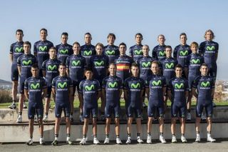
Movistar Team
Visibility: The Movistar jersey stands out because it is totally dark blue with the fluorescent green M creating a stark contrast and so highlighting the Spanish communications company's logo. From the side, however, it may be hard to pick out from Sky's black.
Design: The jersey is a darker blue for 2013, so dark it is nearly black. However overall it is an improvement on last year and looks much better. While Rapha went for flat stitching, Nalini has virtually eliminated them, giving the Movistar jersey a very smooth and fast look.
The Movistar logo and name dominates the front, side panels and shoulders of the jersey with bike sponsor Pinarello getting a good sized logo on the right side of the upper chest. The other side is filled by the Nalini logo and the UCI WorldTour logo. That's it. Nothing else pollutes the look or distracts from the primary sponsor.
Colours: The all-dark blue colour may seem unoriginal but it works, especially with the contrast between the blue and florescent Movistar green logo. It might prove hot in the summer races.
Omega Pharma-Quick Step
Visibility: The new-look design of the Omega Pharma-Quick Step kit for 2013 is a mix of sky blue, black and white. It stands out but with typical Belgian modesty: It is not flash, it is not artistic, but looks good and lets the sponsors logo stand out.
Design: The Omega Pharma and Quick Step logos dominate the kit, with the two main sponsors filling the chest and back of the jersey with their company font, colours and logo. The shorts are a traditional and practical black, with sky blue stitching framing the sponsor names. The clothing is made by Vermarc and the Belgian company has big logo on the shorts and chest which fight with the Specialized S for visibility.
Colours: Patrick Lefevere's team has always had a blue and white jersey. For 2013 the blue has become lighter and been given a fading dot effect on the arms and chest. It will be interesting to see if this sparks some kind of digital interference on television. The white back will help the riders stay cool in the sun.
Orica GreenEdge
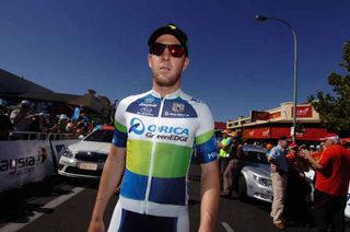
Visibility: The Australian ProTour team's green, white and blue jersey made as much an impact as its riders during its 2012 debut. For 2013 the colour volume has been cranked up to 11 and certainly stands out in even the most distant helicopter shot. Design: The colours are bright but the design is actually rather modest, with block of green, blue and white simply filling up the jersey. The Orica logo dominates the chest, shoulders and side panels, with Jayco, Subaru, bike sponsor Scott and kit sponsor Santini slightly squeezed into the upper chest panel.
Colours: The Australian national colours are traditionally green and gold but the Orica-GreenEdge kit is surprisingly different, with green, white and blue dominating. Luke Durbridge is the new Australian time trial and road race champion and so gets to ride with a simple but classy green and yellow stripe across his chest. He is probably the proudest rider in the team and should be: he's got the best looking kit.
Radioshack-Leopard-Trek
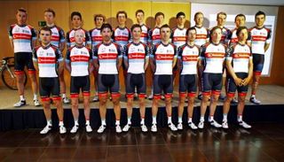
Visibility: The Radioshack-Leopard-Trek jersey has a new look after Nissan ended its sponsorship but it is still a modern classic that stands out for its simplicity and style. It might not scream at the television camera but new team manager Luca Guercilena will surely be hoping that the attacks and victories of Fabian Cancellara, Jens Voigt, Andy Schleck and Chris Horner will give the team lots of visibility in 2013.
Design: A simple but balanced design combines colour panels with the more dominant black and white areas. The designed seems to have been done by an engineer rather than a fashion stylist but it works well, especially when combined with colour coordinated gloves and helmet. The Radioshack name is on a red panel across the chest, with the Radioshack R and new sponsor Anonimo Watches on the shoulders. The kit is made by Craft, with other technical sponsors Skoda and Gaerne getting tiny logo on the chest. Shorts are black but with a modern red border strip at the ends.
Colours: Touches of red and pale blue mix with the dominant black and white to reflect the colours of Luxembourg – where the team is registered.
Sky Procycling
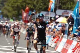
Visibility: We imagine that the mod-style loving Bradley Wiggins had his say in the team's kit design after winning the Tour de France - "too much colour" - could have been one of the criticisms of last year's design, judging from the basic black of the 2013 kit.
Gone is the distinctive white back panel that served two purposes - absorbing less heat from the sun and giving more visibility in the overhead shots. However, it never really worked from those aerials so perhaps the blue stripe on black will make riders easier to pick out. Plus, the vertical blue band on black is slimming, and we all know Sir Bradley needs that.
Design: It's a simple, retro design, a real throwback to simpler times. There is nothing to take away from the Sky logo other than the riders' names and flag.
Colours: The same blue and black as last year, with less white - it's still classy, and there are fewer teams with the same look this year.
Saxo - Tinkoff
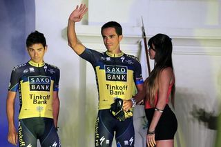
Visibility: What's with all the dark colours? Previously a medium blue, yellow and black after acquiring Tinkoff Bank as a sponsor, the 2013 Saxo-Tinkoff team joins Movistar and Sky in darkening their jerseys down.
Sure, the enormous Saxo Tinkoff branding will be unmistakeable, but what about the front-on shots? A yellow stripe on the blue helmet will be the only thing to distinguish them.
Design: When in November Riis Cycling rolled out its new crest, complete with the scary eagle head, we were eagerly anticipating the return of the bird to the jersey front. Alas, the eagle has not landed. The front of the jersey is nearly the same, while the back gets a medium blue panel with the Saxo-Tinkoff logo. Kudos to the designers for keeping the black front and rear panels on the shorts for modesty.
Vacansoleil-DCM Pro Cycling Team
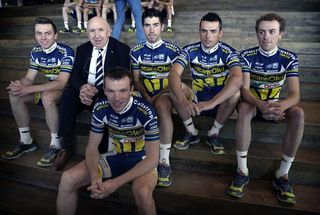
Visibility: The Vacansoleil kit is nearly unchanged from 2012, so we won't have to readjust our expectations for locating their riders. More dark sleeves will further confuse from the front now that Movistar, Sky, Saxo, etc. have gone the same route, but the yellow sunburst is large enough to distinguish the team in overhead shots.
Design: The white accents on the collar and sleeves add a touch of class, while the yellow sunburst on the bottom of the jersey remains faithful to the team's title sponsor. However, the clot of logos on the shoulders and upper chest clutter up the look.
